Read the edition or download the PDF.
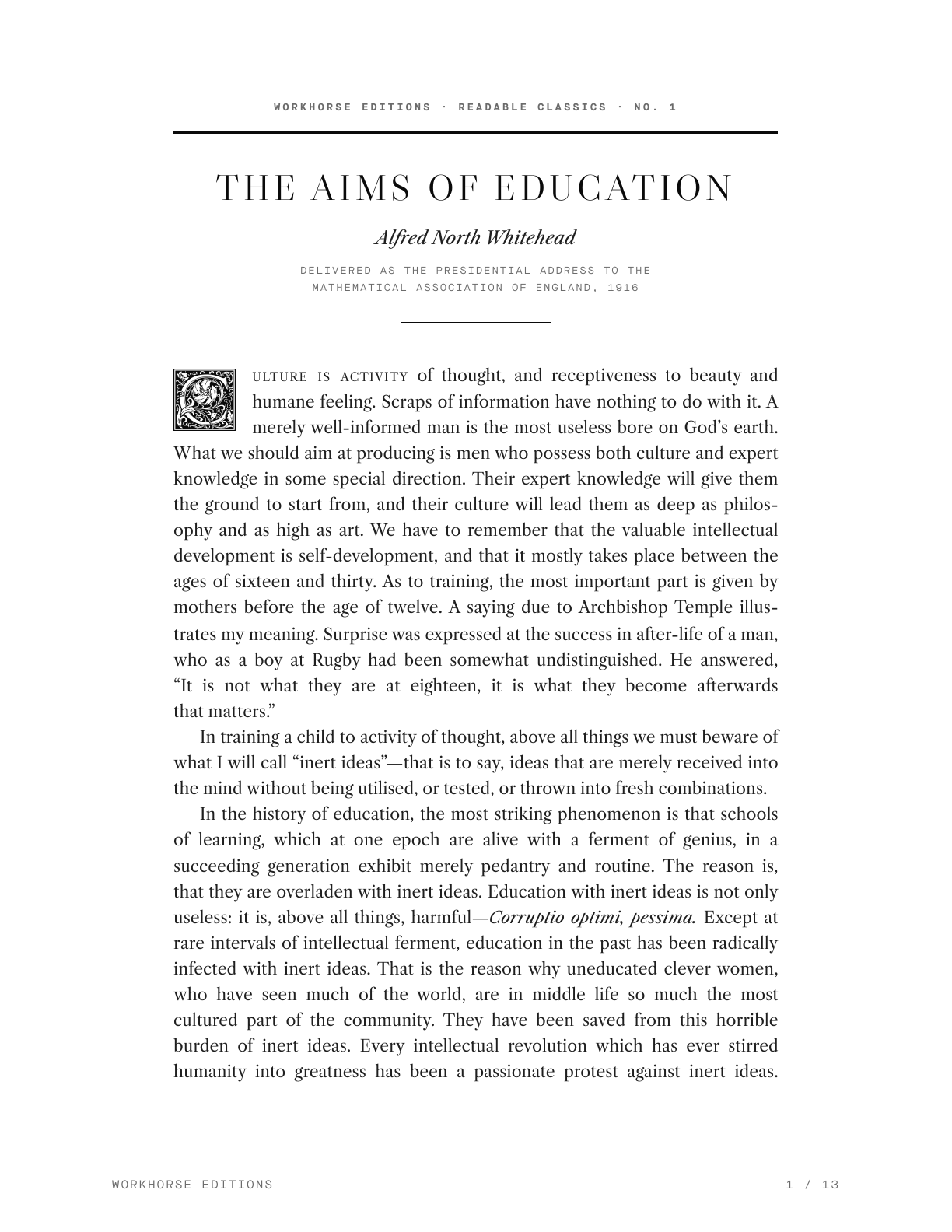
I designed an edition of Alfred North Whitehead’s The Aims of Education to make the essay more comfortable to read and print. The source I was working from needed text cleanup, and I wanted a layout with considered typography and notes that explained unfamiliar references.
The project also gave me a way to extend this site’s résumé print system to a longer piece of writing.
Adapting the print system
The existing pipeline renders a page in the codebase and exports it to PDF through a browser. That gave me a starting point for styles and document generation.
An essay places different demands on the layout. Readers spend longer with continuous text, so line length, leading, paragraph treatment, and page breaks become especially noticeable. I adjusted the system around those needs.
Choosing the type and page proportions
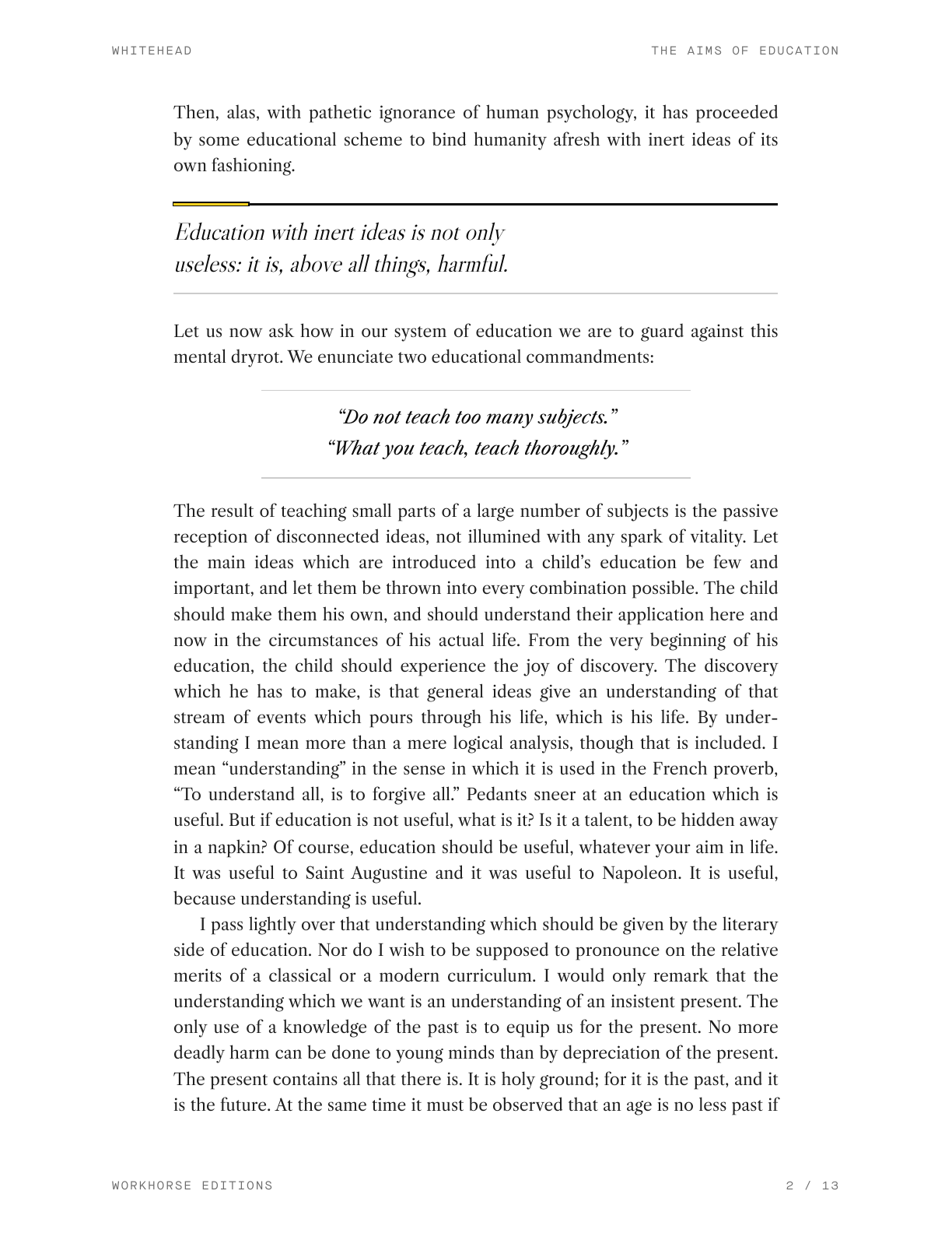
Mark Argetsinger’s A Grammar of Typography informed the page design. I used its guidance to work through the relationship between the text block, margins, leading, and supporting information.
I chose Libre Caslon for the body and used justified paragraphs with first-line indents. A single asterisk marks section breaks. The opening page uses an ornamental initial to distinguish the start of the essay.
I adjusted the leading alongside the measure, checking how the paragraphs read on the page. Roman, italic, and small caps provide the main distinctions within the text and supporting matter.
The reusable styles are organized into four layers: tokens, hyphenation and justification, notes, and page furniture such as running headers and folios. That separates the choices specific to this edition from the rules another document could reuse.
Adding context in the margins
The edition includes notes for references that may be unfamiliar to a reader today. They explain people, phrases, and details in the source, including Archbishop Temple and the spelling “Behren’s Straits.”
I placed the notes in the outer margin so they can be read alongside the relevant passage. The position mirrors on facing pages. Smaller type distinguishes them from the essay, while their alignment keeps them visually connected to the main text.
The editorial question was how much help to provide. The notes needed to explain a reference without taking over the reading experience.
Cleaning the text and checking the pages
The source text included words broken across lines, page numbers within sentences, and transcription errors. I used Claude to help reconstruct the text, with instructions to retain Whitehead’s punctuation and British spellings.
Text cleanup and layout review were separate tasks. After setting the text, I adjusted the hyphenation rules and inspected the exported pages for short fragments, repeated hyphens, awkward breaks, and isolated lines.
CSS can express many of those preferences, but an export still needs review. I used a page-by-page checklist to examine headings, paragraph breaks, alignment, and the relationship between the notes and the essay.
The result
The result is a reading edition available on the site and as a PDF, published as Workhorse Editions No. 001.
The project extended the print pipeline beyond résumés to continuous text, margin notes, and book-style page details. It also established a process I can reuse: prepare the source, set the typography, export, and inspect the pages.