On January 1, 2025, everything published in 1929 entered the American public domain. That includes The Aims of Education and Other Essays, the book where Alfred North Whitehead opens with one of the best first paragraphs ever written about learning: “Culture is activity of thought, and receptiveness to beauty and humane feeling. Scraps of information have nothing to do with it.”
The problem is that if you go looking for that essay today, you find it as OCR sludge on an archive scan, or as a wall of unstyled text on a decades-old faculty page. A text about the difference between inert ideas and living ones deserves better than the most inert presentation the web has to offer.
So I gave it the treatment I built for my own documents.
A design system that prints
Over the past few months I built a print pipeline for this site’s resumes and cover letters. The idea is simple: a document is a route. Each printable artifact is a real page in the codebase, styled with the same tokens and typefaces as everything else, and a build script drives a headless browser over it to produce the canonical PDF. Running headers, footers, and page numbers get composed onto the finished file with the brand fonts embedded, so the artifact you email someone is the same design system you see on screen.
Resumes are a good stress test for layout. An essay is a better stress test for reading. Five thousand seven hundred words, no bullet points, no grid of credentials. Just text that has to carry a reader for thirteen pages.
The choices
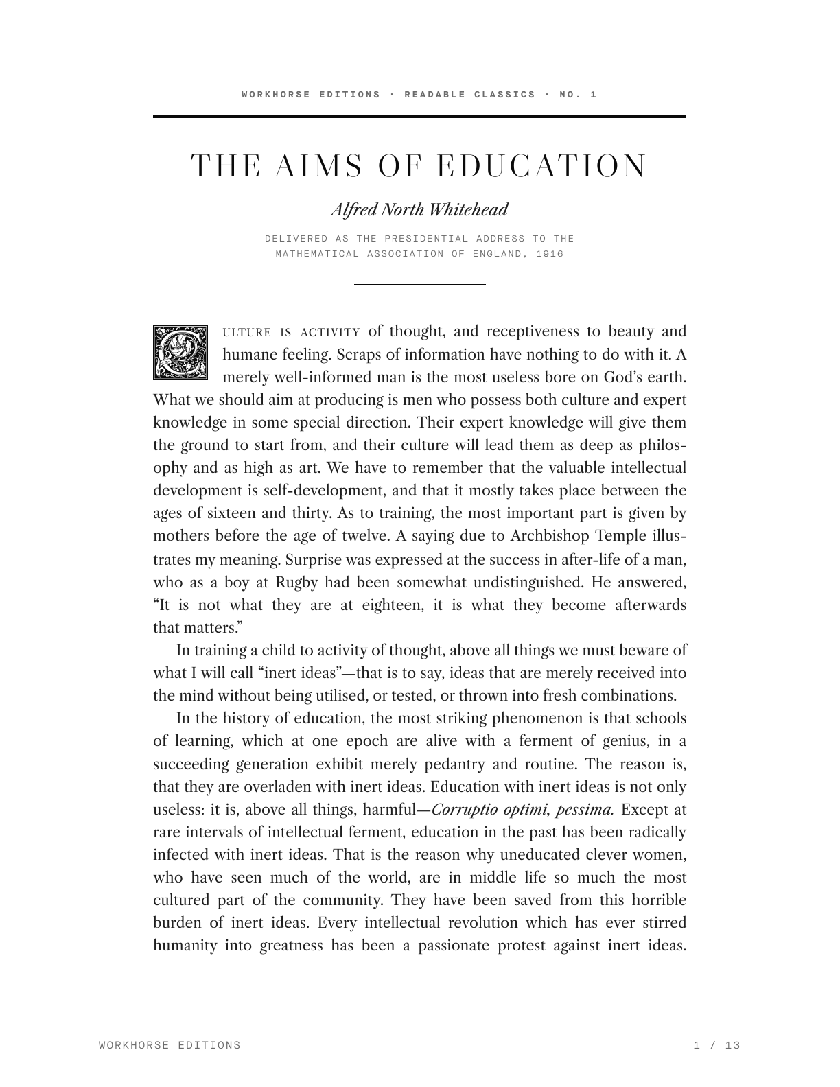
The resumes are set entirely in Maison Neue, sans and mono. For the essay body I broke that rule on purpose and reached for Libre Caslon, the serif that was already sitting in the system’s font stack. A 1916 lecture wants book typography: a measure held to about 68 characters, justified lines with hyphenation, first-line indents instead of paragraph gaps, and an ornamental initial on that opening sentence. The drop cap is a real one, Frederic Goudy’s floriated initials from the early 1900s, public domain like the essay itself. The system’s voice still frames the page in the running furniture and the yellow accent.
The edition opens the way an old essay collection does. No standalone title page: a compact head with the series line, a double rule, the title in letterspaced Caslon capitals, the author in italic, and then the essay begins on the same page under the initial. The publication facts, first printing, copyright status, this edition, moved to the colophon at the back, where a book keeps them. Stating “public domain, United States, 2025” in the imprint is part of the design. Provenance is content.
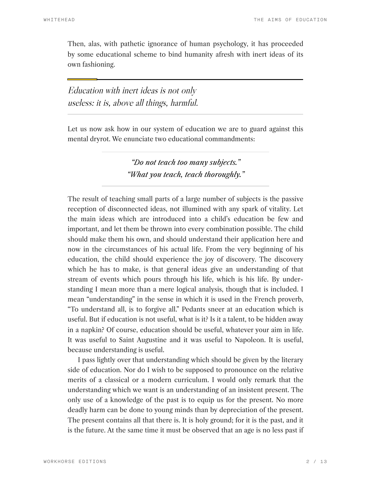
A continuous essay also needs interruptions, so the edition carries the system’s editorial voice. Pull quotes lift Whitehead’s sharpest lines into Caslon italic under a black rule with the yellow tab. Section breaks land as a short accent bar where the argument turns. And when Whitehead issues his two commandments, they get set off as a display quote between hairlines:
“Do not teach too many subjects.”
“What you teach, teach thoroughly.”
The same marks appear in the web edition, the flowing PDF, and the Paged.js book build, all styled from one source text.
Cleaning a century of OCR
The other half of the work was editorial. The source is the Archive.org scan of the 1929 Macmillan edition, and the raw OCR is rough: words hyphenated across line breaks, page numbers embedded mid-sentence, “curriculum” rendered as “cirriculum.” I had Claude reconstruct the text, rejoining paragraphs across page breaks and fixing a few dozen misreads while keeping Whitehead’s punctuation and British spellings intact. Where the scan disagrees with later reprints, the 1929 reading stays. The scan says “Behren’s Straits,” so the edition says “Behren’s Straits.”
That division of labor felt right. The model did the patient, careful transcription work in minutes. I made the calls a designer makes: which typeface carries the body, how wide the measure runs, what belongs on a title page.
Why bother
Whitehead argues that education fails when ideas are received without being used, tested, or thrown into fresh combinations. Typesetting his essay was exactly that kind of use. The print system stopped being a resume tool and became something more general: a small press. You can read the full essay here or download the 13-page PDF, and the series line now says what the system turned into: Workhorse Editions, Readable Classics, No. 001.
There is a century of writing entering the public domain one January at a time, and most of it will only ever exist as scans. Making one essay readable took an afternoon. That seems like a reasonable exchange rate for keeping a good idea alive.