cat info.txt

Double Exposure

A decade-long brand partnership with DC's investigative film festival. From founding identity through the 10th-anniversary system.

Double Exposure
Double Exposure

Double Exposure

Double Exposure.

A decade-long brand partnership with DC's investigative film festival. From founding identity through the 10th-anniversary system.

Client
Double Exposure / 100Reporters
Discipline
Brand Identity · Campaign Creative · Typography · Editorial
Year
2025
11
Festival cycles, 2015 to 2025
4 days
Of screenings and symposium each year
Case study
Read the full story at wrkhrs.co

The brief.

Double Exposure is a project of 100Reporters, the nonprofit investigative newsroom in Washington. It began in 2015 as the investigative film festival: documentaries built on reporting, screened in the capital, with a symposium running beside the screenings where filmmakers, journalists, editors, lawyers and funders work through how the films get made and defended. The audience is the people who do this work.

The festival came to us for its second year. It needed an identity that took the films as seriously as the newsroom did, could carry a different campaign every October, and could hold across posters, passes, the website, the trailer and the stage. We designed the system in 2016 and have designed every edition on it since, ten festivals through 2025.

01

Studies

Finding the year.

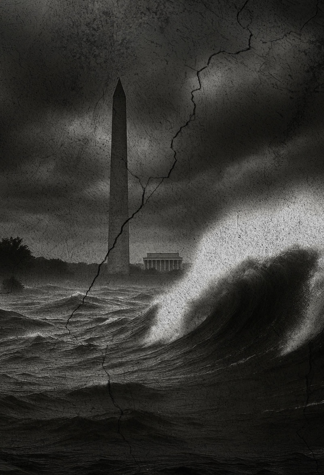
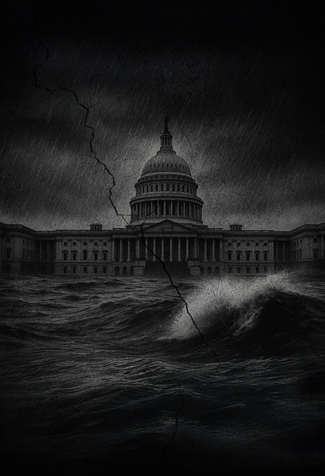
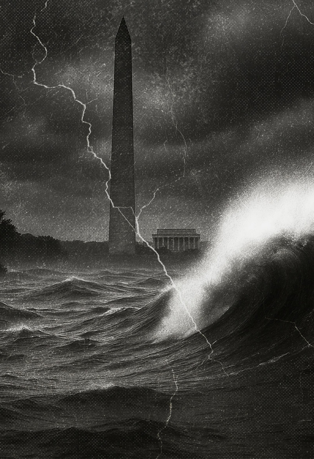
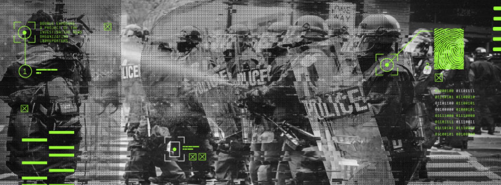
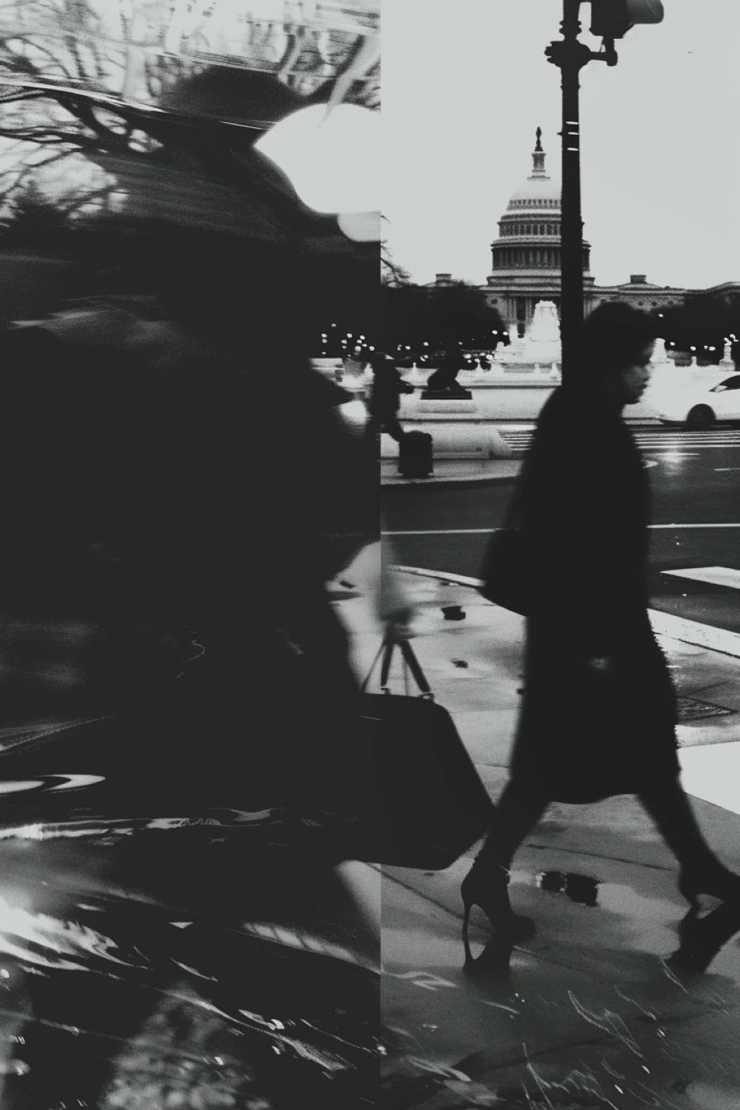
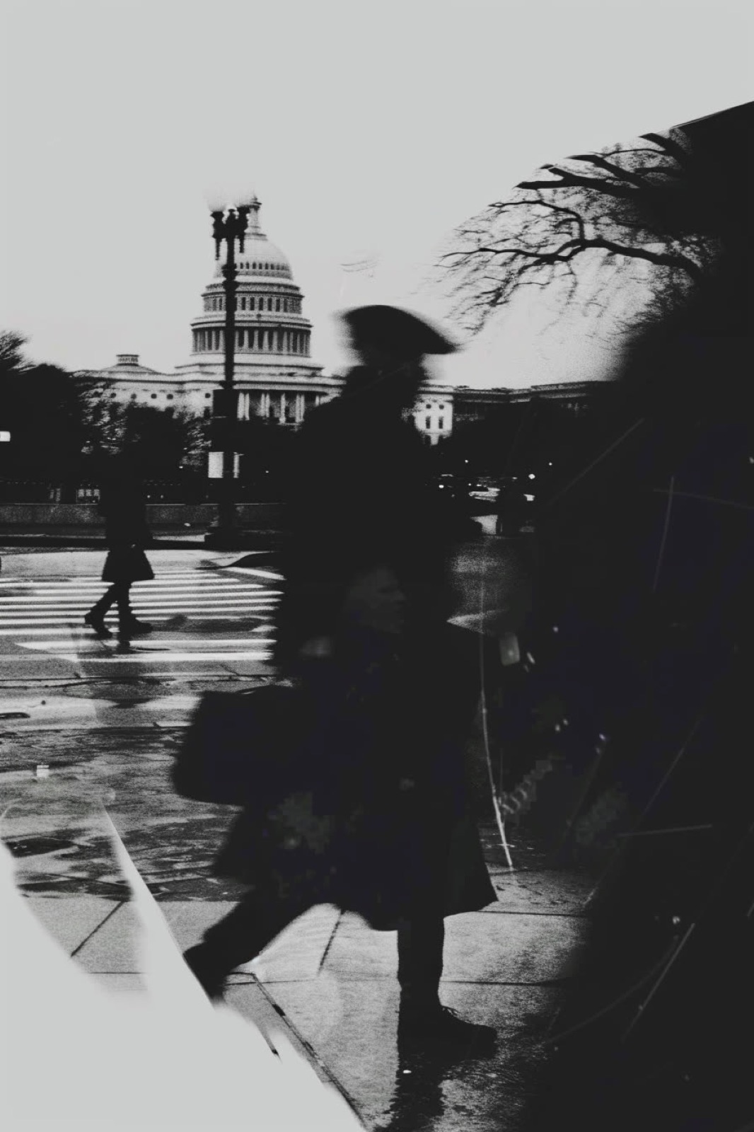
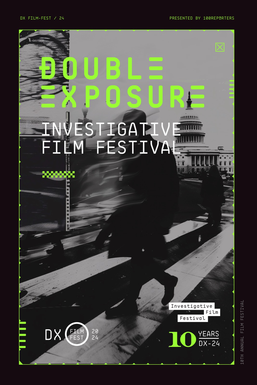
Before a campaign has a poster it has a pile of studies. For 2024 that pile was the capital under weather: the Monument and the Capitol in a storm surge, and people crossing the street in front of the dome, shot fast and doubled over. The studies set the tone of the year. The figure on the street became the poster.

02

Identity

Evidence, set in mono.

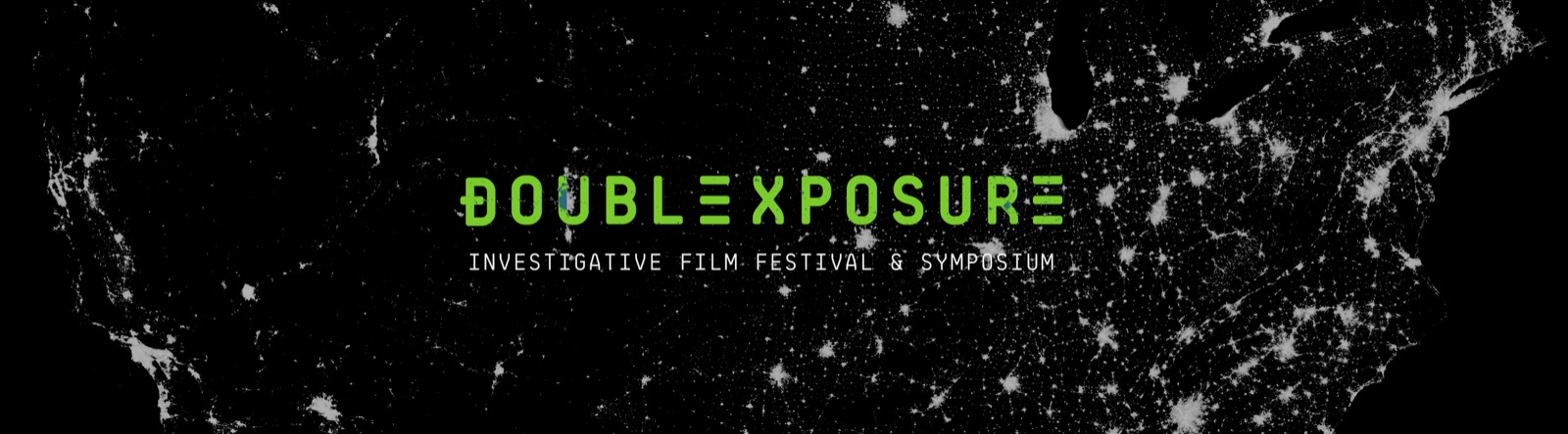
The identity is typographic. BB Roller Mono, Fabian Harb’s monospaced face for Grilli Type, sets everything with the festival’s name on it, always uppercase, often knocked out of black at poster scale, so the type reads as a file rather than a headline. Druk, from Commercial Type, is there for the lines that have to shout. Post Grotesk carries the paragraphs, and Acumin Condensed takes the schedules and the data strips, where Druk would be too loud. Each face has one job.

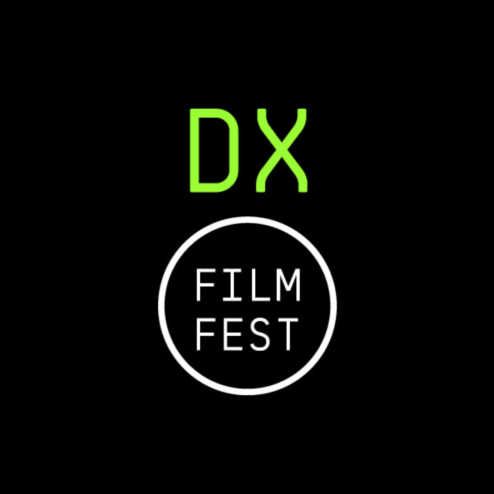
Black is the ground and the electric green is the signal. The gold of the first identity survives in the laurels. Over ten years the mark family has grown to sixteen: the logotype, the horizontal and stacked lockups, the DX monogram and circle, the arrow with the year, the laurels for official selections, and the anniversary seals.

A visual language built for surveillance-era storytelling.. Every element of the Double Exposure system signals the same thing: this festival takes the work as seriously as the filmmakers do.
03

Print

Passes, programs, pins.

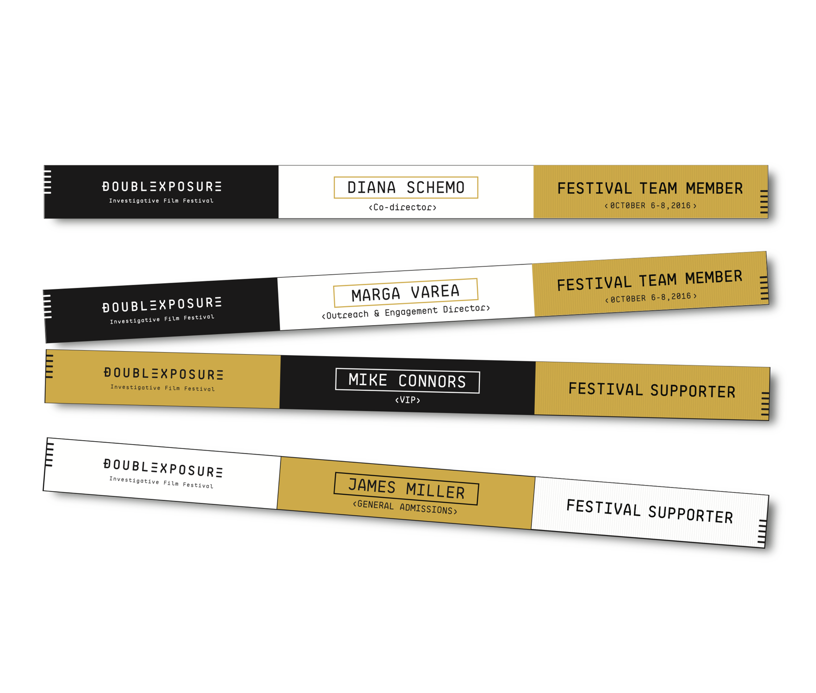
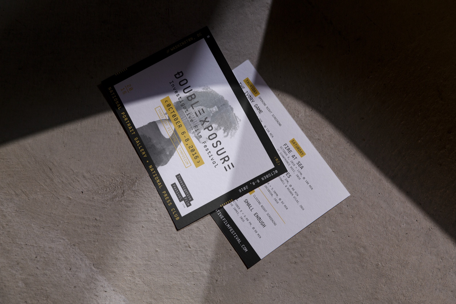
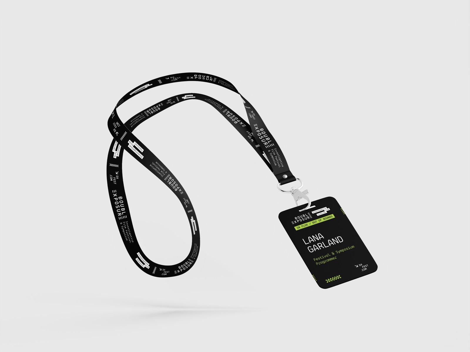
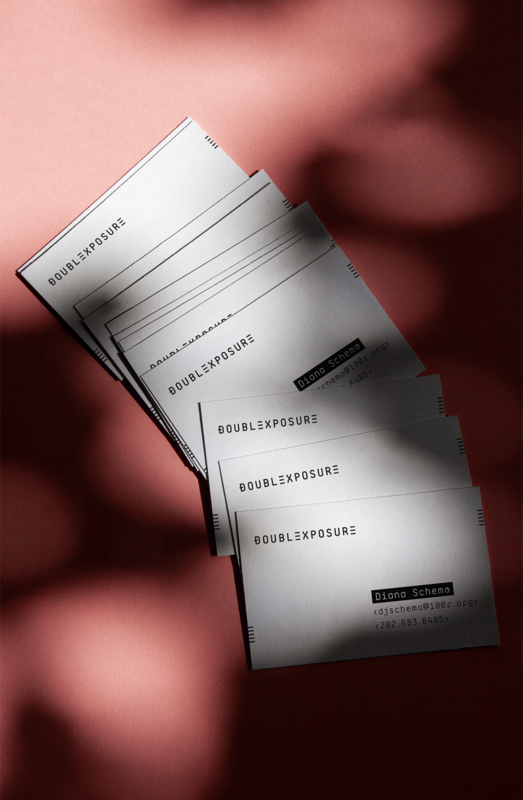
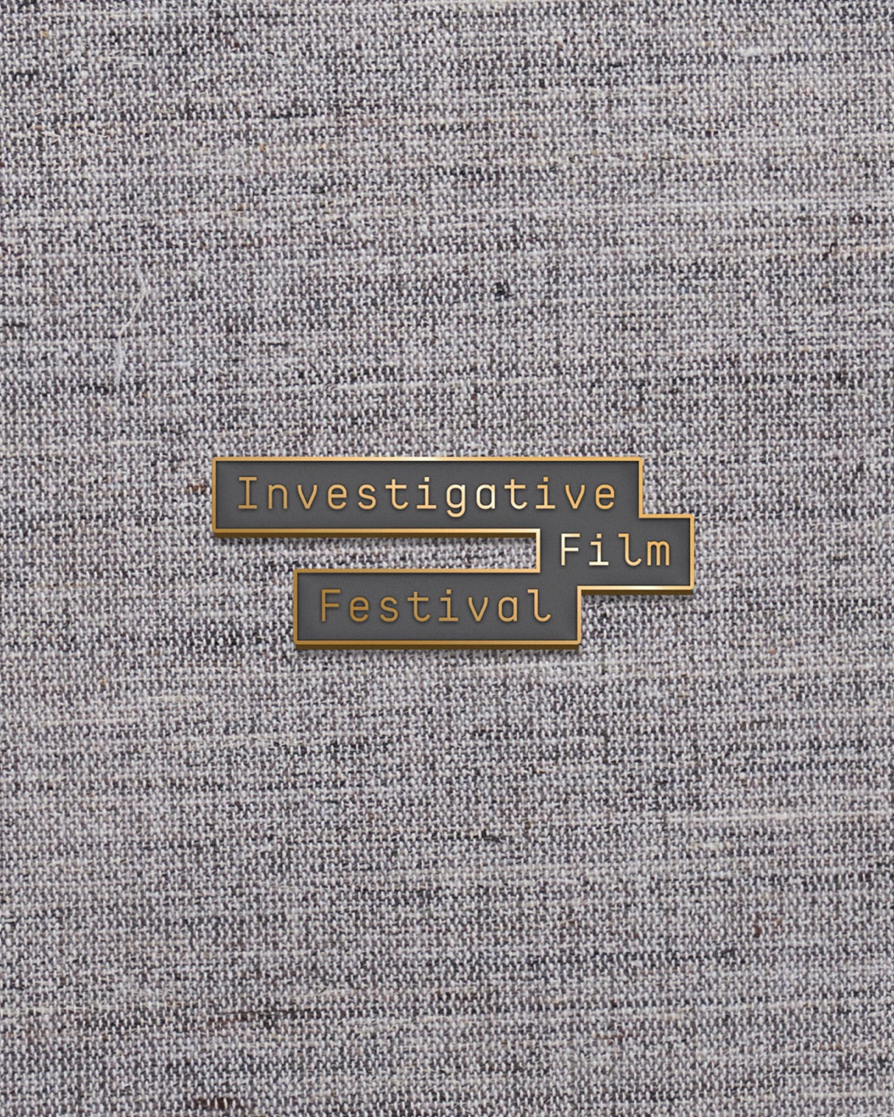
The print runs from the mailbox to the theater lobby on the same type. Postcards and the program cover, wristbands in the first-year gold and black, team and supporter passes, business cards, a lanyard, and an enamel pin of the descriptor for the people who come every year.

04

Films

The selections, on the system.

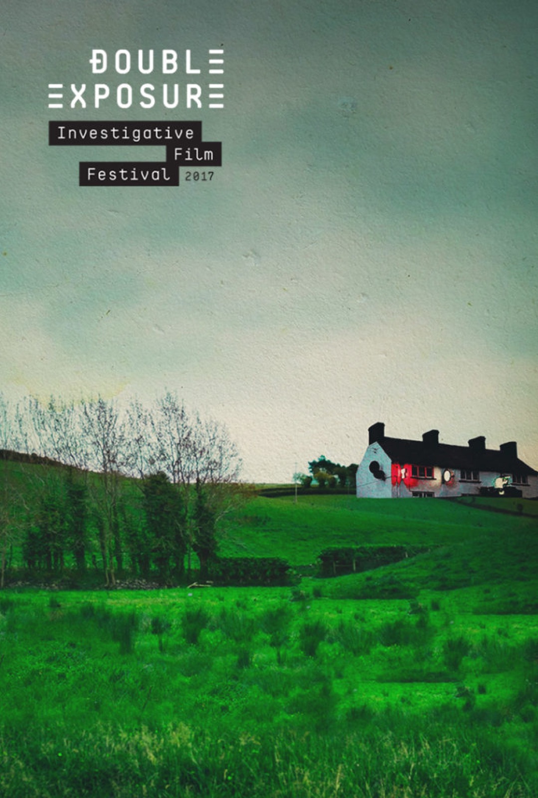
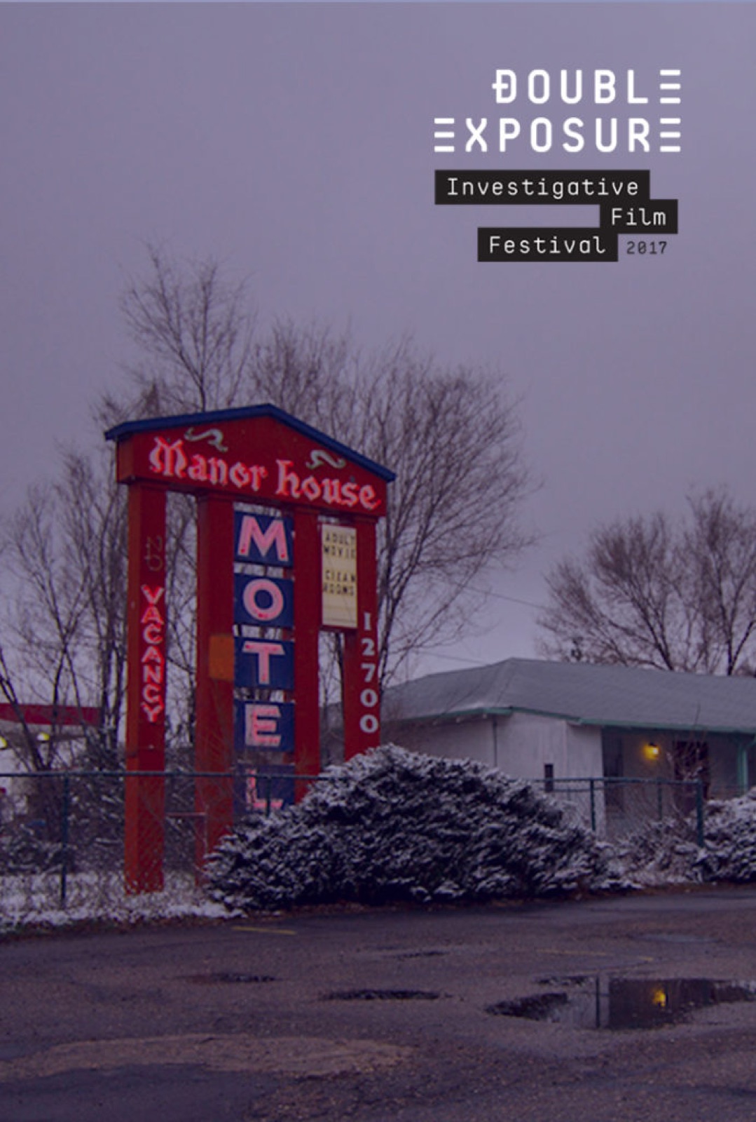
Each year’s official selections get a poster on the festival’s type with the film’s own image behind it, so a program that runs from a farmhouse in Northern Ireland to a Colorado motel still reads as one lineup. No Stone Unturned and Voyeur, both 2017.

05

Campaigns

A poster a year.

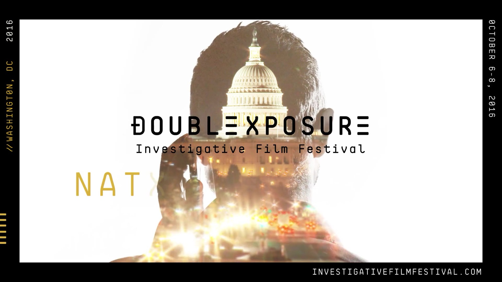
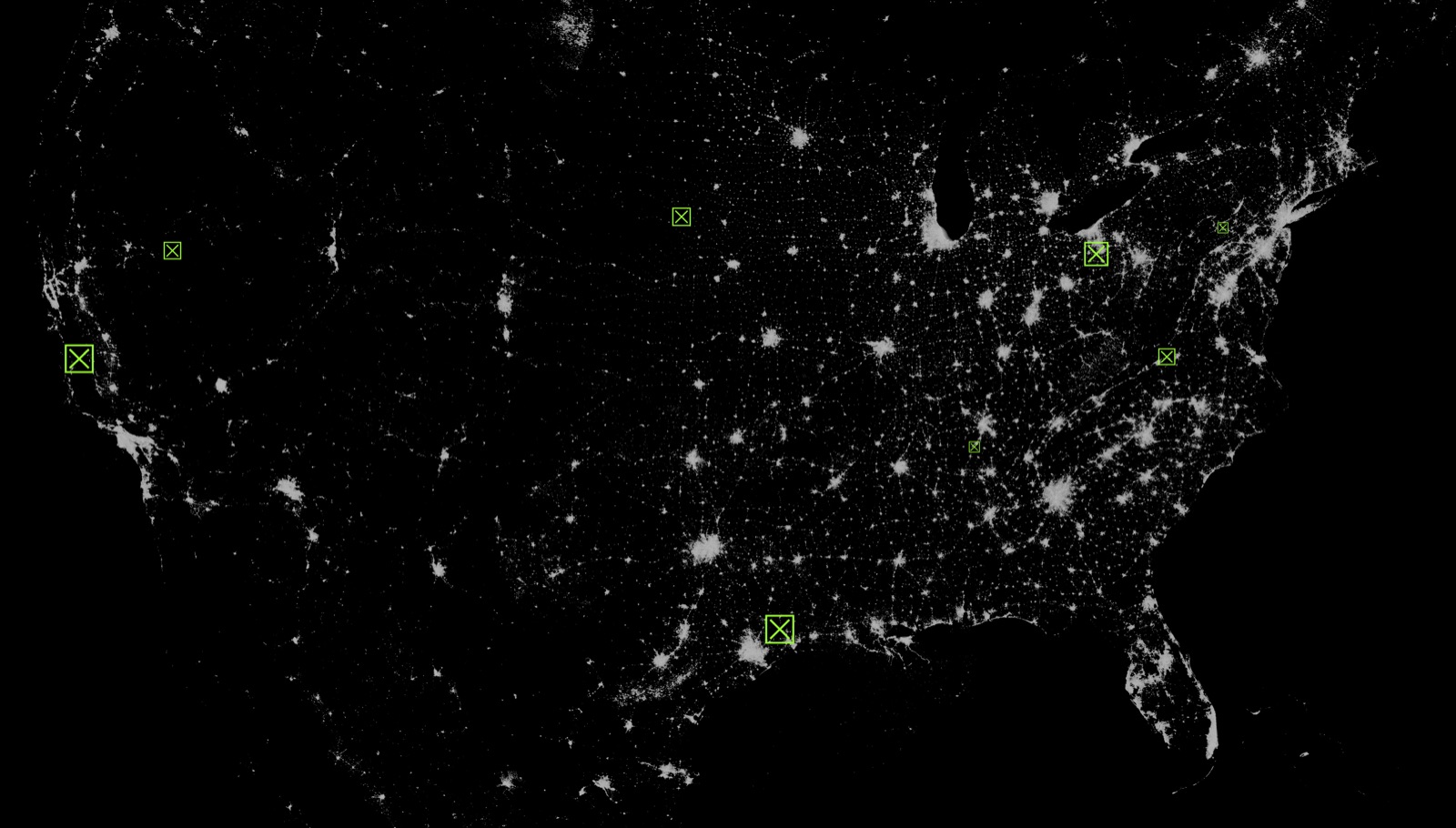
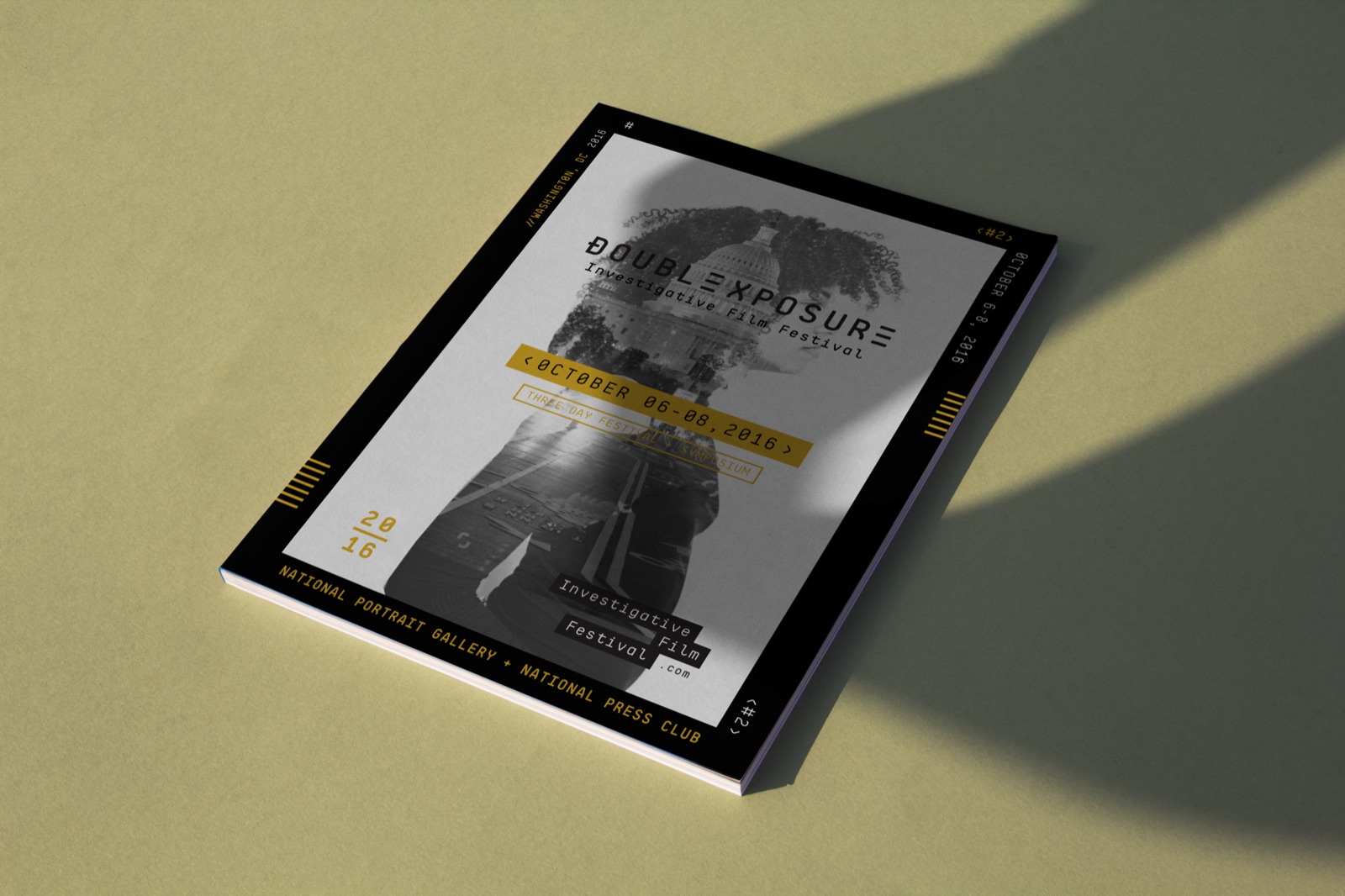
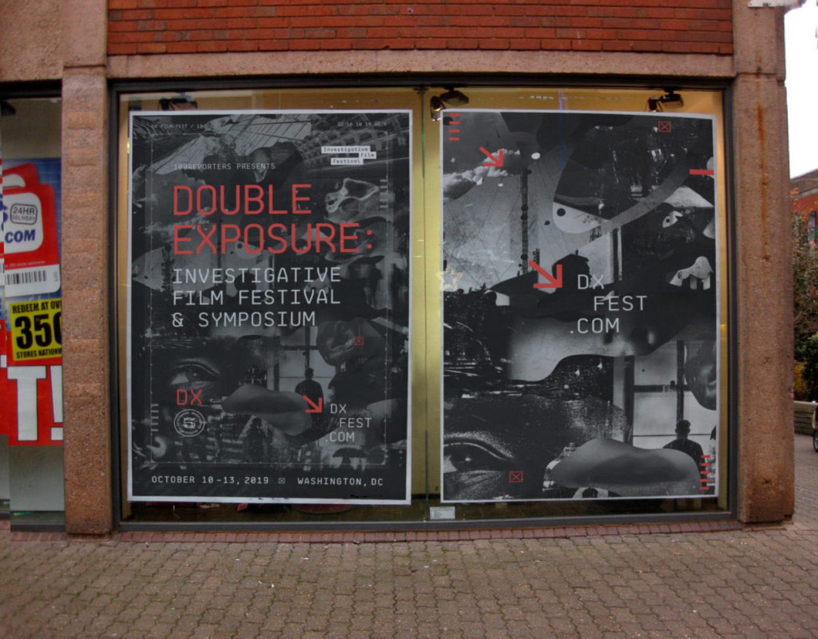
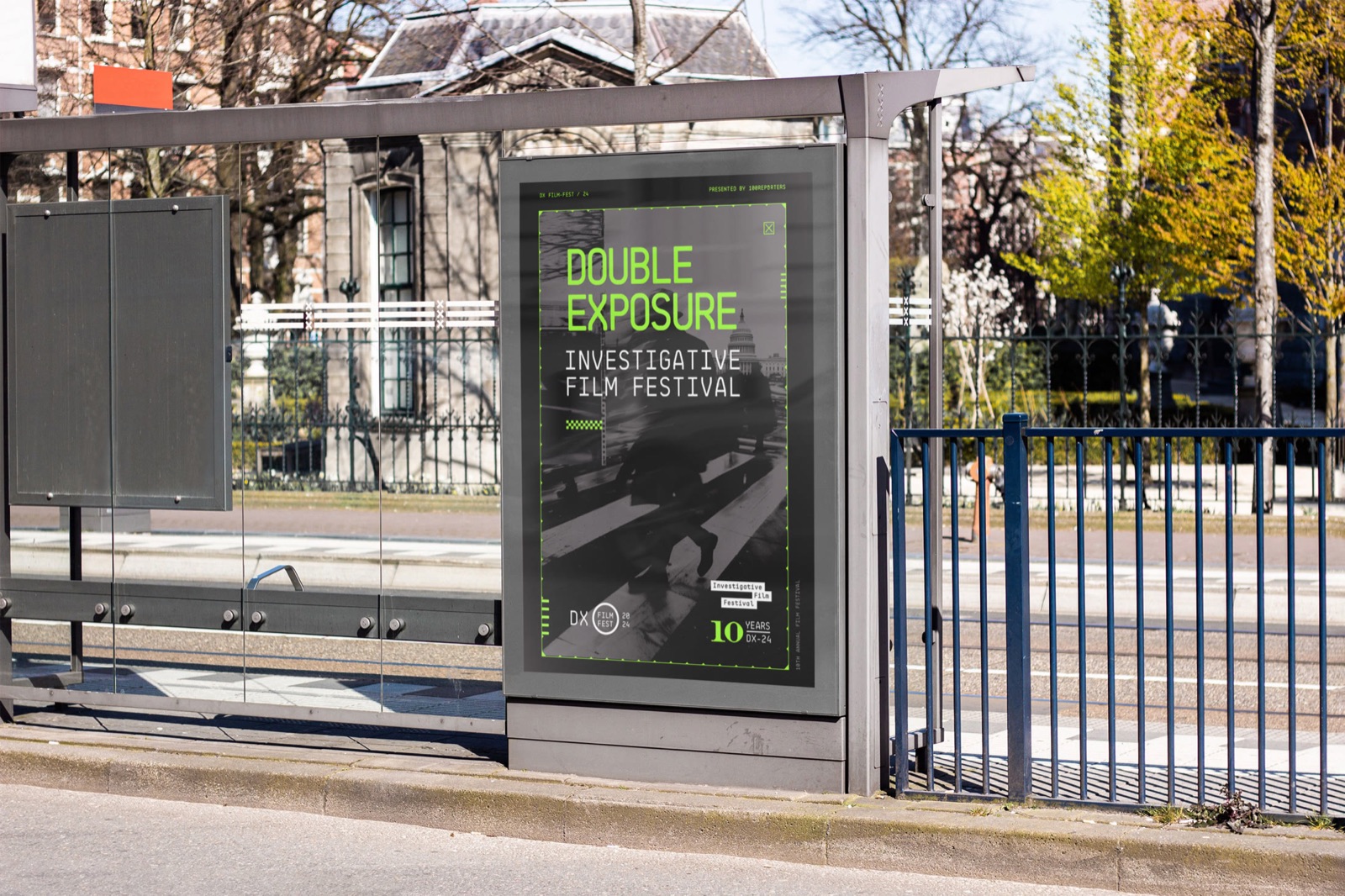
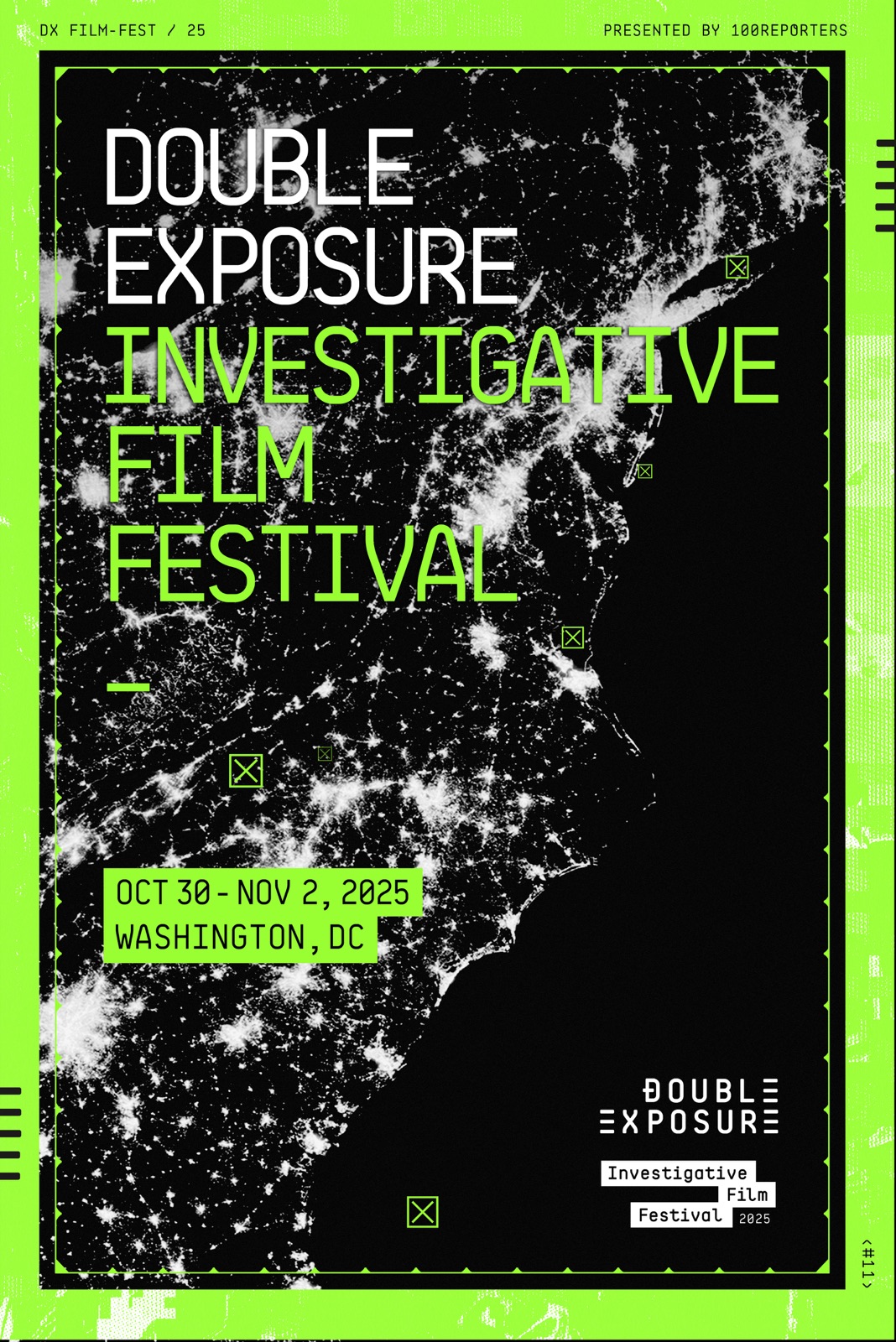
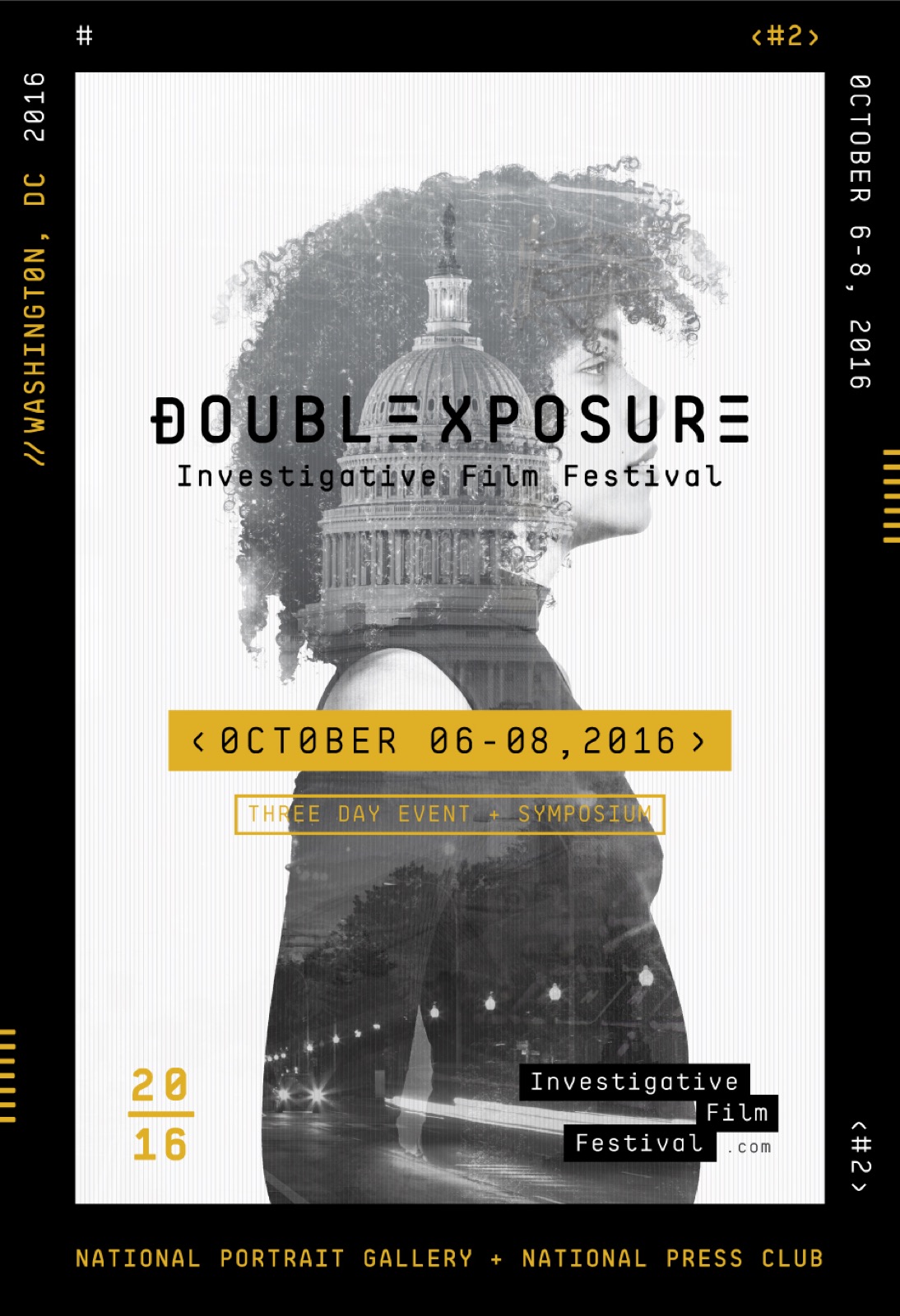
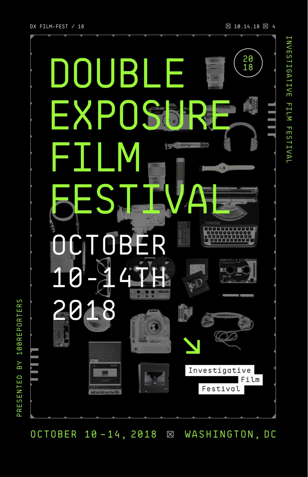
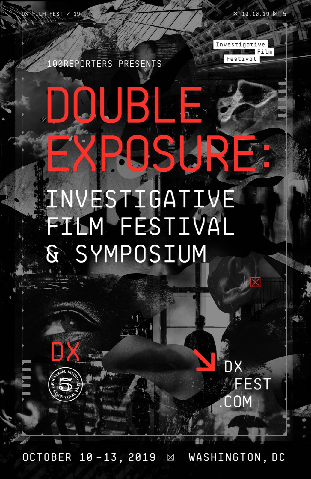
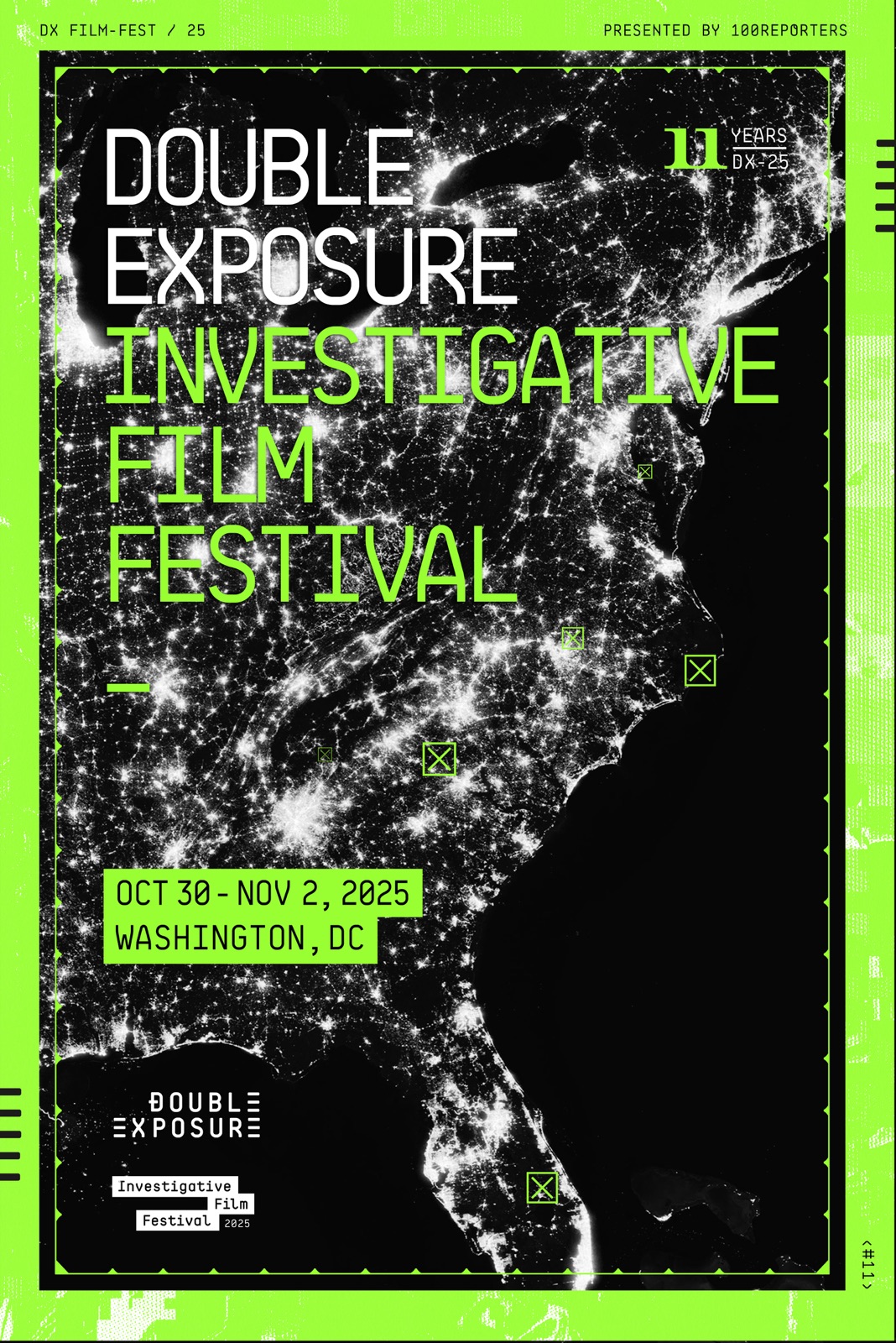
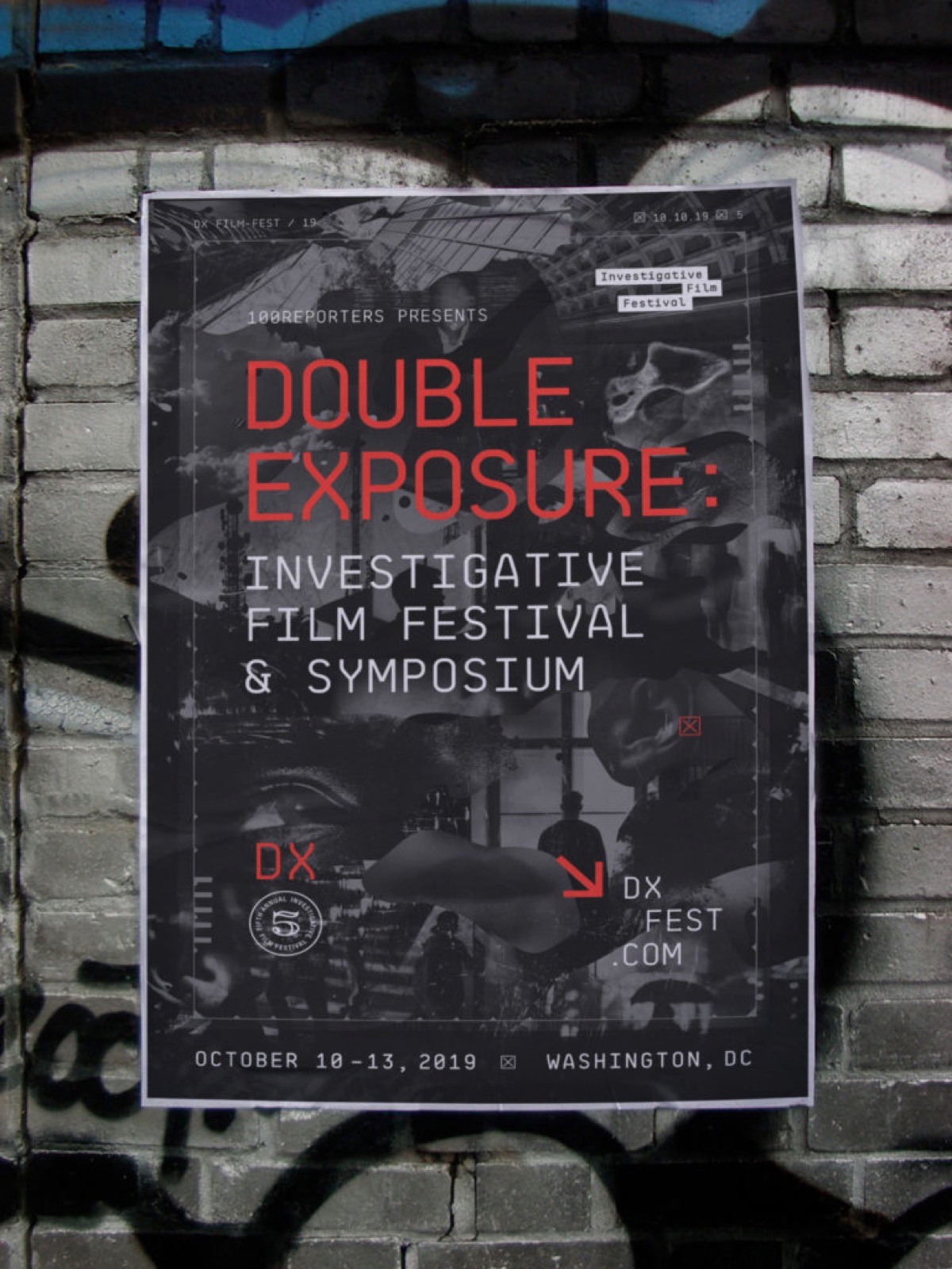
Every edition gets one lead image and the system does the rest. 2016, the first year we designed, set the name over a double-exposed portrait of a woman and the Capitol. 2018 laid the tools of the trade, cameras, a typewriter, a phone, around the green type. 2019 turned the name red over a collage of eyes and hands. For the tenth festival in 2024, a figure crosses a wet street in front of the Capitol. The eleventh, in 2025, is the eastern seaboard from orbit at night.

The type never changes. BB Roller Mono sets the name, the dates and the line for the year, uppercase and monospaced, so a festivalgoer who saw the 2016 poster reads the 2025 one as the same festival.

The 2016 poster: the festival name over a double-exposed portrait of a woman and the Capitol
2016
The 2018 poster: the name in green among cameras, a typewriter and a phone
2018
The 2019 poster: the name in red over a collage of eyes and hands
2019
The 2024 poster: a figure crossing a wet street in front of the Capitol
2024
The 2025 poster: the eastern seaboard from orbit at night, in a green frame
2025
06

Digital

The site and the trailer.

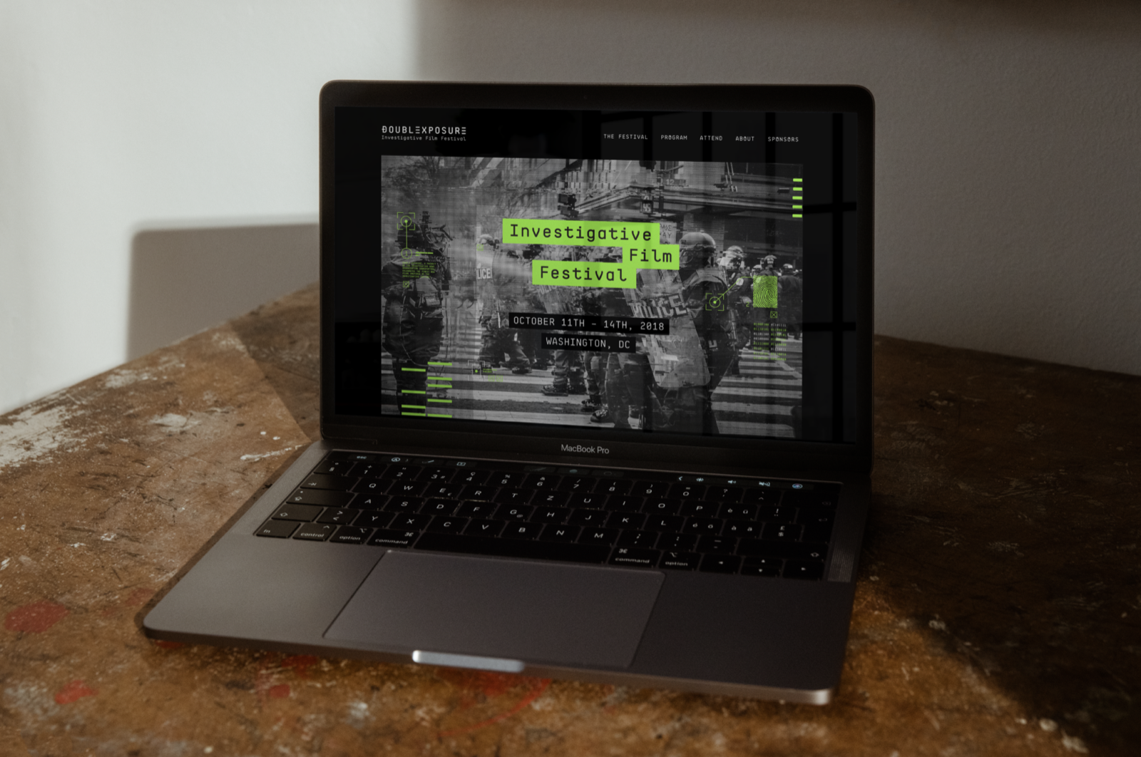
The website carries the same type and the same green onto the screen, with the year’s lead image behind the lineup. The trailer runs before every screening and on social, and the avatars, headers and banners for each edition are cut from that year’s poster.

07

Festival

In the room.

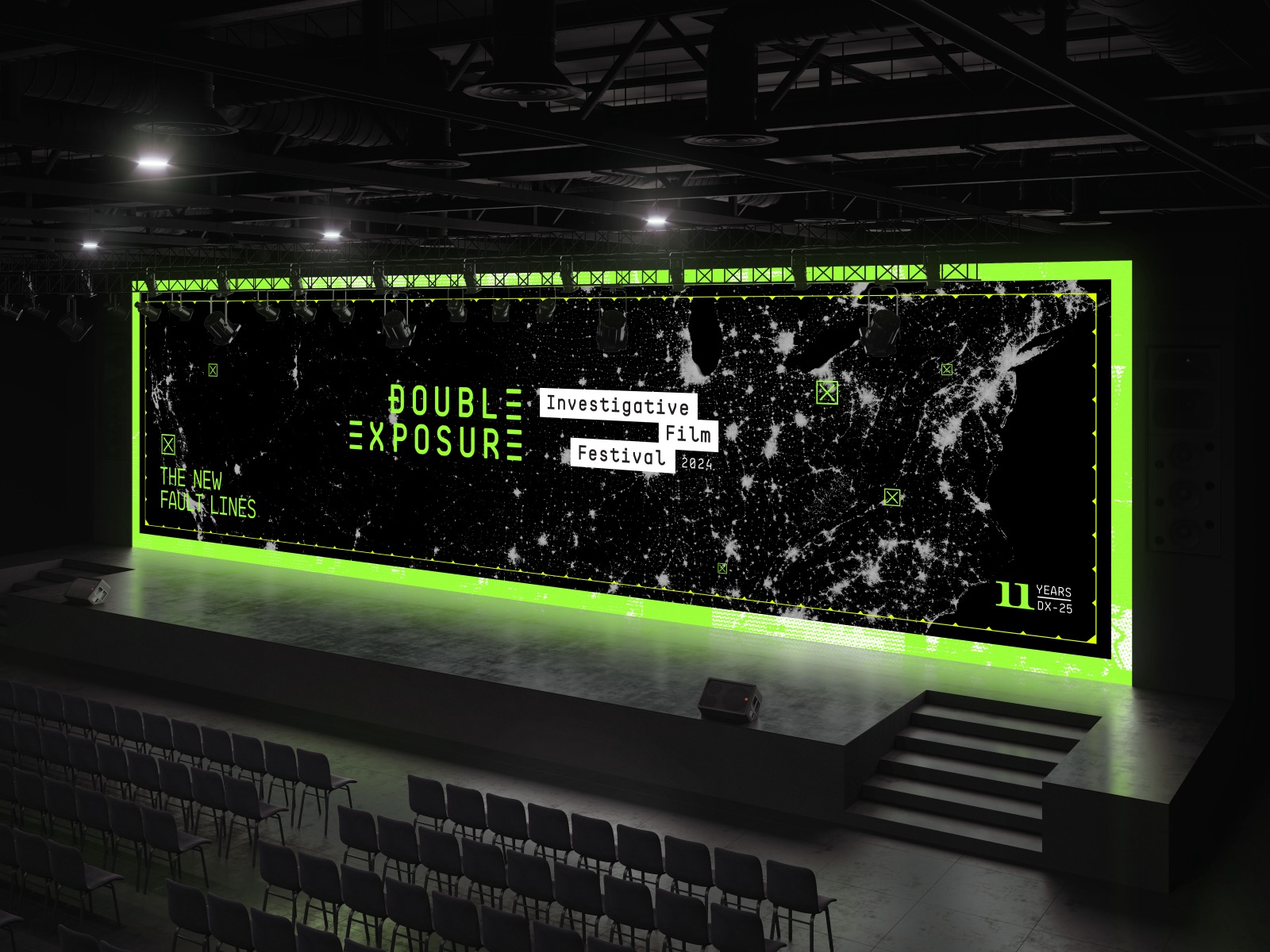
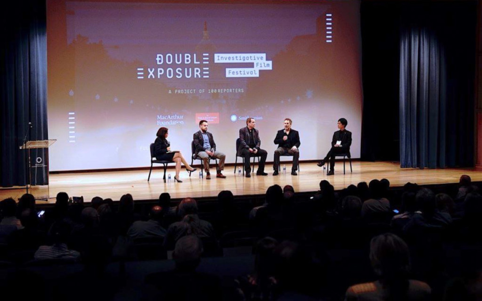
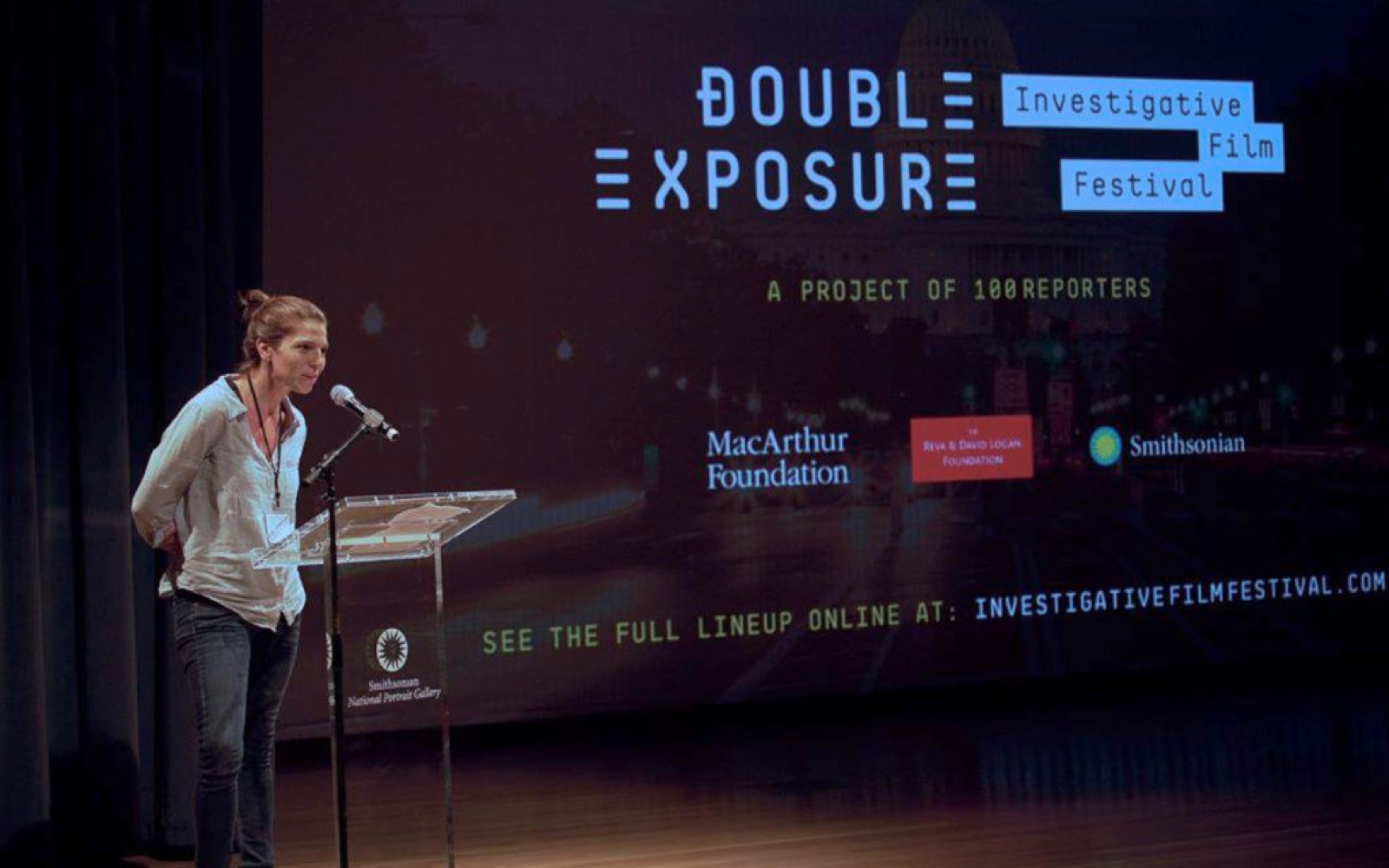
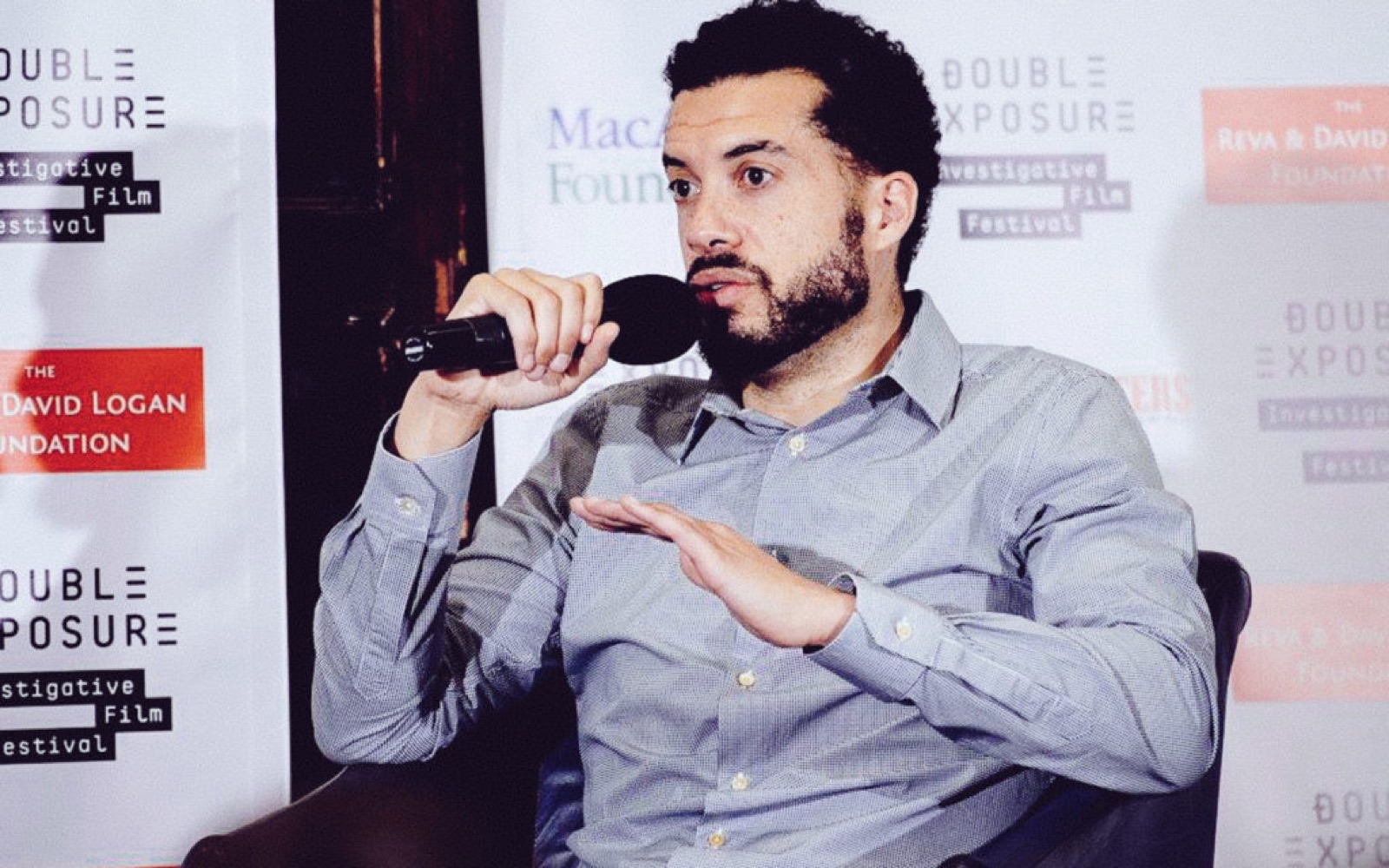
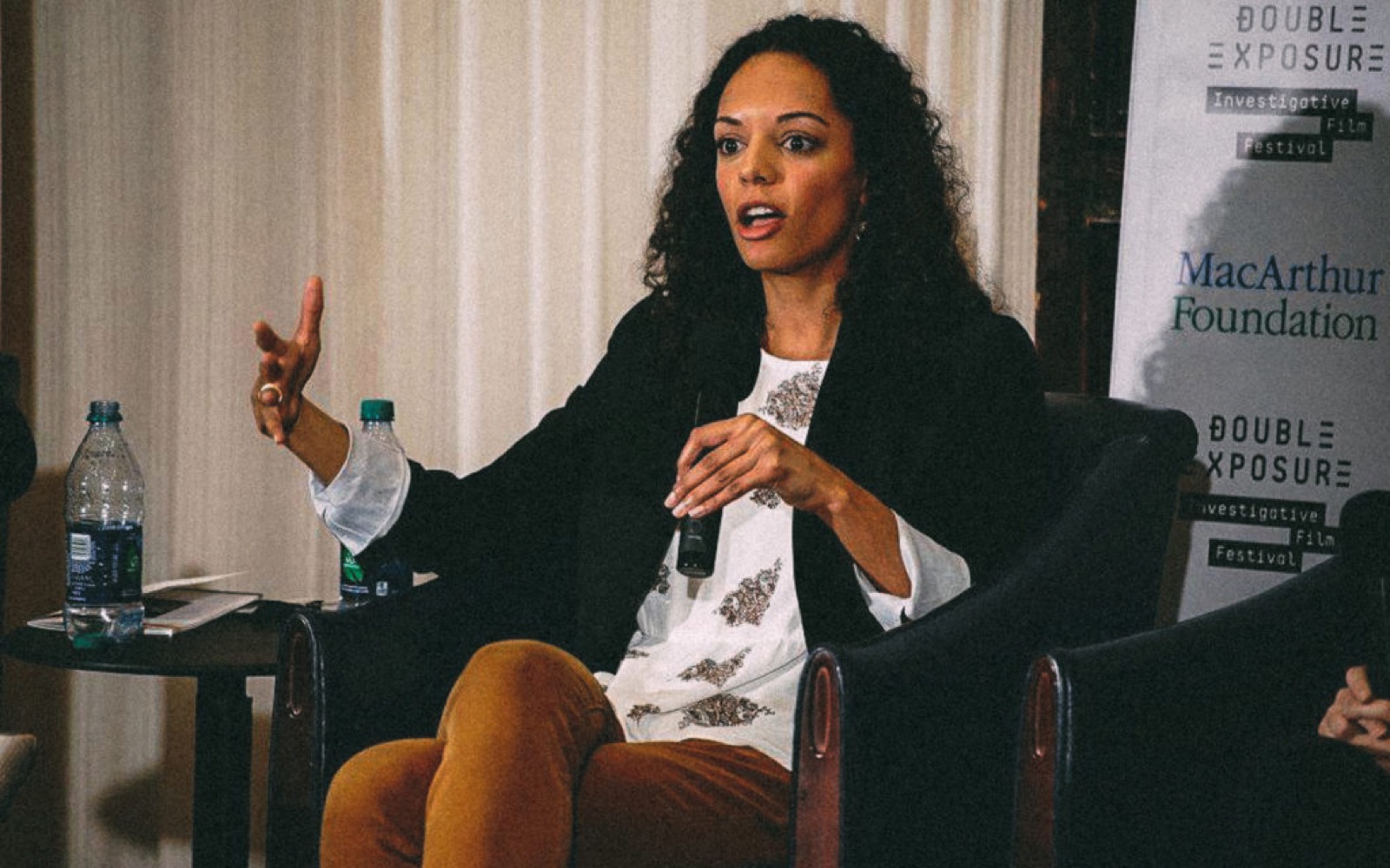
The system ends up on the stage. The screen carries the lockup and the year’s image between films, the step-and-repeat carries it behind the panels, and the 2025 title frame put the green frame around the screen itself.

Cut from the full case study at wrkhrs.co/work/investigative-film-festival

From
Abraham Garcia
Studio
Charleston, South Carolina
Email
abe@wrkhrs.co
Phone
(202) 550-7569
Studio site
www.wrkhrs.co
LinkedIn
in/thehonestape