The brief.
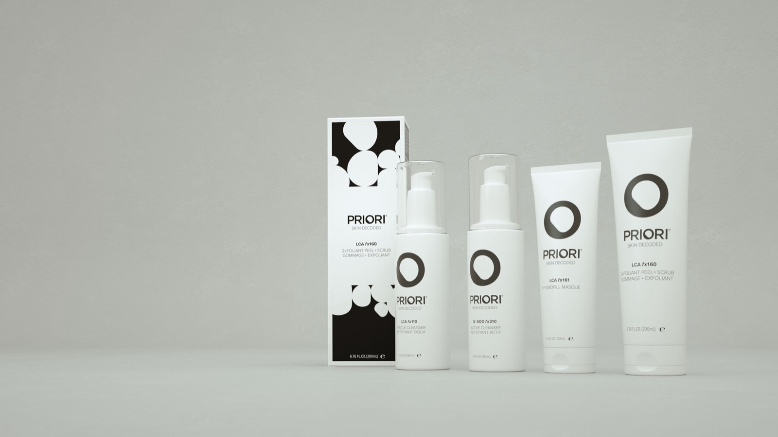
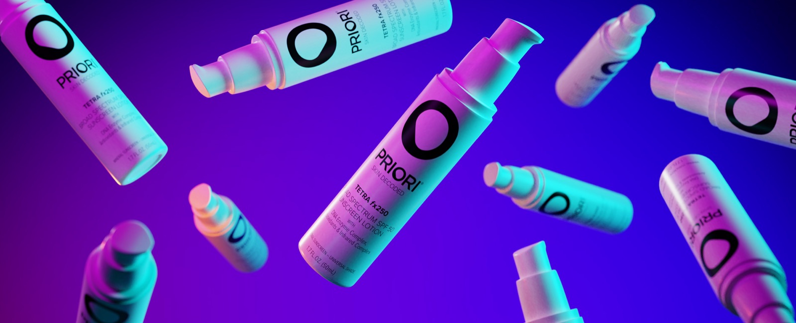
Priori is a science-led professional skincare brand, sold through estheticians and dermatology practices under the line Skin Decoded. Its formulas are built on what it calls Adaptive Skincare, ingredients that respond to what skin needs in the moment, and its packaging is clinical and white. We had worked with the brand for a year, rolling out a refresh across its channels and launching Tetra, its sunscreen, in the summer of 2018.
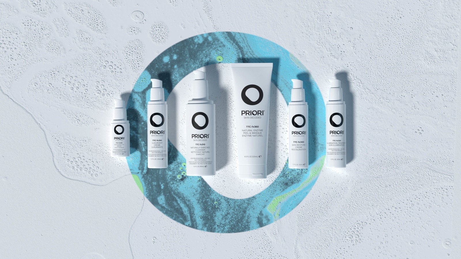
As demand for clean beauty grew, Priori developed its first all-natural line: Priori Naturals, six products built on a Triple Turmeric Complex. What the brand needed was a launch that read as clean and luxurious at once, without the soft light, neutral tones, and slow-living mood that most natural lines default to. Energy was the word Priori kept coming back to.
Direction
Naturally adaptive skincare has arrived.
Clean and soothing over earthy.
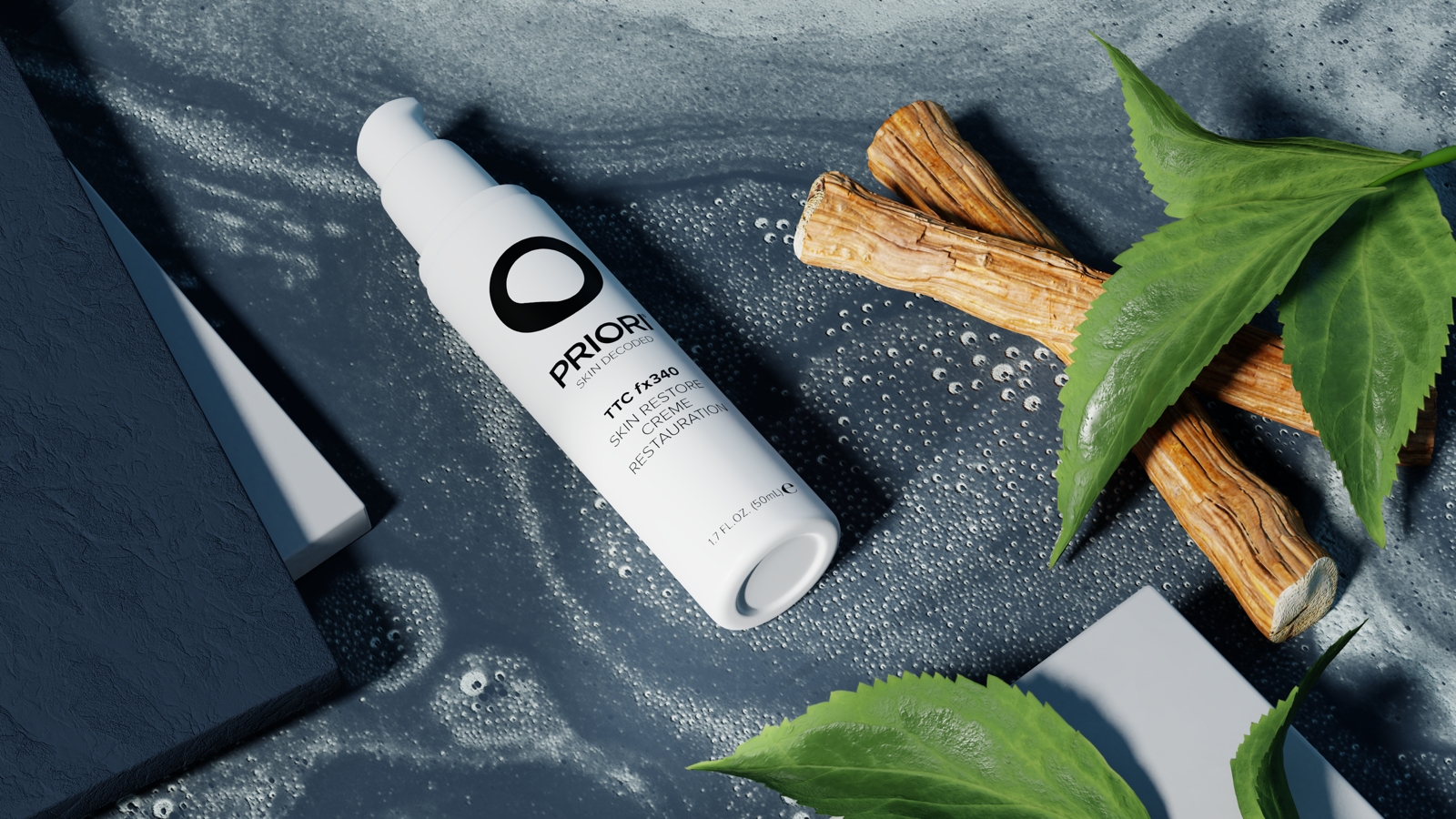
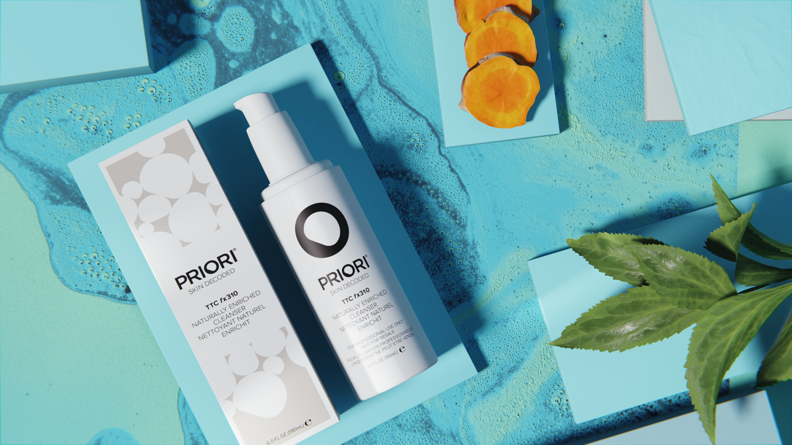
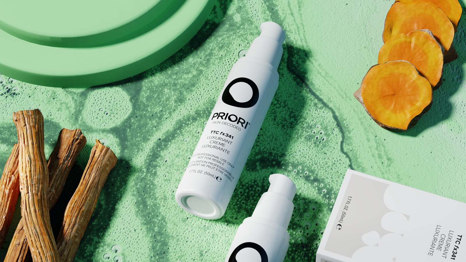
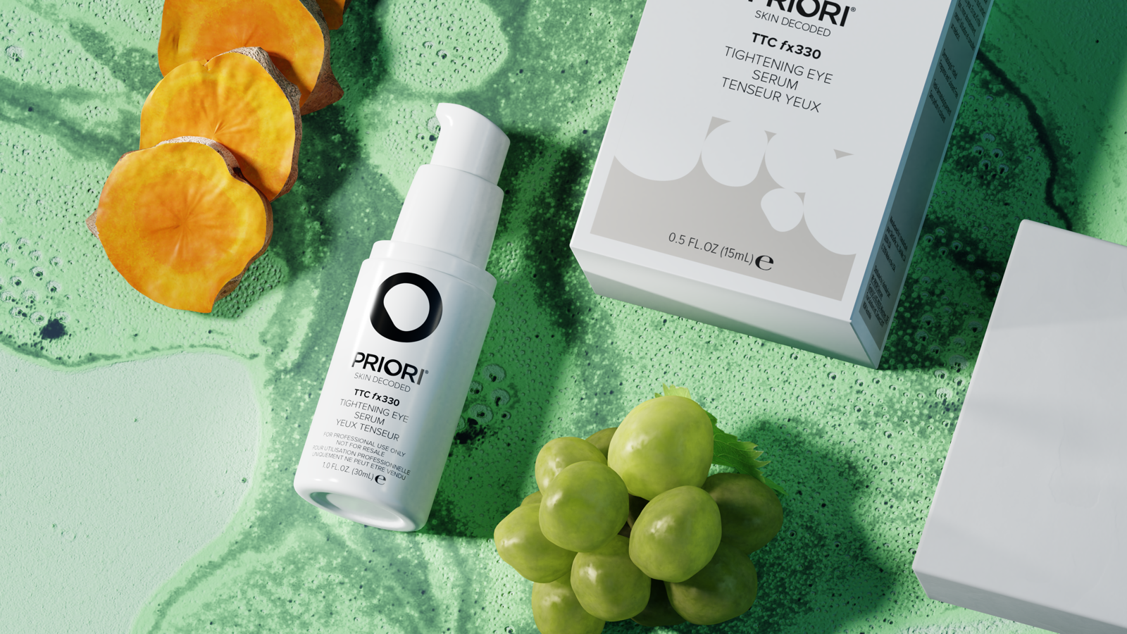
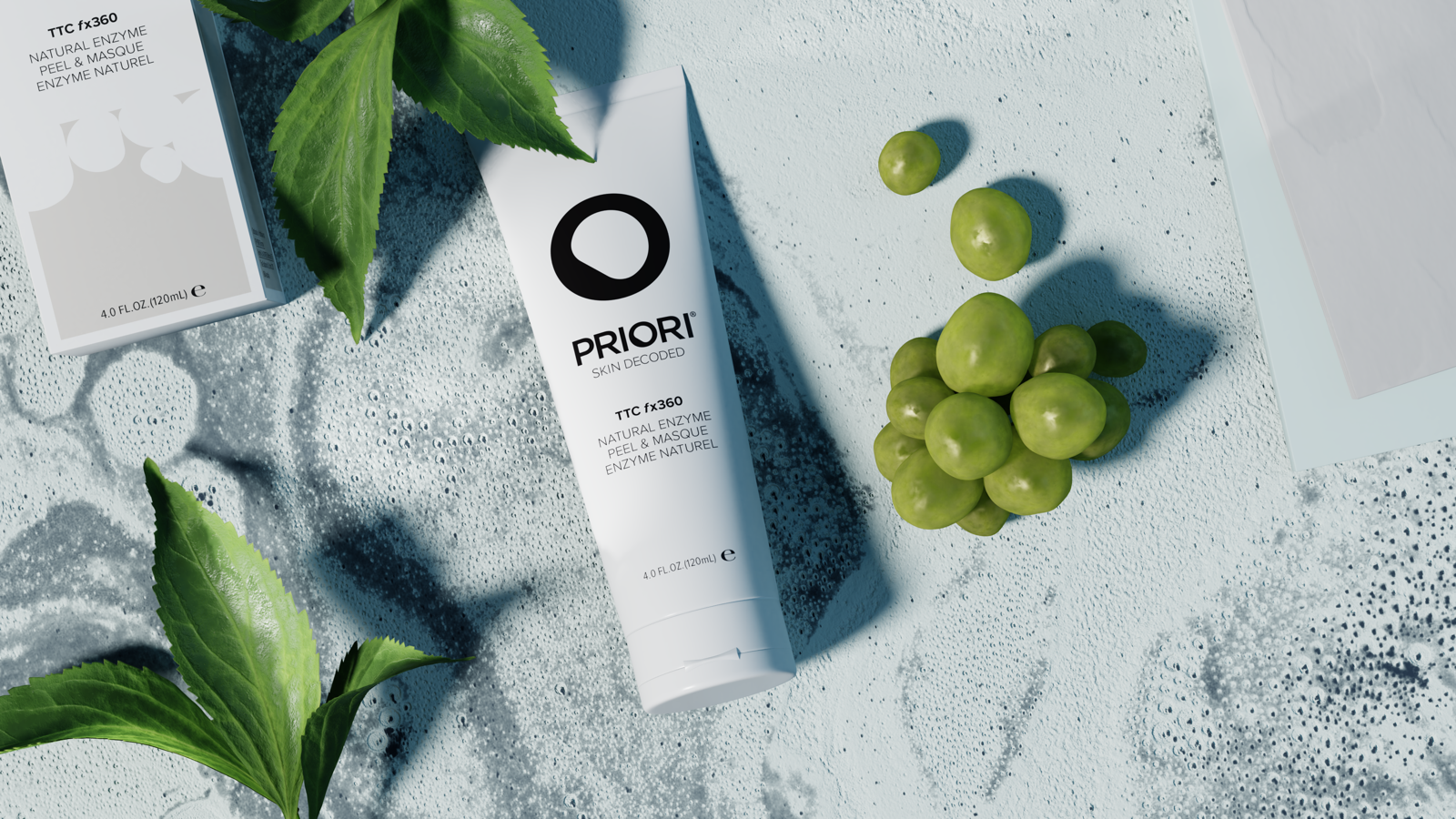
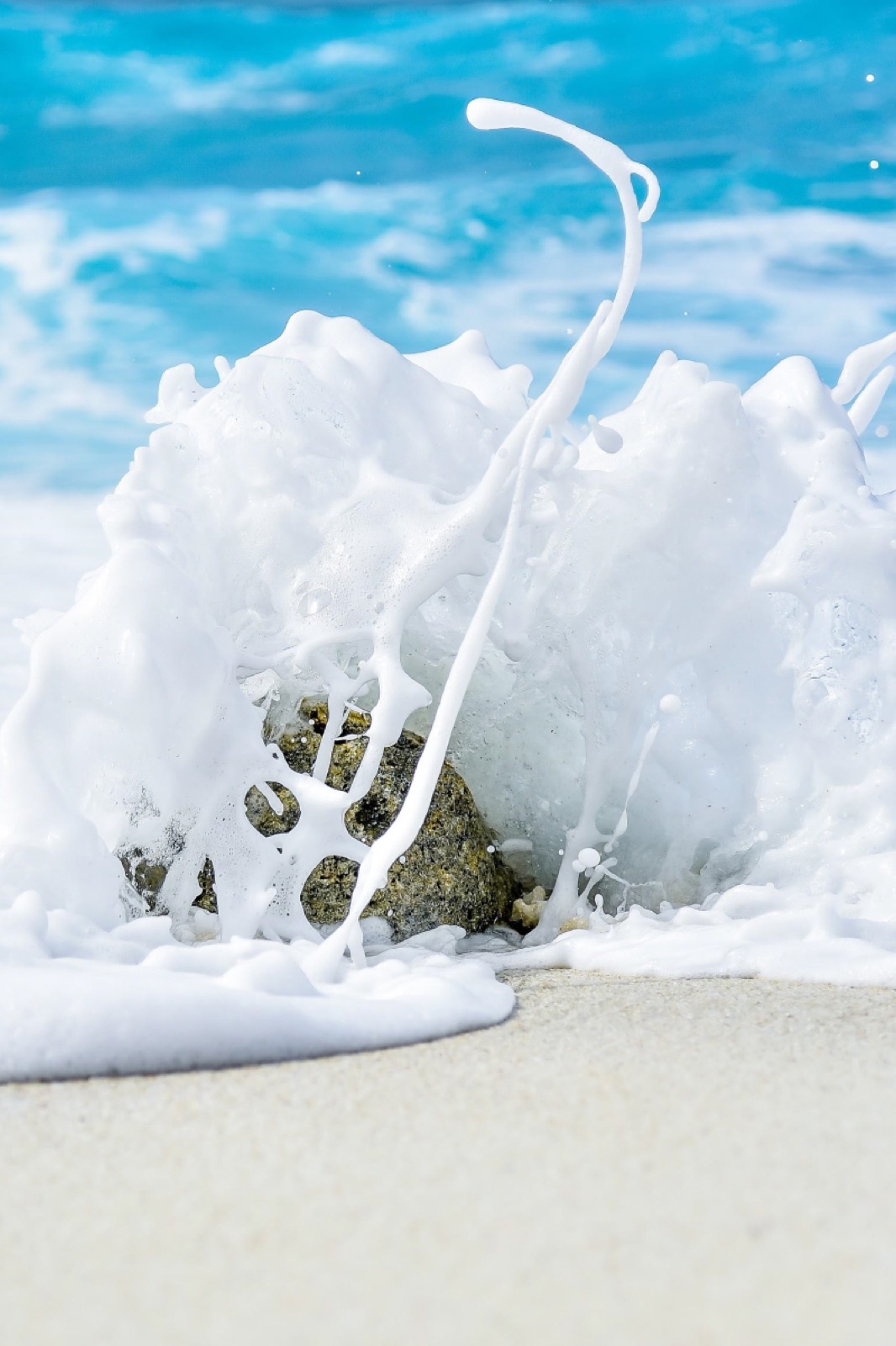
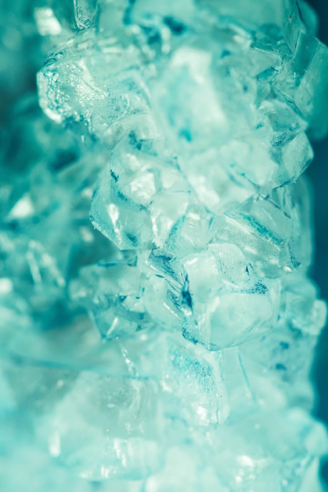
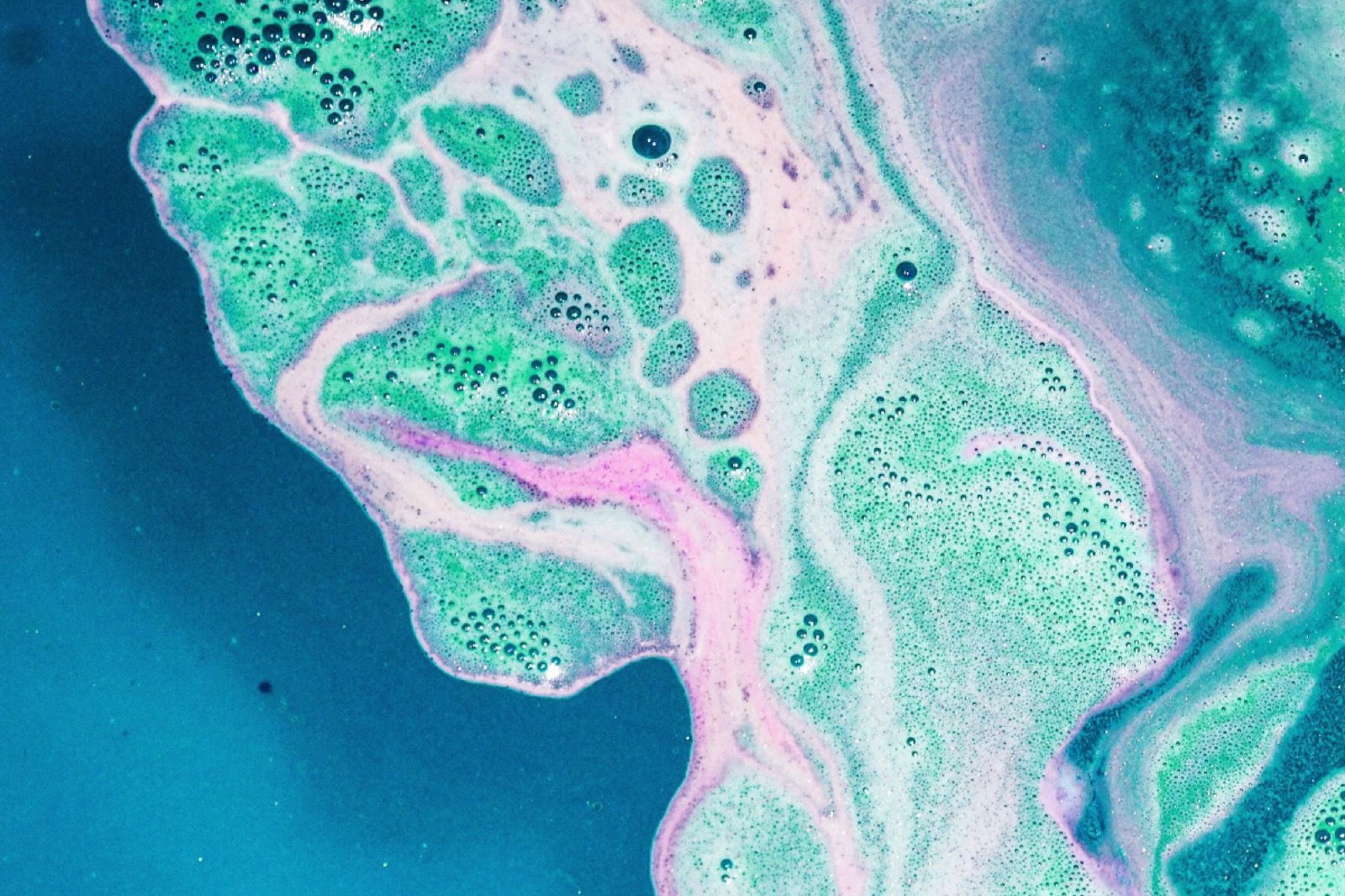
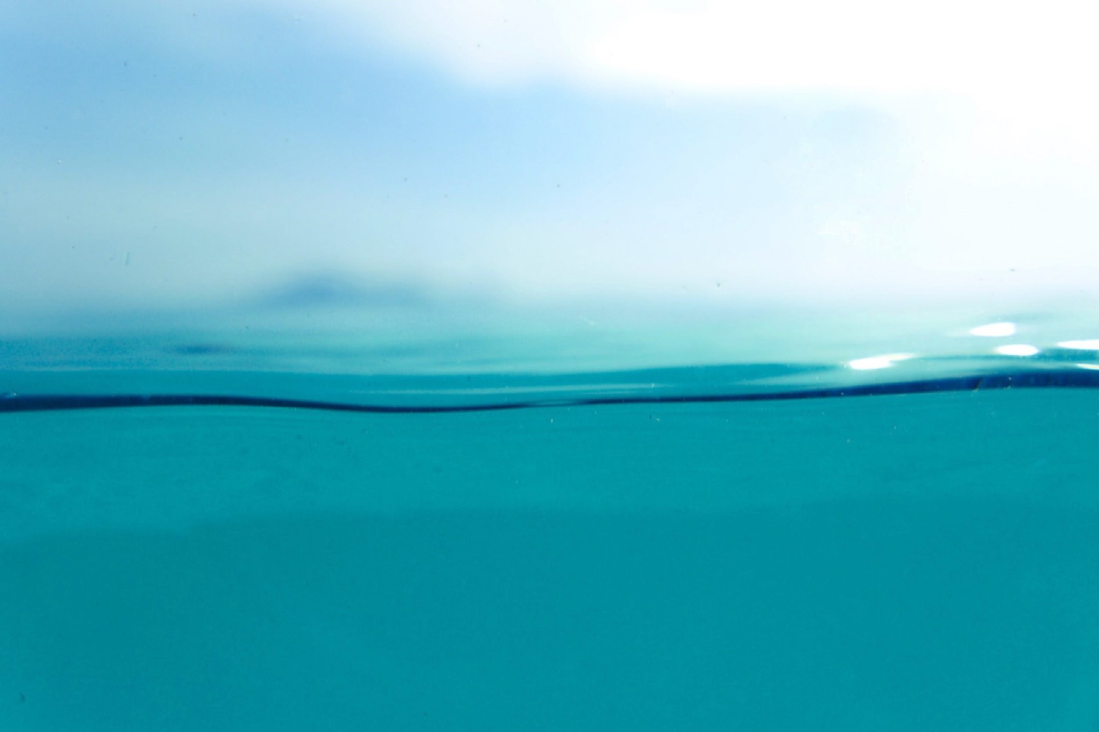
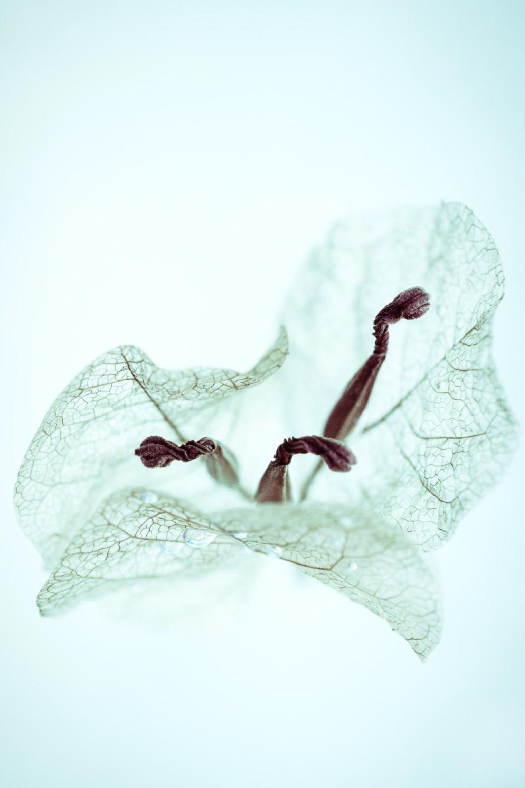
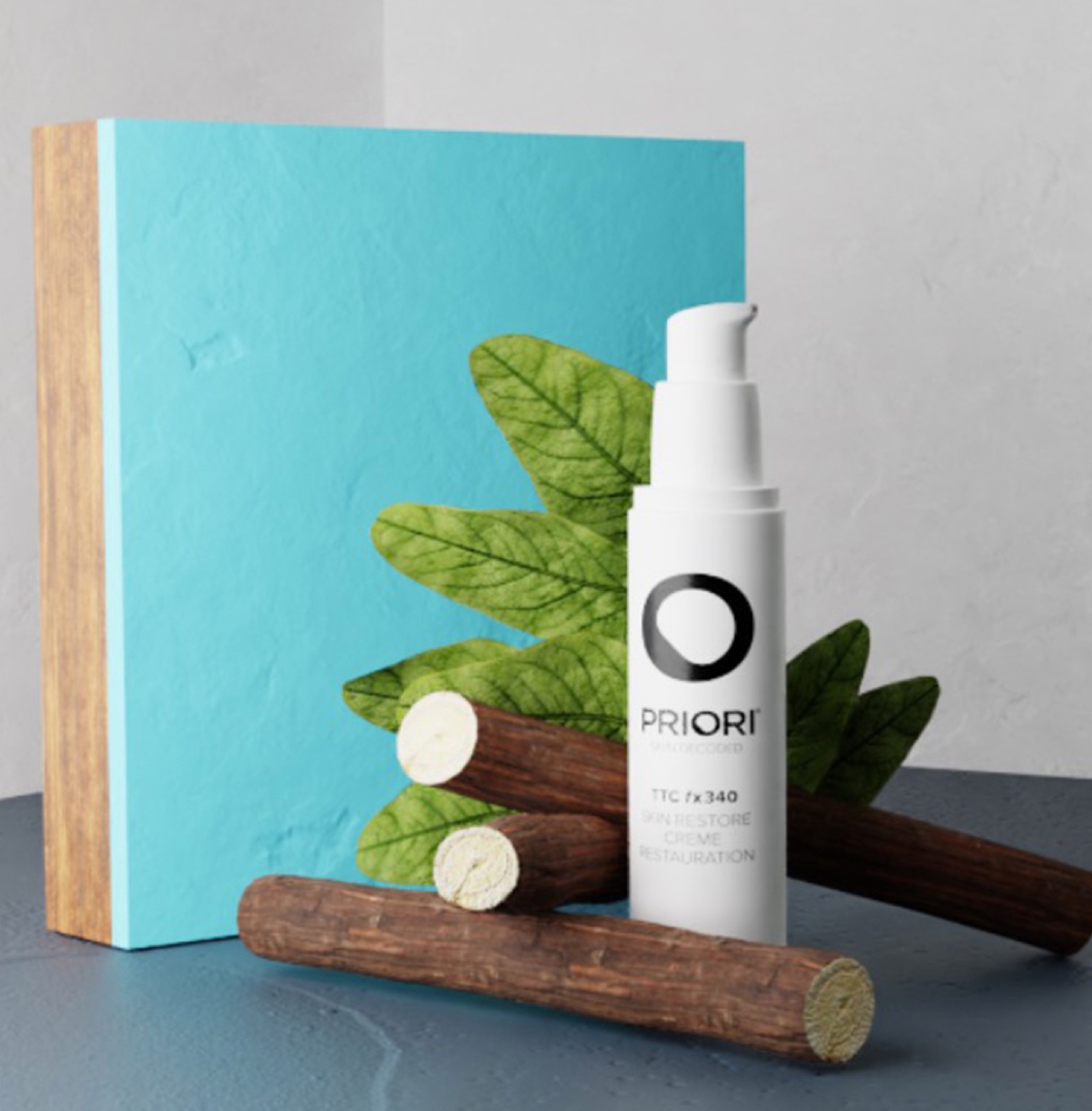
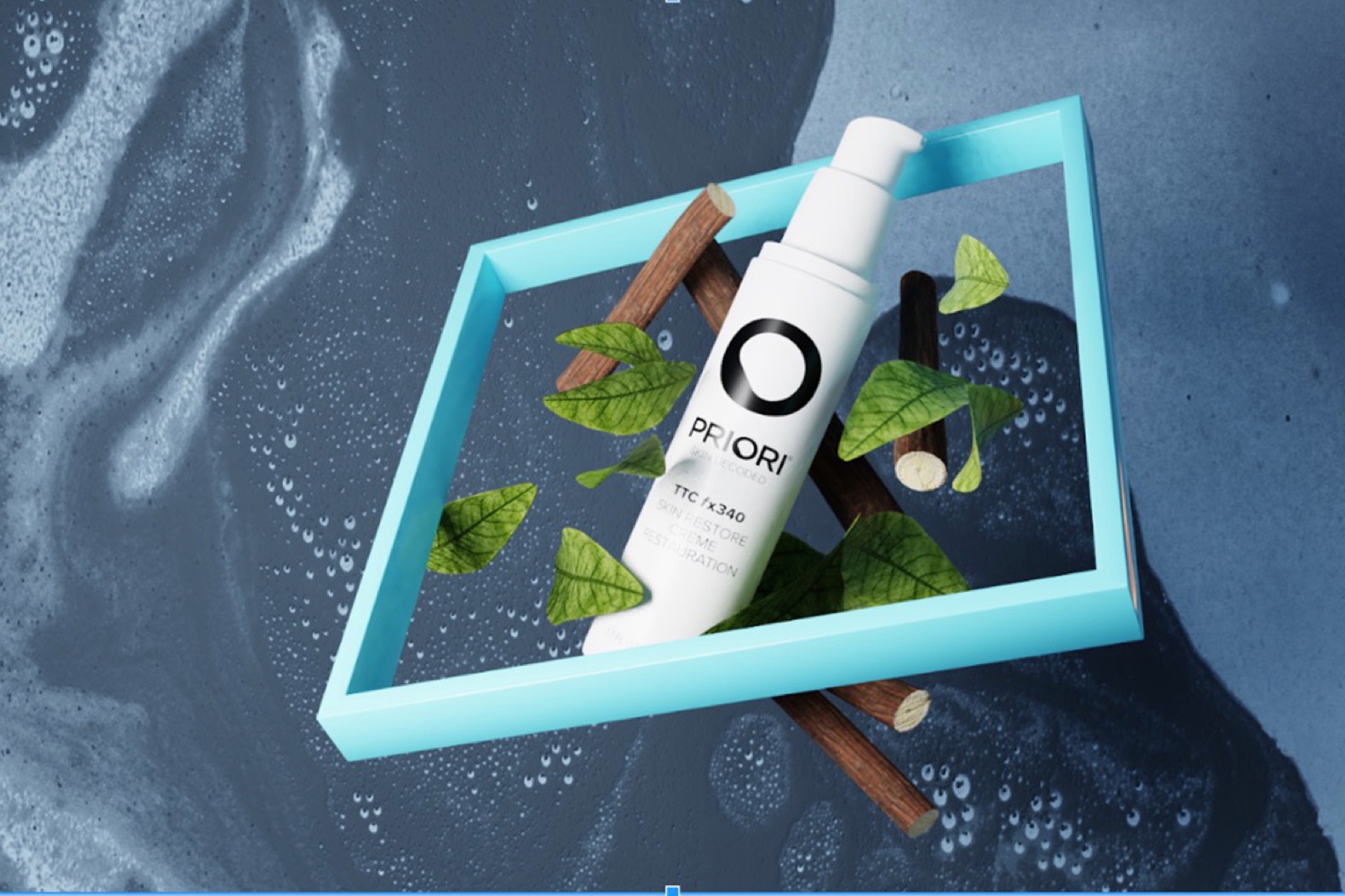
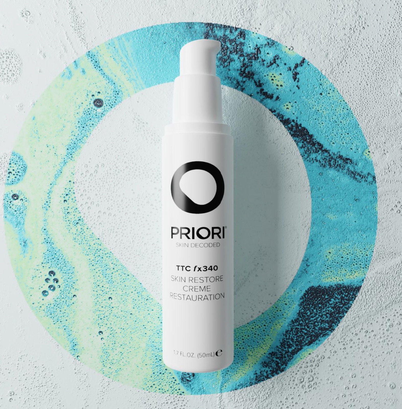
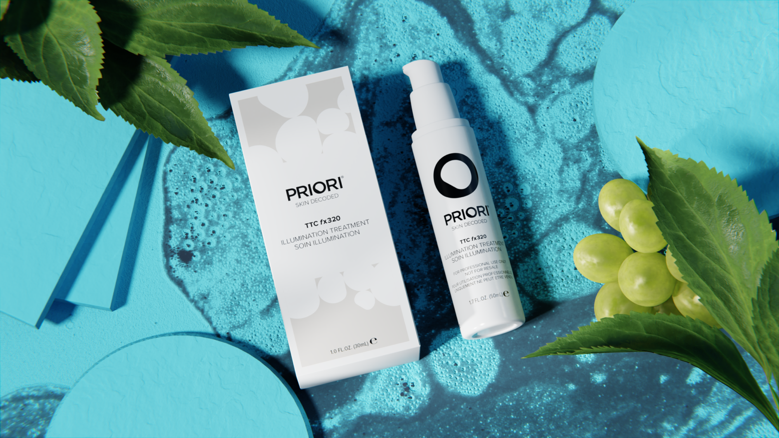
The direction took its color from water and its texture from the ingredients. Sea foam, agave, marbled ink, sugar crystals, a water line against sky: a palette of turquoise, mint, and white that read as clean without a single kraft box or linen backdrop in sight. Turmeric, the line’s hero ingredient, supplied the one warm note.
The mood boards set the standard the renders would be held to: bright, sharp, and in motion.
Renders
Built in 3D.
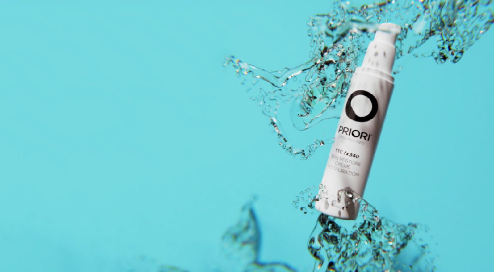
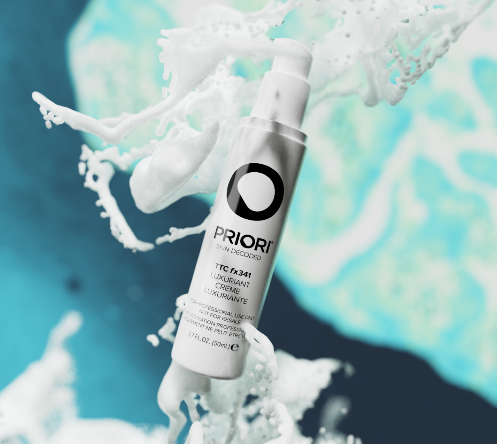
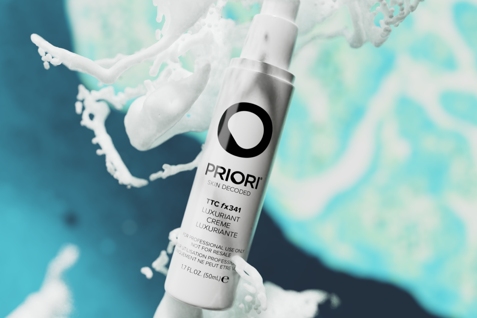
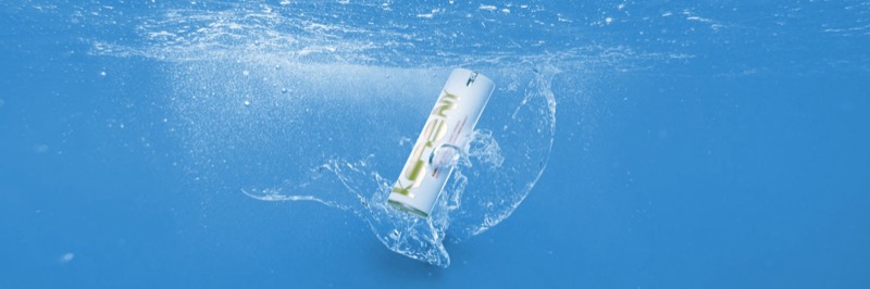
We built the campaign in 3D instead of photographing the ingredients. Rendering let us stage turmeric slices, leaves, and grapes with the product on marbled sets, catch a bottle mid-splash, and sharpen every texture past what a camera would give. The scenes were roughed in, iterated until the compositions held, then finished into the campaign art.
Launch
The site, the email, the portrait.
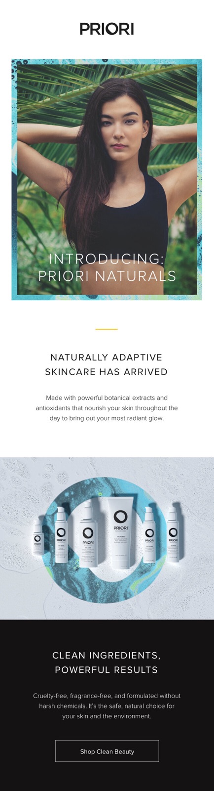
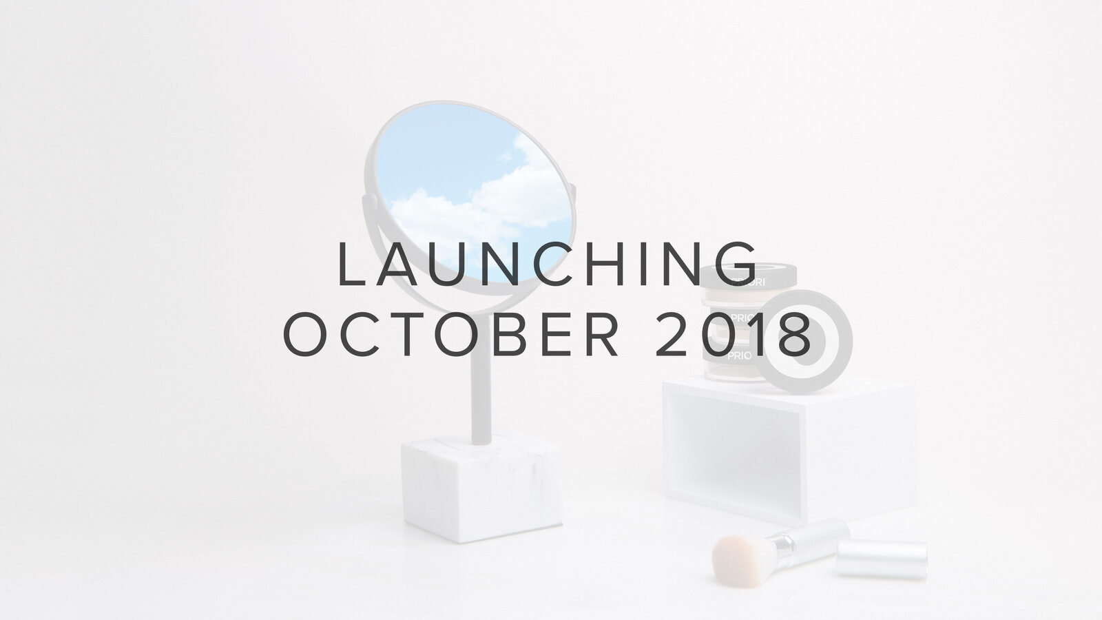
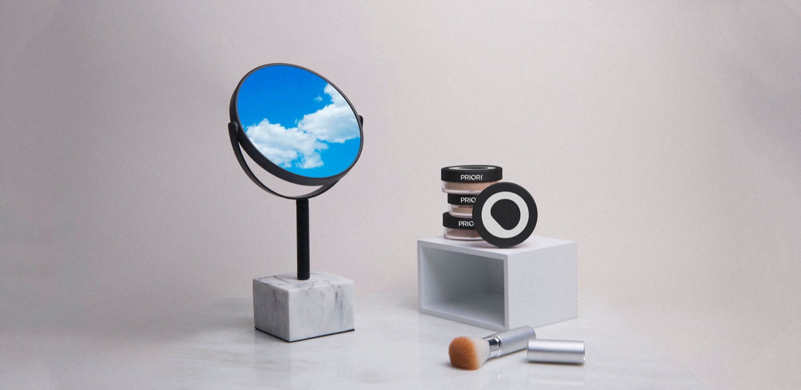
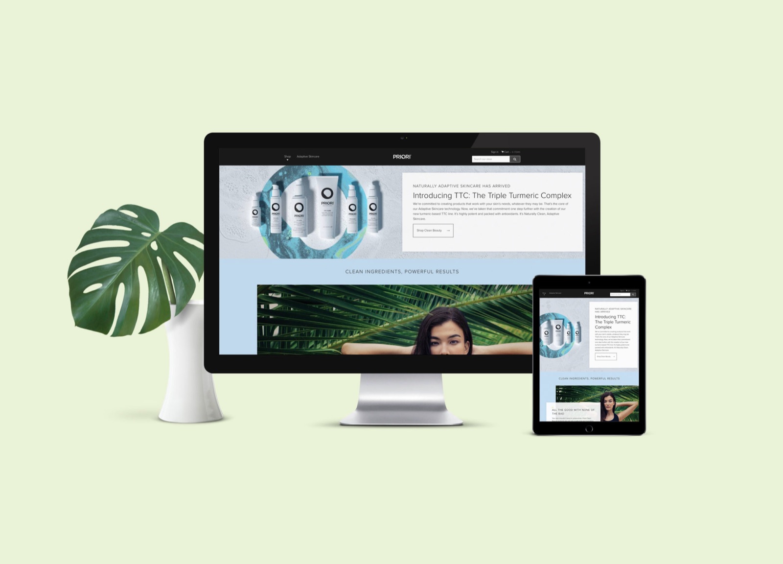
The website went first. A countdown to October 2018 sat over a still life of a sky-filled mirror and marble, then gave way to a landing page for the line: the six products composed inside a turquoise ring, the headline Naturally Adaptive Skincare Has Arrived, and a single call to shop clean beauty. The email series introduced the line the same way, and the same art ran across social.
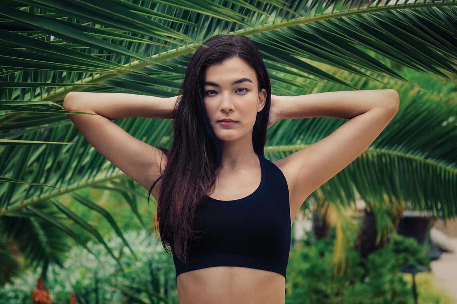
Alongside the renders, one campaign portrait, shot in front of palm leaves and framed in the marbled turquoise, put a face on the launch.
The email series.
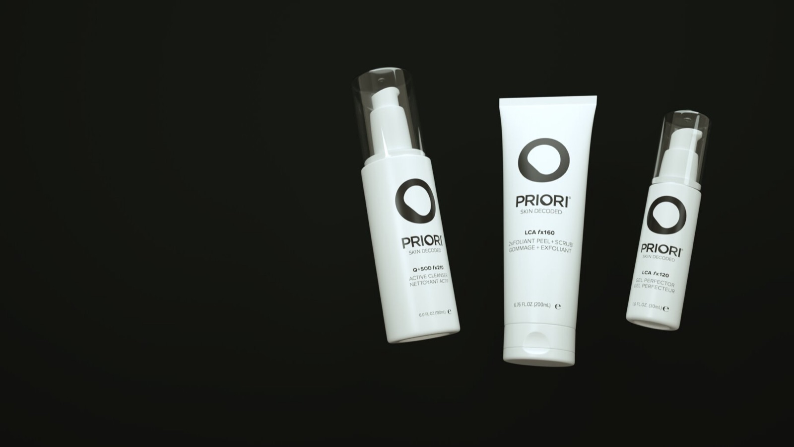
Three beats in one email: the portrait with the introduction, the family in its ring, and the claim on black. Clean ingredients, powerful results.
Social
Clean ingredients, powerful results.
Social and the influencer program.
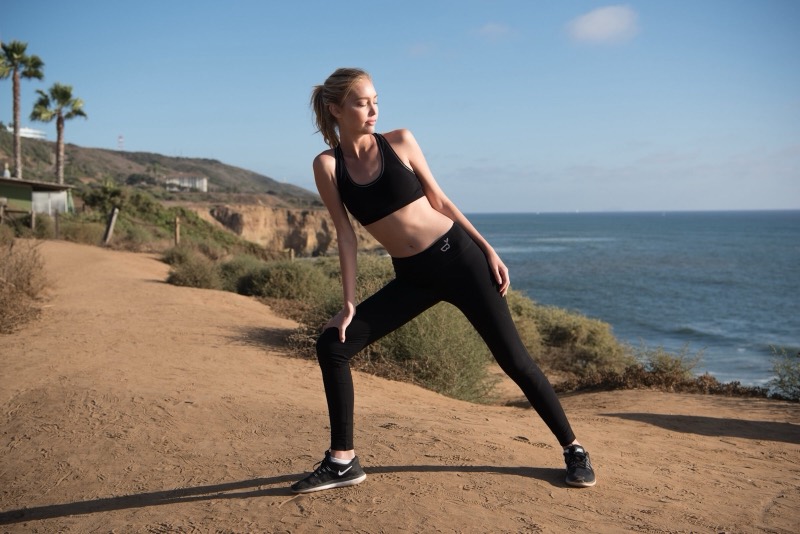
The campaign art was built for the feed, and it performed there. Engagement per post rose 120% over the months before the launch, the strongest response of anything in the campaign. To support it we created and managed an influencer program, a small roster of beauty voices who made original content with the line and were briefed to the same visual standard.
Cut from the full case study at wrkhrs.co/work/priori-natural-launch-campaign