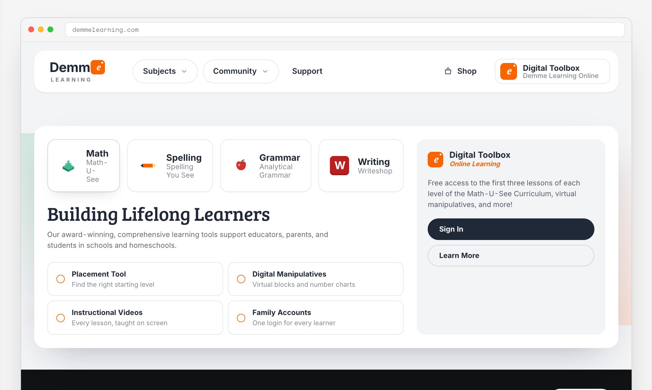
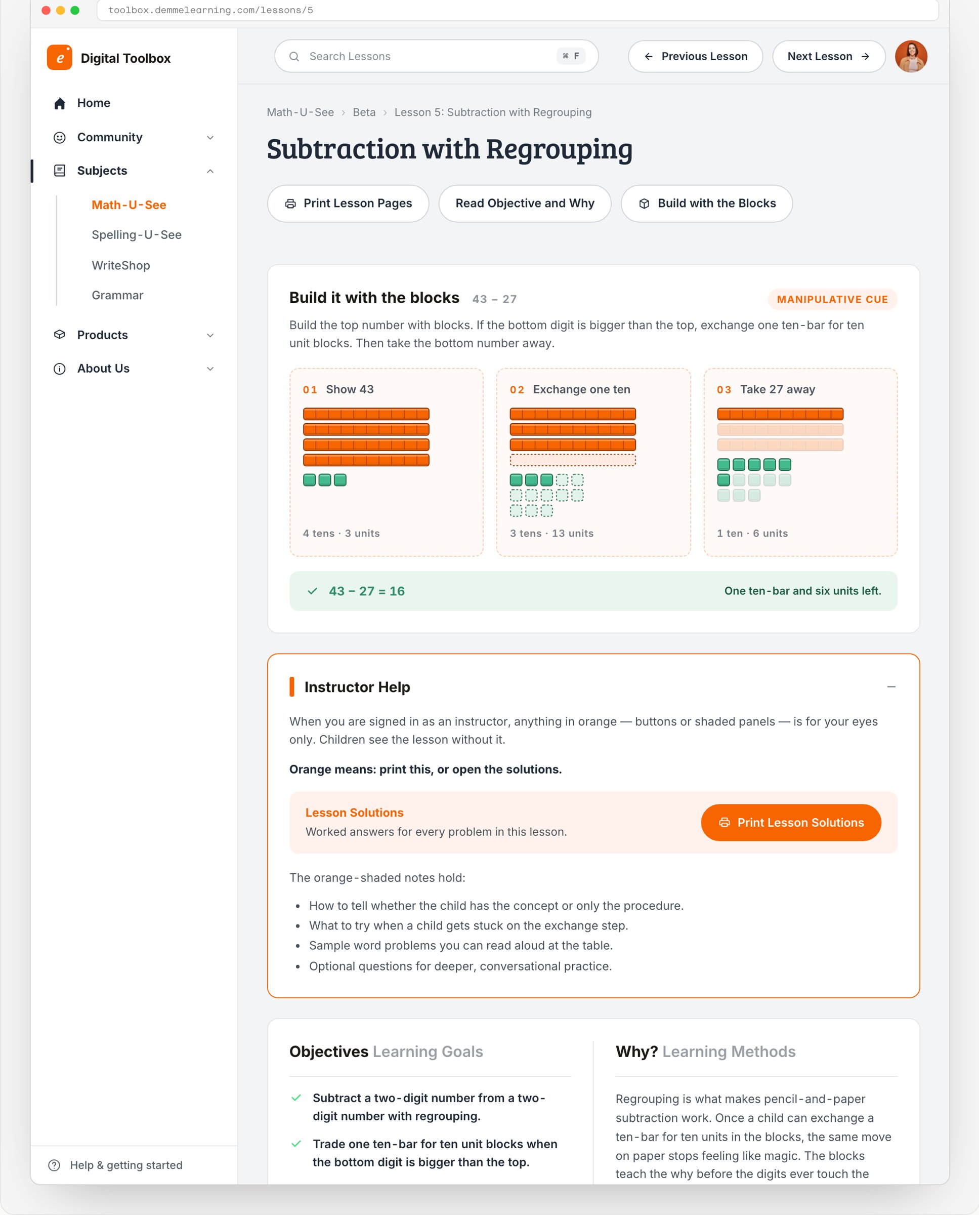
The handoff
The build paused before launch, so there is no public site to point at. What we handed over was the system: a 21-page spec, 17 Figma pages, and the color, type, and spacing values that the panels further down this page render from directly.
Strategy
Three domains, one company.
A parent looking for Math-U-See could land on the marketing site, the store, or the software, each on its own domain with its own login. Customers did not experience that as an architecture. They experienced it as getting lost.
At the same time the sales team was opening a second market in charter schools and districts. The brief had two constraints from the first meeting. Do not spend the homeschool trust. Do not build a second site for schools.
2023
Two markets, one front door.
Three decades of homeschool trust, and a new buyer in the school administrator. One brand had to hold both without changing its voice between them.
01Homeschool
The base · Tactile, sequential, trusted

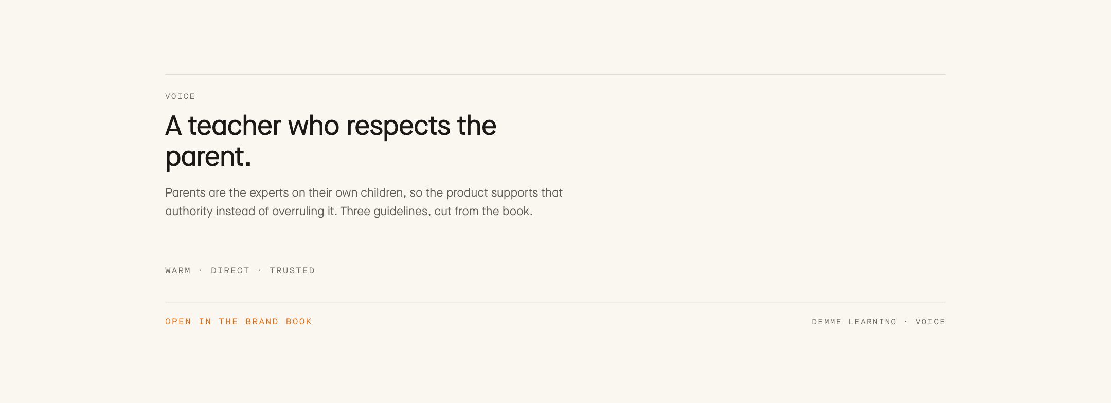
Parents chose Math-U-See because it is hands-on and sequential, and because a person answers the phone. The product had to read like a teacher who shows up, not software that watches.
02Schools
The second market · SSO, rosters, K-8 sequencing

Charters and districts evaluate at the institutional level. Anything that read as homeschool-only stalled in review before anyone looked at the curriculum.
The same catalog, told two ways, on one information architecture.
Principles
The brand decided the structure.
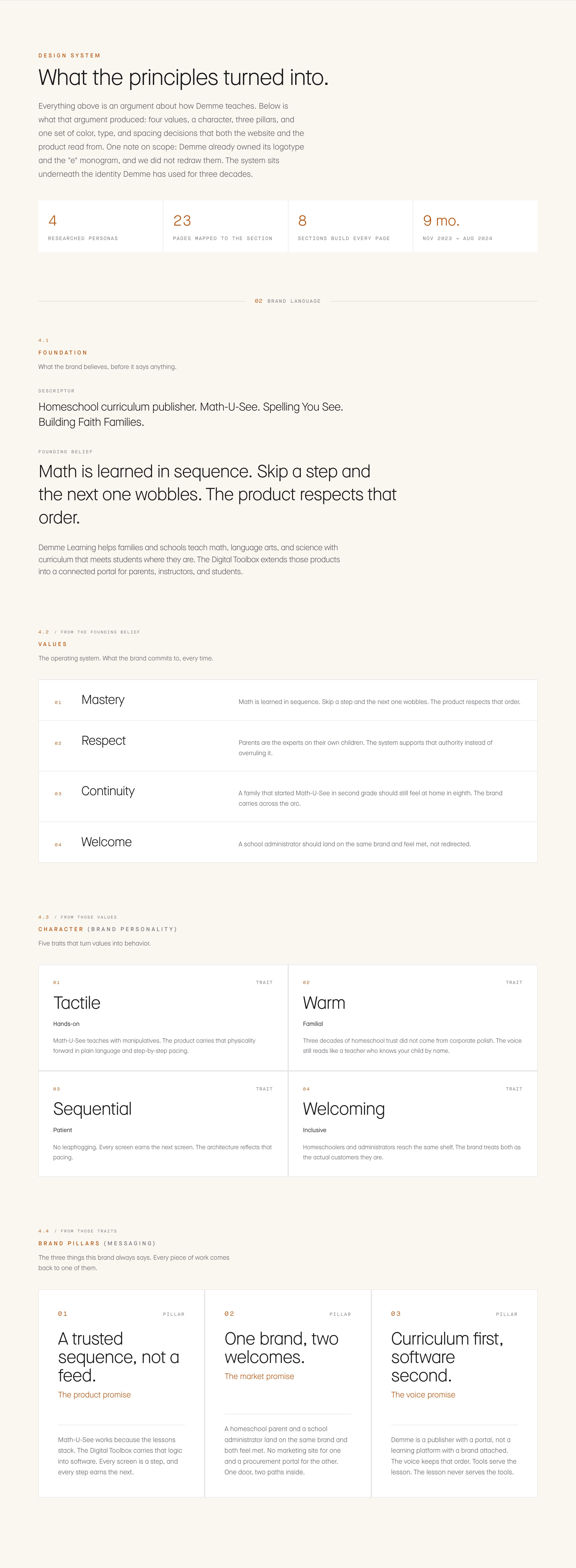
Before we drew a screen we wrote down what Demme actually believes about learning, then treated those statements as constraints on the design instead of as language for an About page. Seven principles came out of that work. Four of them changed the product.
Principles
Four principles, four screens.
- 01
Strong foundations
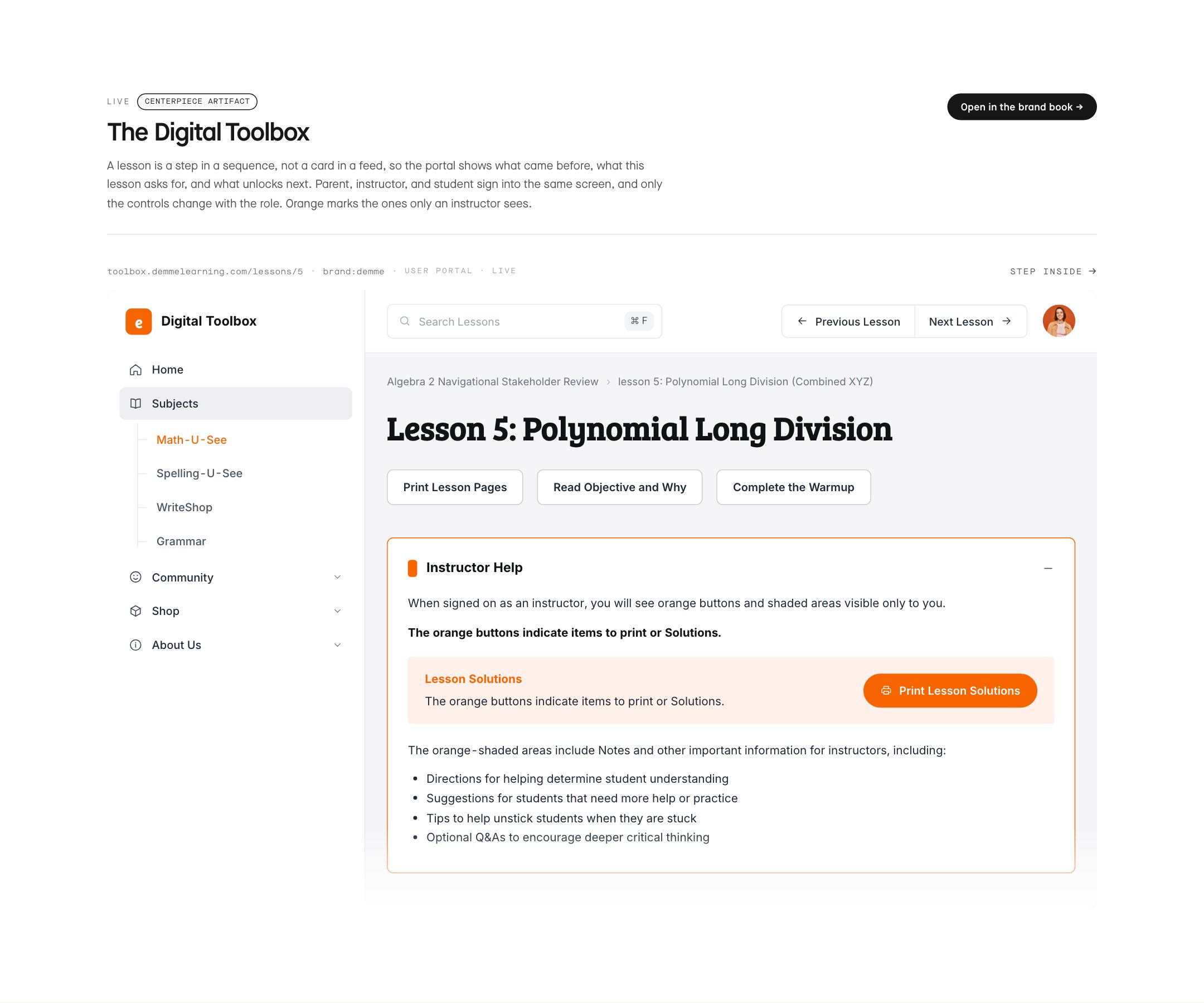
Order matters; a learner earns the next step. This became the lesson-shaped content model in the Digital Toolbox.
- 02
Deep learning
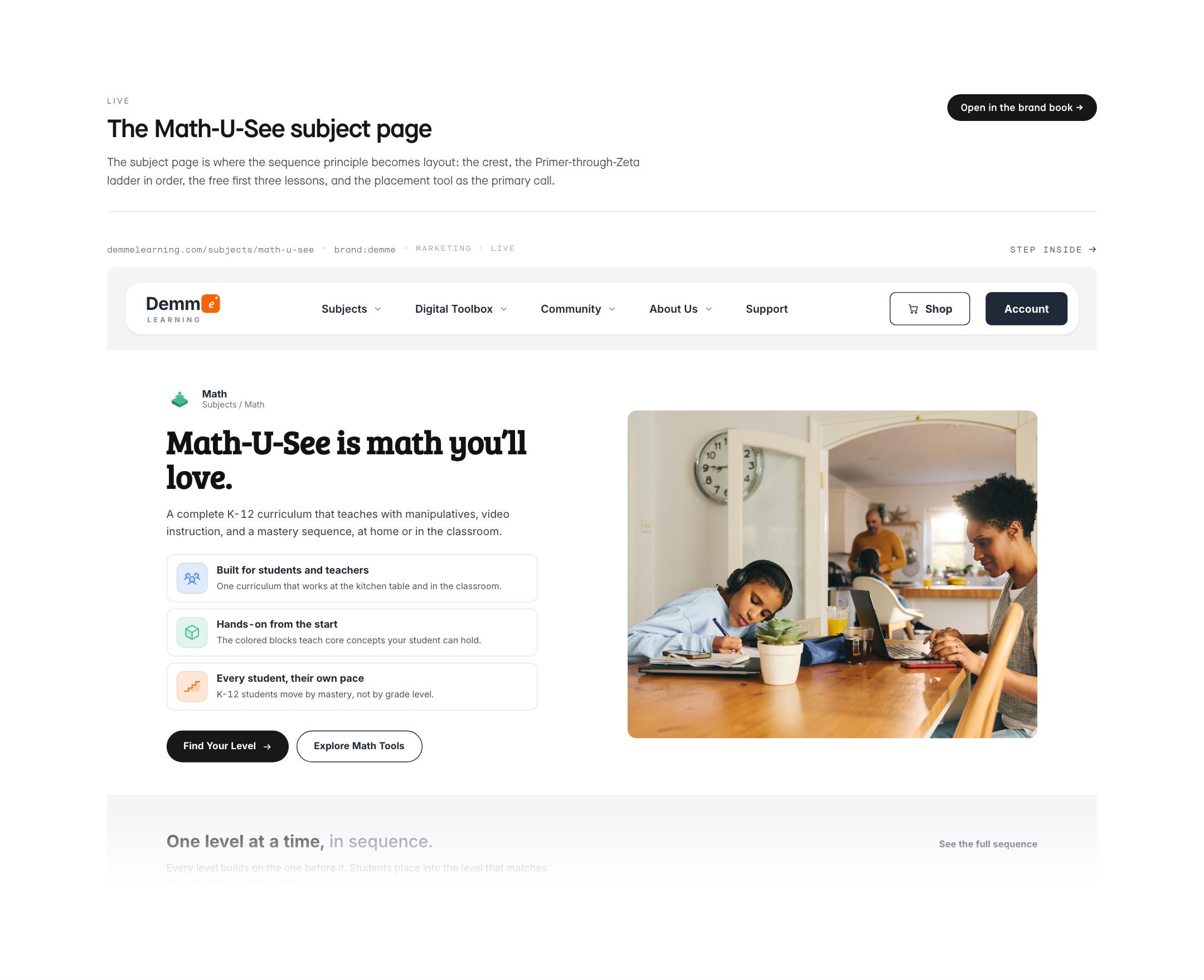
The same order, in the catalog: Primer through Zeta, presented in sequence on every subject page.
- 03
Empowering parents
The adult in the room is the expert. Progress views inform the parent; they never grade them.
- 04
Building communities
The homeschool co-op is a customer in its own right. Community sits at the top level of the navigation.
The rest of the page is these four claims, cashed.
A principle that does not change a screen is decoration.
Architecture
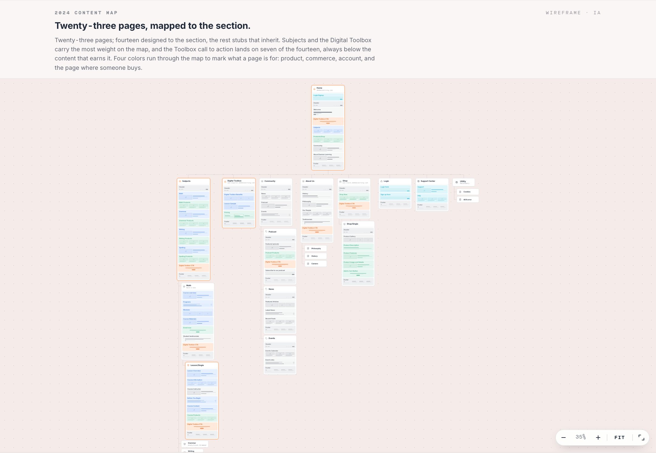
Three domains became one tree.
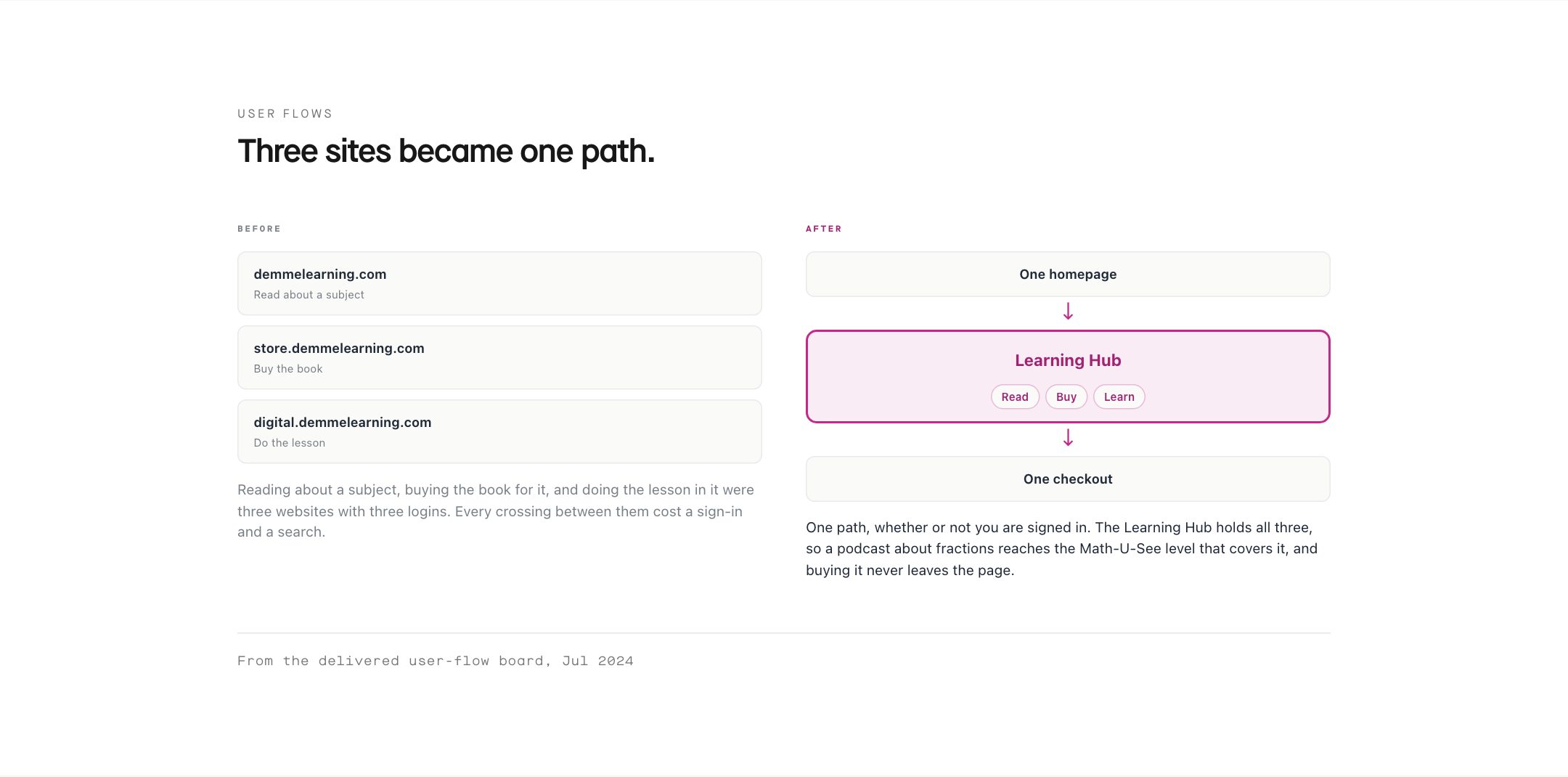
We ran a card sort using the words Demme customers use, not the ones on the org chart. The result was unambiguous. People think in subjects, and they expect one path through reading, buying, and doing the lesson.
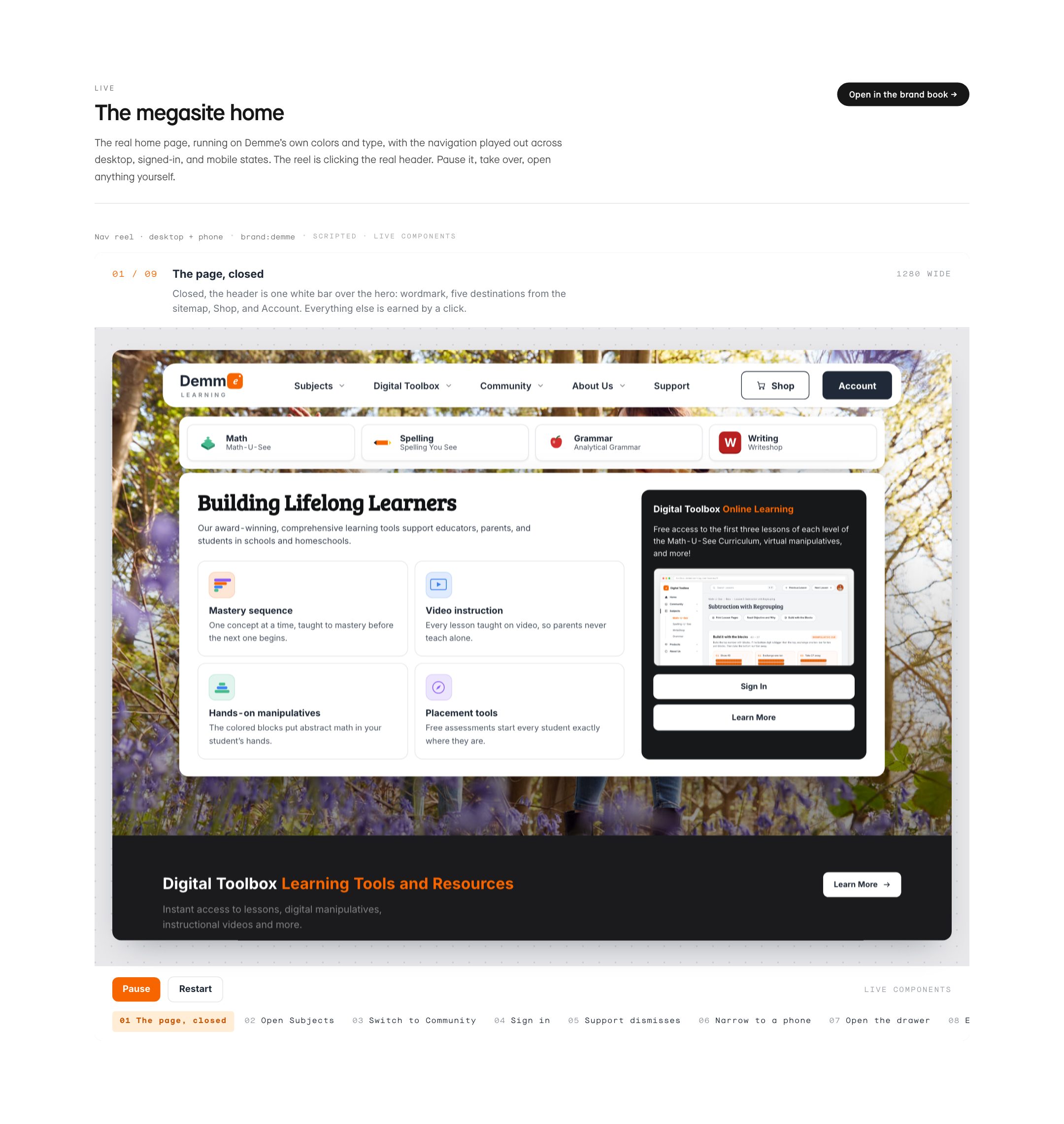
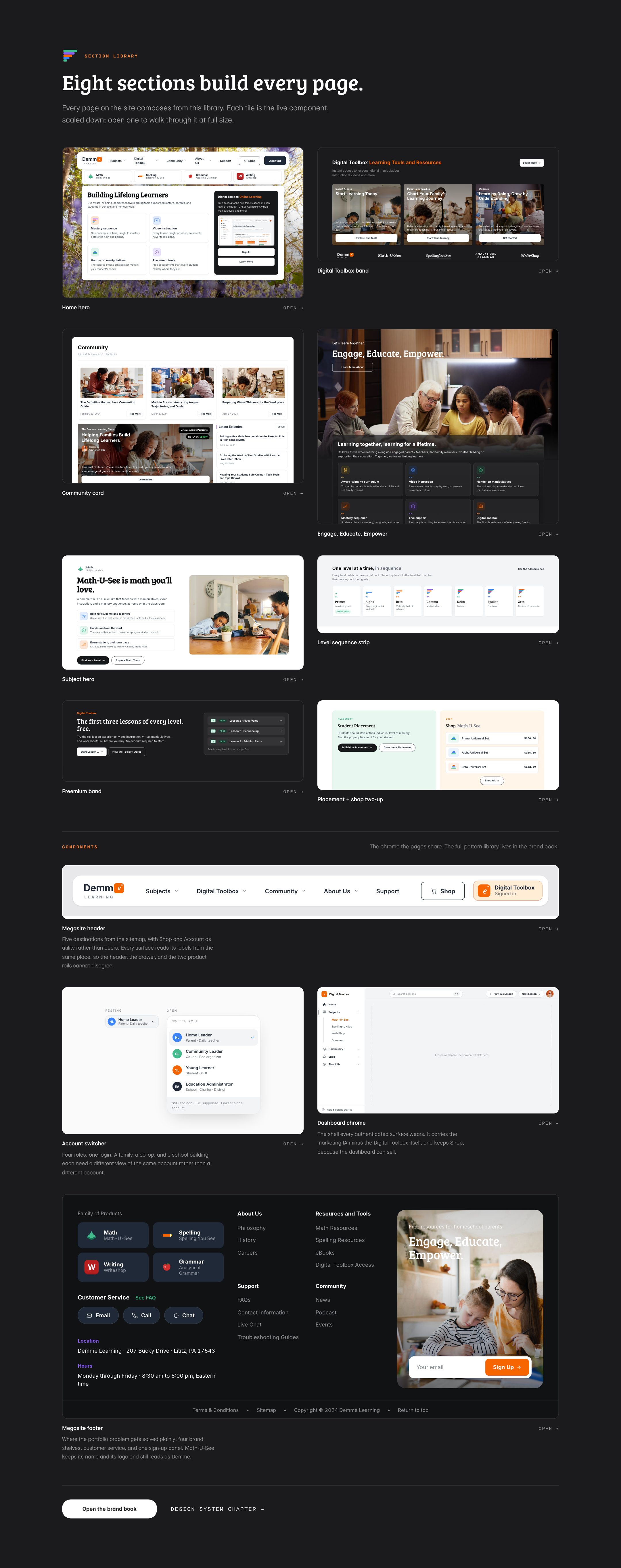
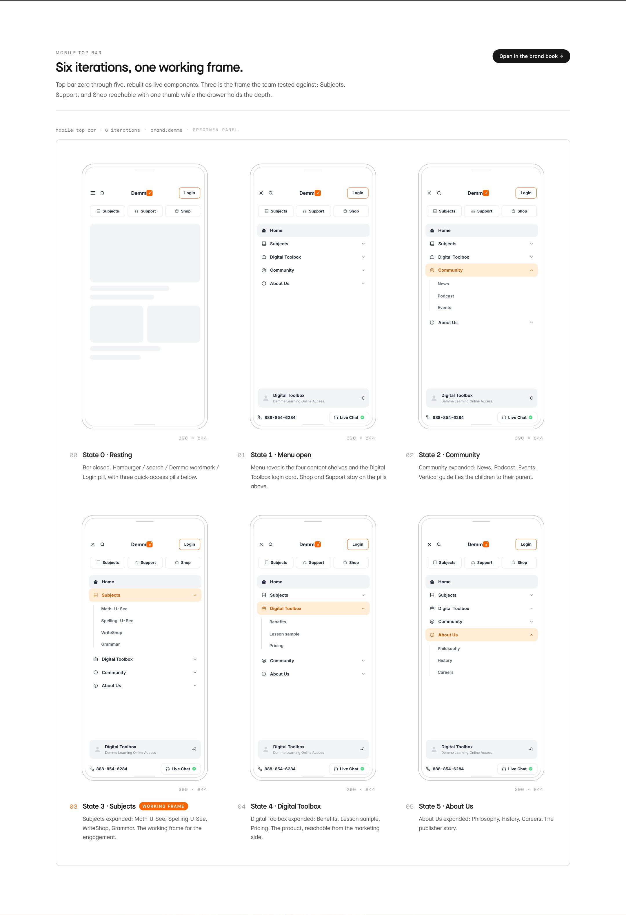
So the structure leads with Subjects, Shop as a sibling, and the Digital Toolbox fixed in every navigation state. We mapped it to the section level: eight sections cover twenty-three pages, which is what makes the site cheap to extend and hard to break.
Research
Four people, four reasons to be here.
Persona work on a curriculum platform is not demographic. What matters is why someone opened the page, the room they are in when they open it, and how many minutes they get before something interrupts. A parent planning a week of lessons needs a different first screen than a nine-year-old opening one.
We built four. Two of them are the poles of the two-market problem, and they never see the same navigation state.
Audience model
The four we designed for.
Each persona is three facts: what they came to do, where they are sitting, and how long they have. No biographies. Demme's team keeps the working copies in the brand book at /brand/demme.
- 01
Homeschool Home Leader
Parent teaching at home
Teaches two or three children across subjects and grade levels, in whatever room fits the activity. Balances teaching against everything else the household needs.
- 02
Homeschool Community Leader
Co-op and tutorial organizer
Runs group instruction in co-op spaces and libraries. Adapts one set of materials to a mixed-age room and reports back to the families who trusted them with it.
- 03
Education Administrator
Charter, district, and school buyer
Evaluates curriculum at the institutional level against standards, budget, and rollout risk. Arrives skeptical that a homeschool publisher can serve a building.
- 04
The Young Learner
Student, roughly ages 8 to 14
Opens the lesson during a scheduled learning block, at home or in a classroom. Motivated by seeing the next step arrive and knowing how far along the sequence they are.
Where the flows were breaking.
We mapped the path customers actually took, then redrew it. Four changes did most of the work.
The redraw went through three states: the site as it stood in April, the corrected paths in May, then a reorganization around hubs after a walkthrough surfaced account-type branches we had collapsed too early. The hub model is the one we delivered.
User flows
The four changes.
- 01
Discovery ignores sign-in
The catalog is the same object whether or not you have an account.
- 02
Content links to product
A podcast episode about fractions reaches the Math-U-See level that covers them.
- 03
One checkout
Purchase and upgrade both terminate in one checkout instead of three.
- 04
The dashboard can sell
An existing customer adds to the product without leaving it.
Interface
The structure, drawn.
Everything below is the architecture above, drawn. The panels are working components running on Demme’s own colors and type, so resize the window and they reflow.
System
One family for the work, one face for the welcome.
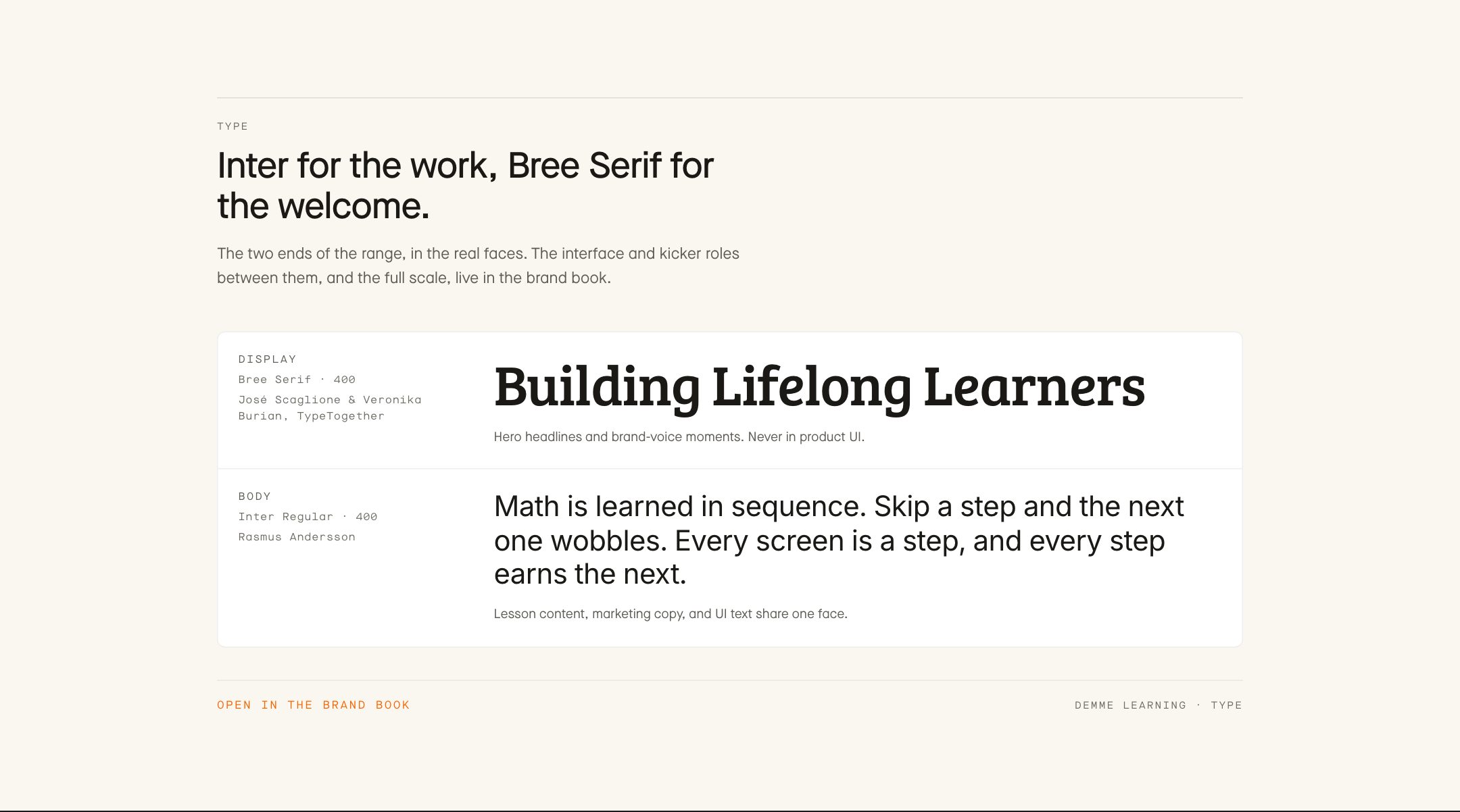
A curriculum publisher writes two kinds of sentence: the lesson a student works through, and the welcome a parent reads once while deciding whether to trust it. Most brands buy a second typeface for the second job and let the two drift.
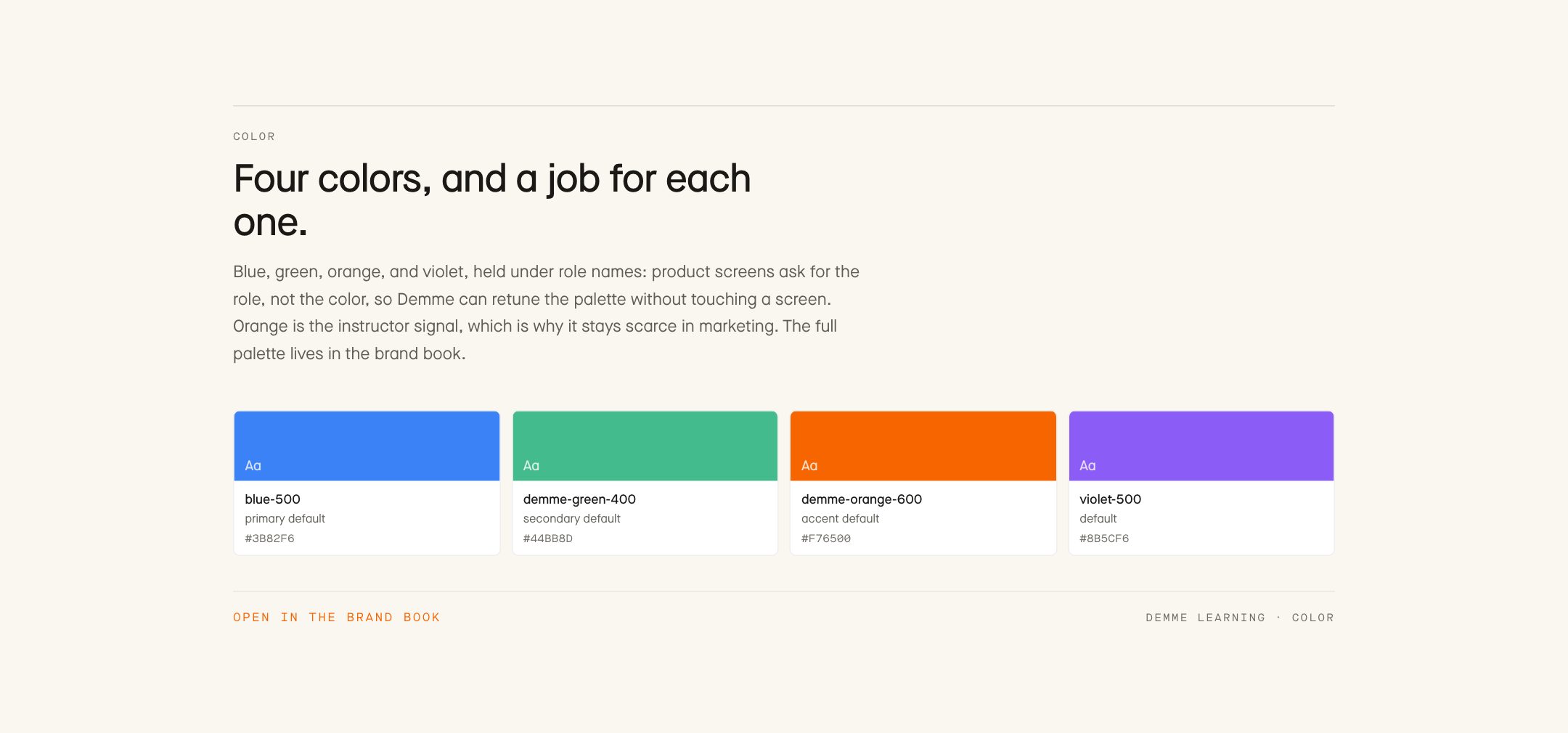
We gave the work one family and the welcome one face. Inter carries lessons, marketing, buttons, and data rows, so a heading on a Digital Toolbox screen and a heading on a landing page are the same object. Bree Serif appears only where the brand speaks in its own voice. Mono is data alone: timestamps, level indices, prices.

Curriculum first. Software second.
Cut from the full case study at wrkhrs.co/work/demme-learning