







cat info.txt

Kane NY

Two products. A whole world around them. Creative direction, photography, 3D, and social for Kane NY.

Kane NY
Kane NY

Kane NY

Visual. Contour. Radiance.

Two products. A whole world around them. Creative direction, photography, 3D, and social for Kane NY.

Client
Kane NY
Discipline
Creative Direction · Social · Photography · 3D
Year
2019
44
Hero rows, 2016 to 2018
2017
kaneny.com redesigned
Case study
Read the full story at wrkhrs.co

The brief.

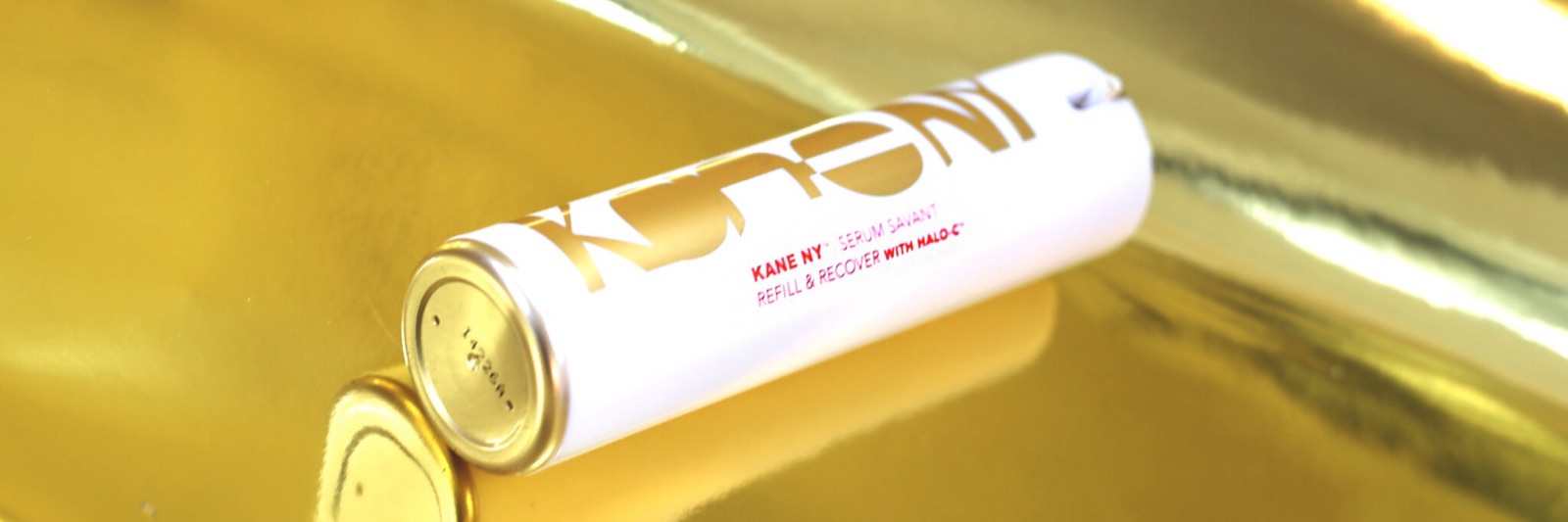
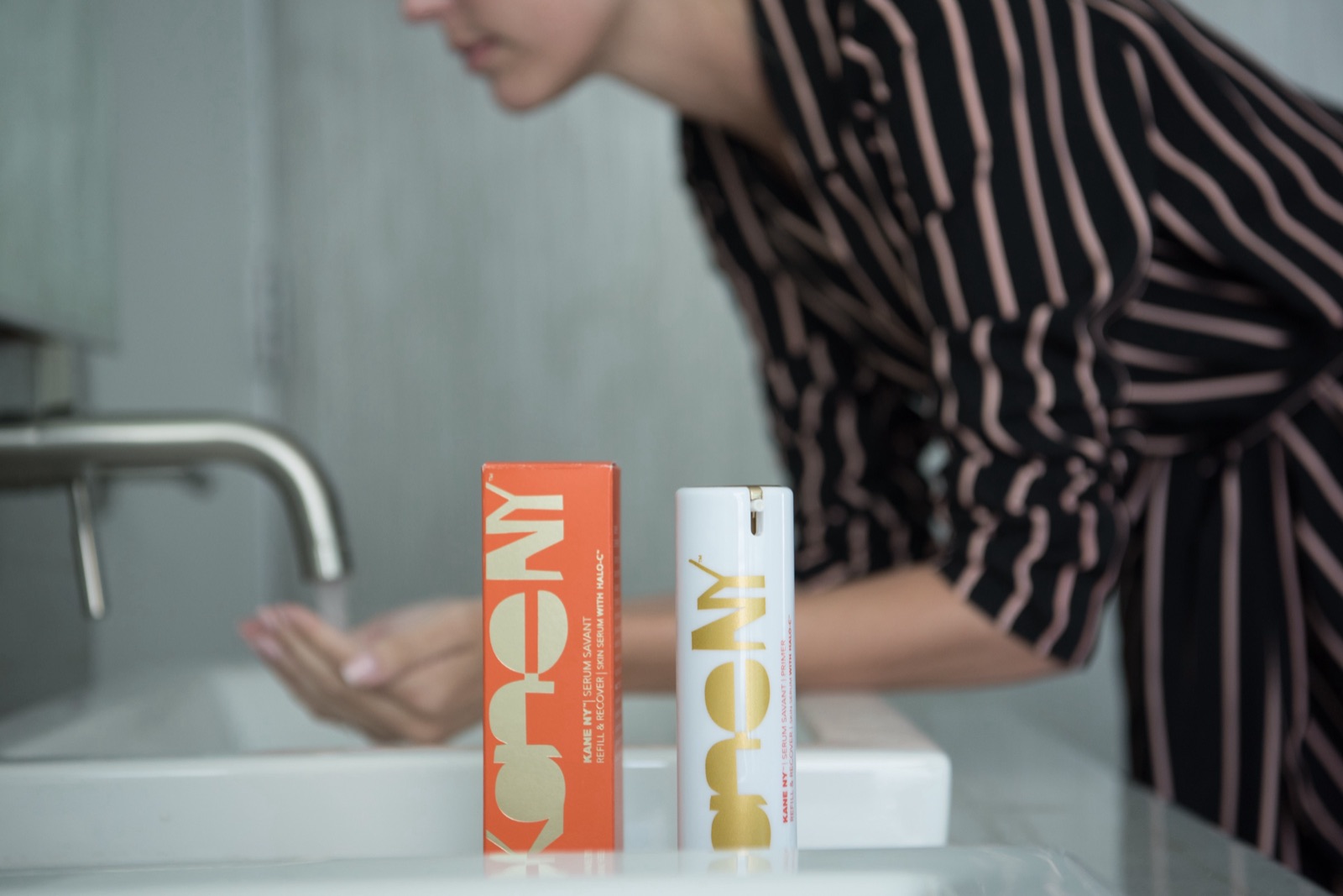
Kane NY is a luxury skincare line developed by Dr. Michael Kane, one of New York’s leading plastic surgeons. Its two products, Serum Savant and a companion primer, are built on his proprietary HALO-C hyaluronic complex and backed by clinical results. The packaging was already confident, a bold orange box with a gold logo. What the brand needed was a creative direction and a narrative that could carry that credibility onto Instagram, where it had to hold its own against the biggest names in beauty.

We took on the channel in October 2015 and ran it through 2019, from strategy and art direction to photography, 3D, copy, and posting. In 2017 we redesigned the website to match.

Thinks (and works) outside the box.
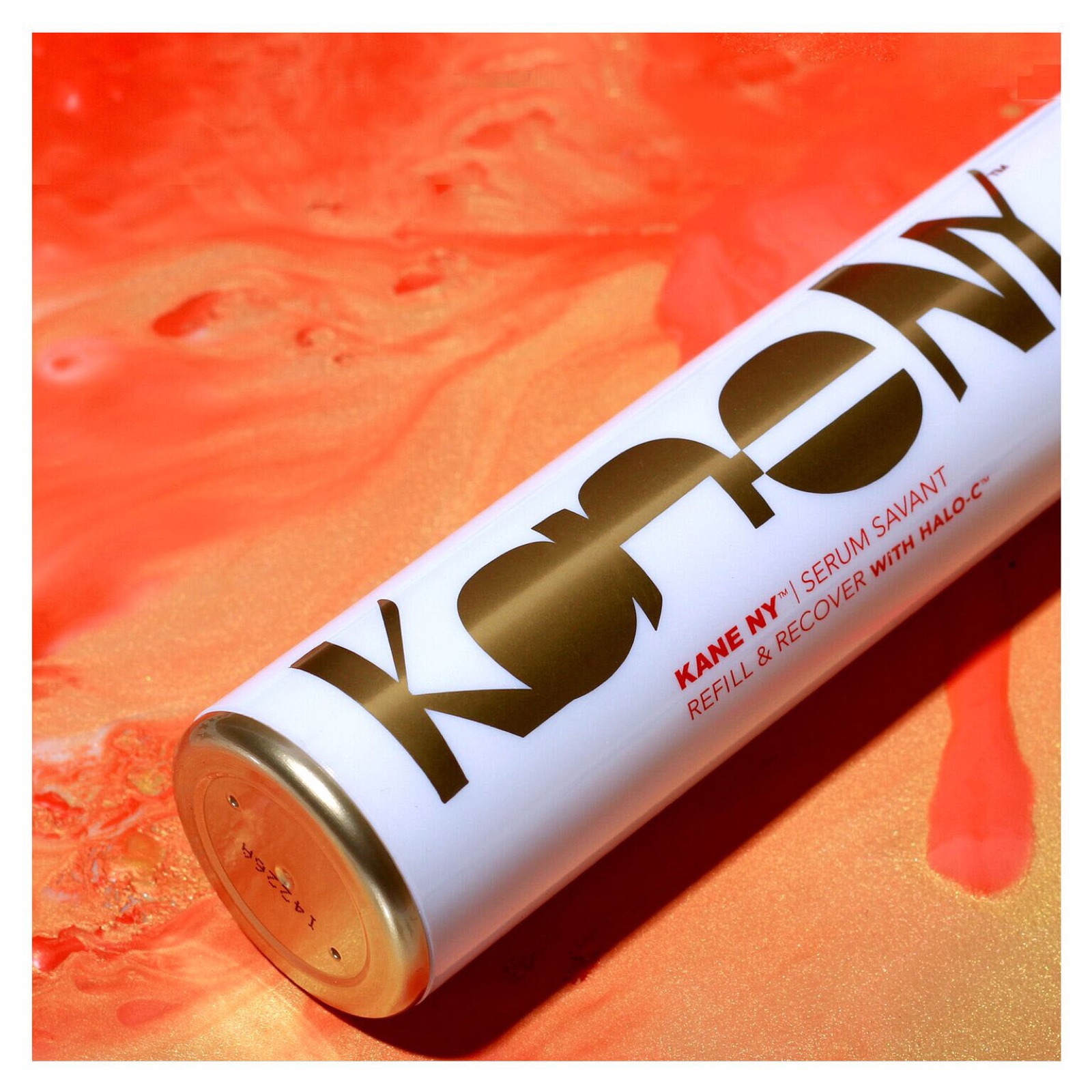
Serum Savant, kaneny.com, 2017
01

Direction

Unexpected beauty.

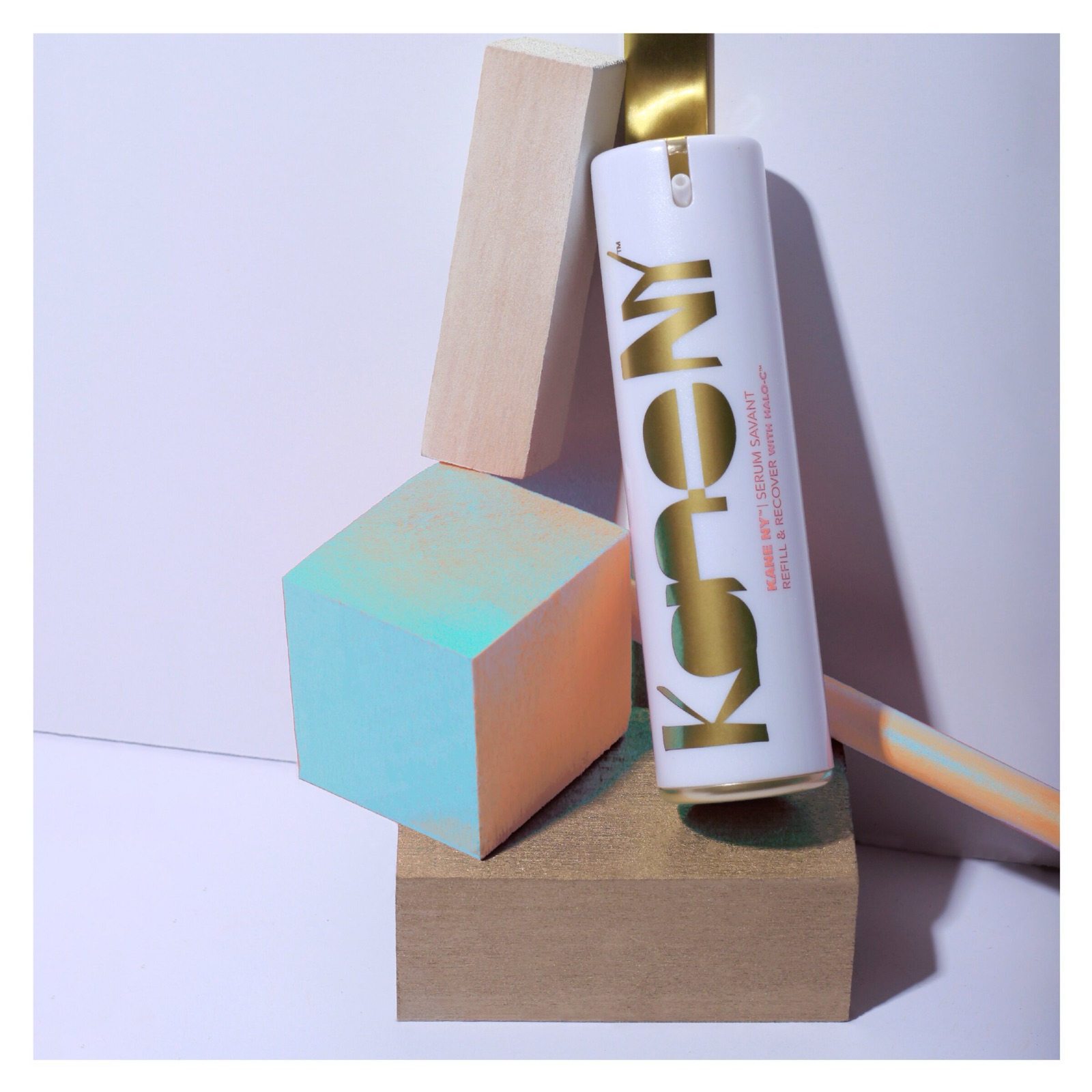
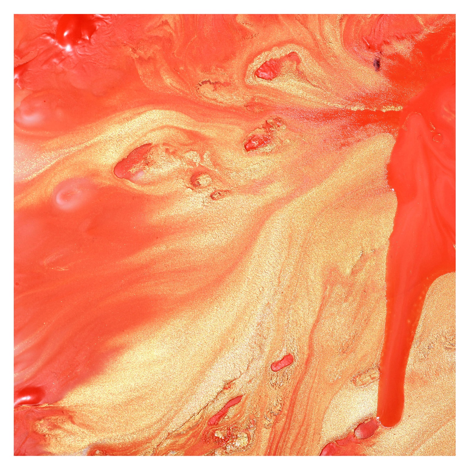
The direction paired the confidence of the packaging with an editorial sensibility drawn from modern art, travel, and New York. Three stories ran through the feed. How the product feels, told through texture, color, and layered materials. Where it goes, with the product placed in everyday and aspirational settings. And the science behind it, with clinical results and the formula illustrated so the claims read as expertise.

Each story tied back to the three results Kane NY promises, visual, contour, and radiance, which gave the content calendar a spine for four years.

System

The framework.

Three brand promises, four visual influences, and four post formats. Each week drew from every column, which kept the feed varied and kept it recognizably Kane NY.

  • Gold #E8C547 Logo foil, hero rows
  • Ochre #C9A258 Warm grounds
  • Violet #2B1547 Product still-life grounds
  • Canvas #F4EFE3 Ground
  • Ink #1A1A1A Type

Type Editorial serif. High-contrast serif for headlines and quote cards, set tight and large.

Modernism, art, travel, and New York: the four influences behind the imagery.

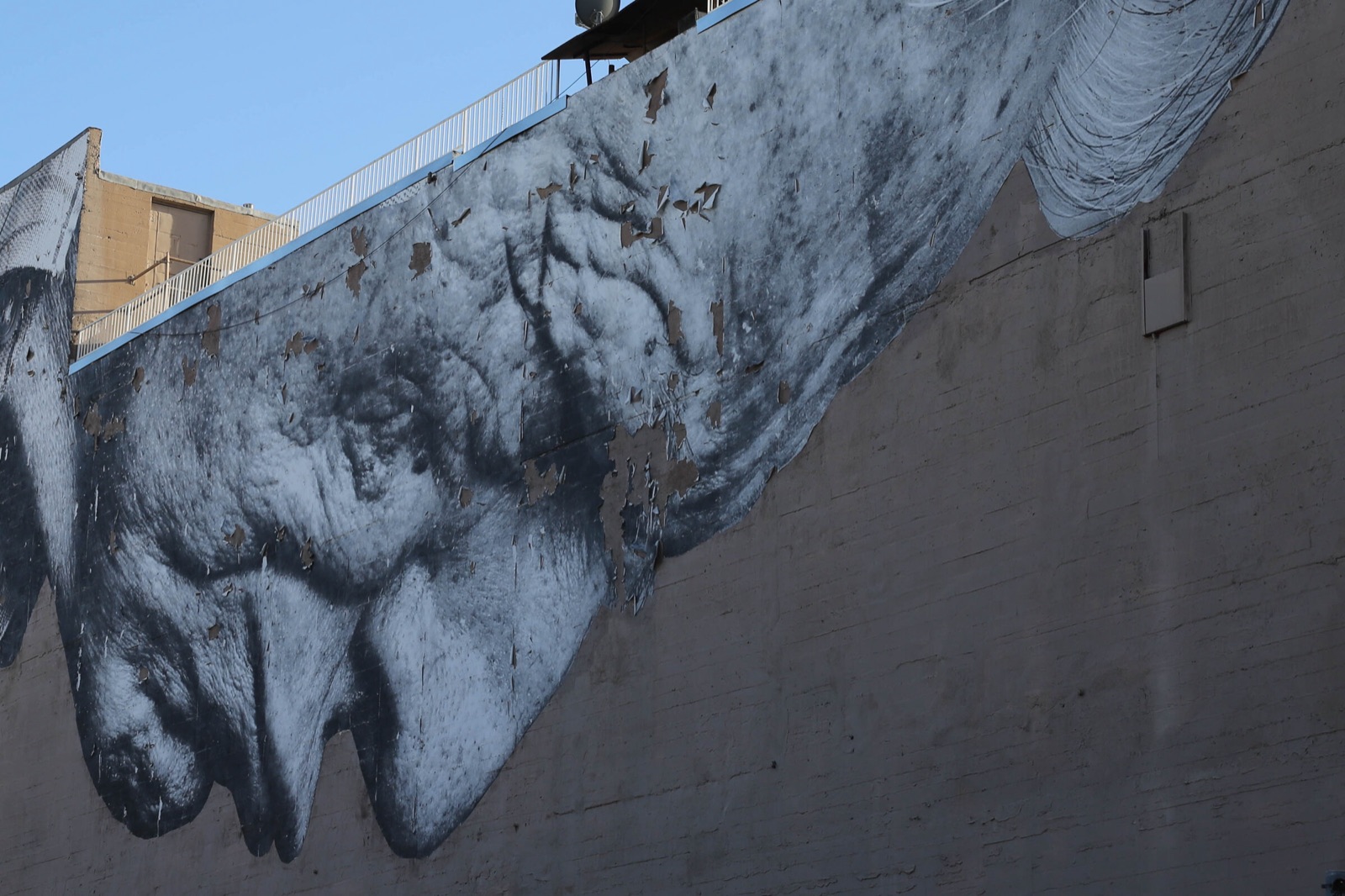
Weathered concrete wall with a pasted figure
Modernism
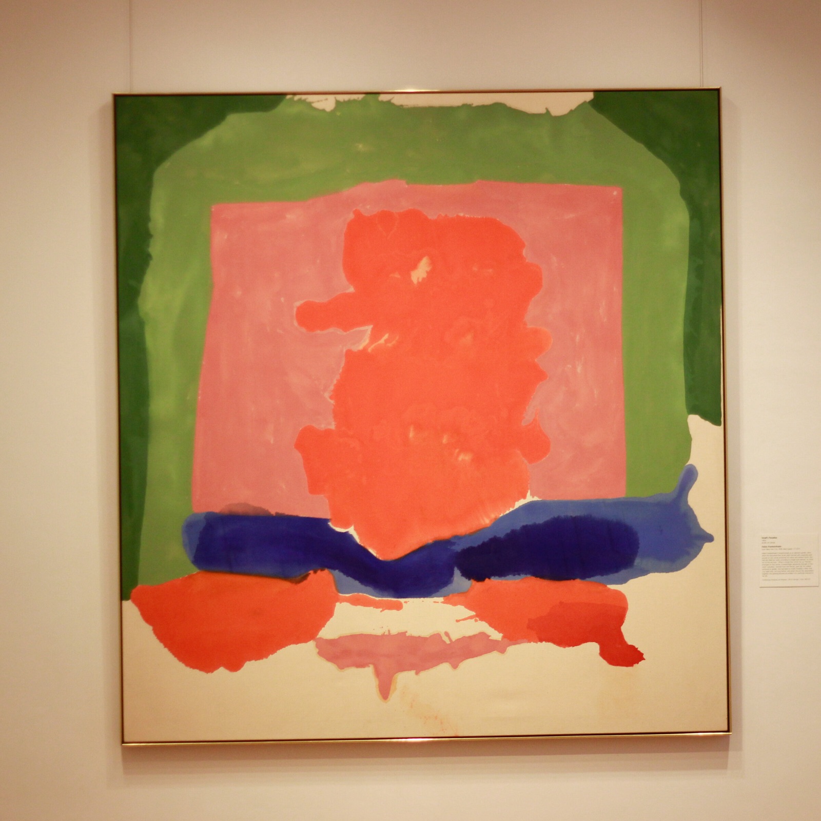
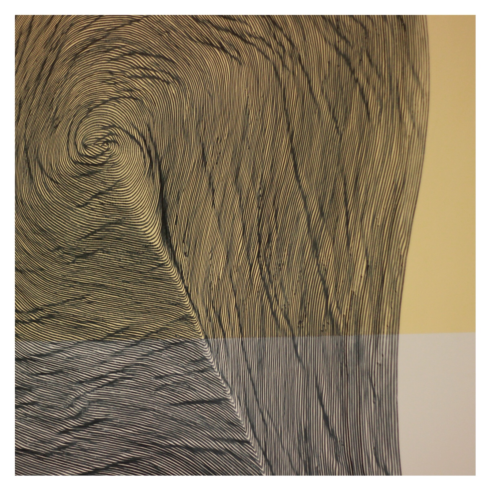
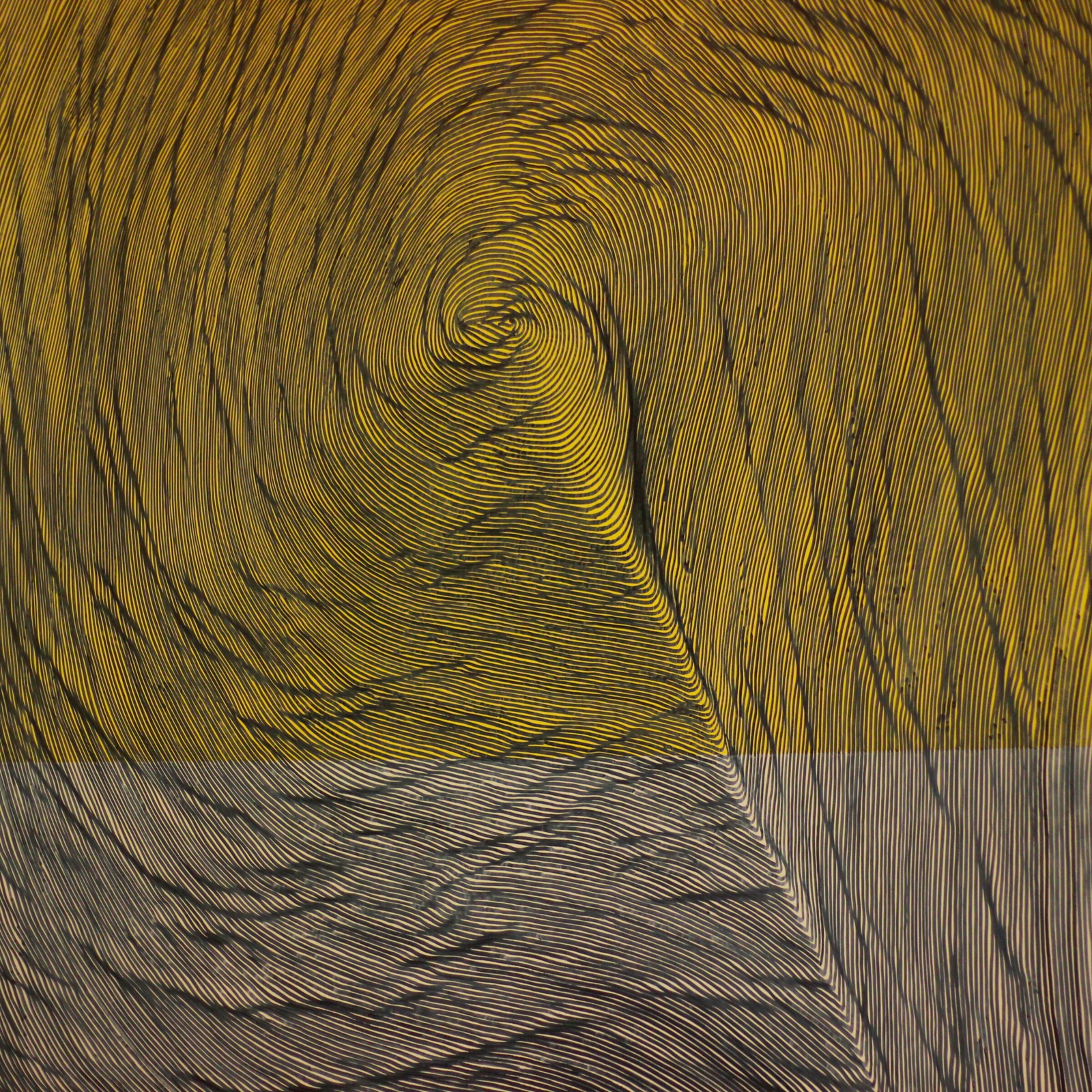
Abstract painting on a gallery wall
Art
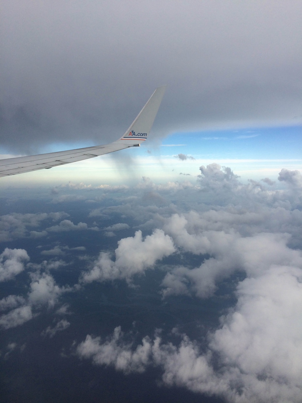
Airplane wing over clouds
Travel · New York

Four kinds of post in rotation.

Surreal product still life
Dimensional
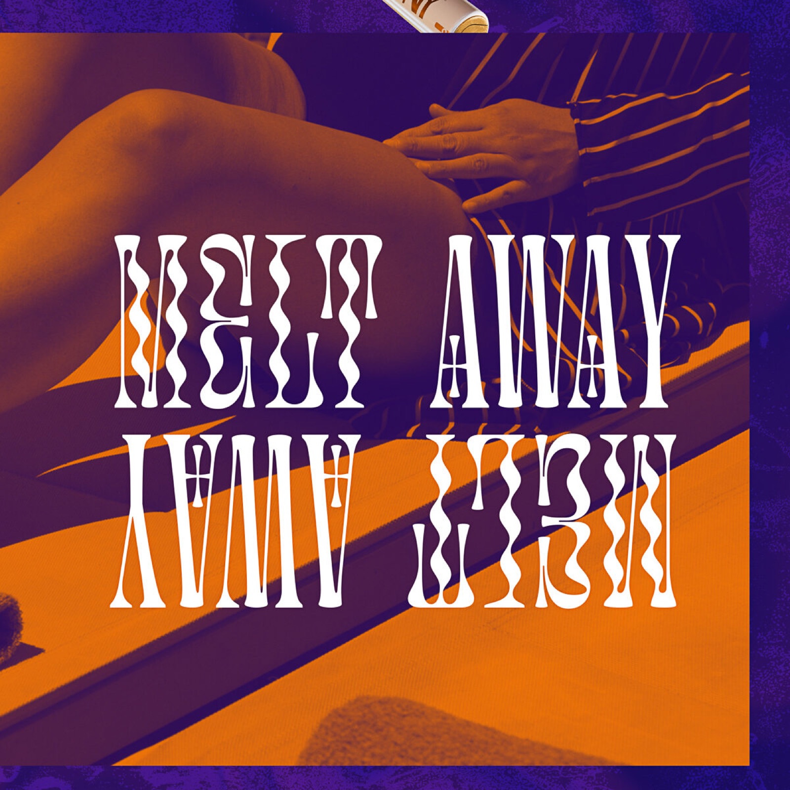
Typographic poster
Typographic
Illustrated post
Illustrated
#KaneGetEnough card
#KaneGetEnough
02

Photography

Original photography.

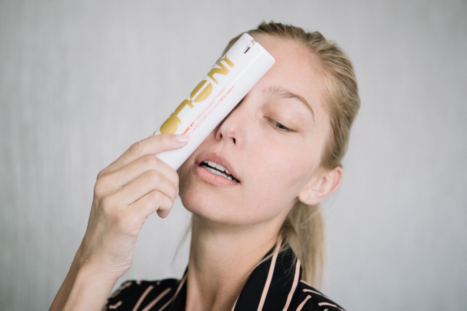
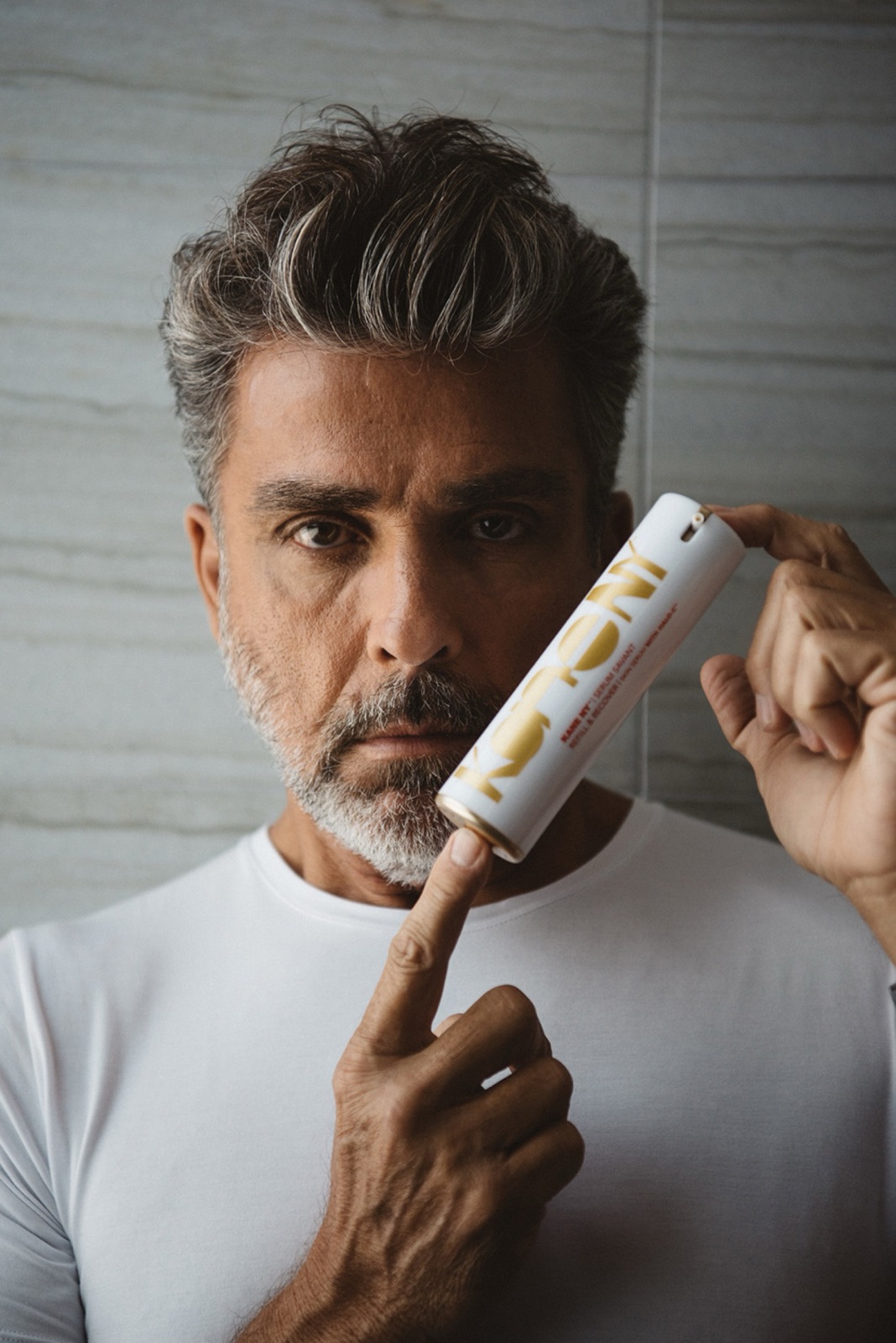
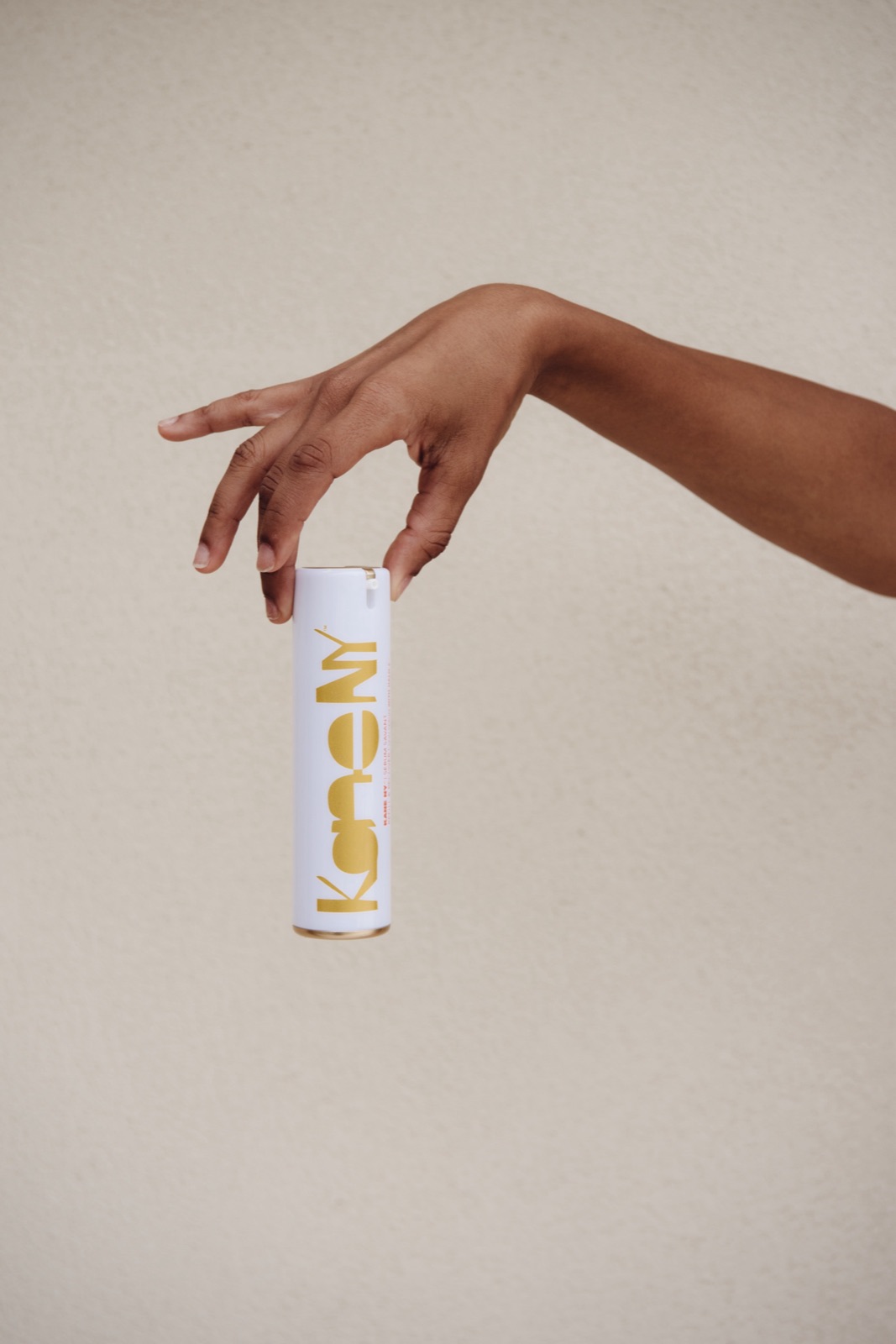
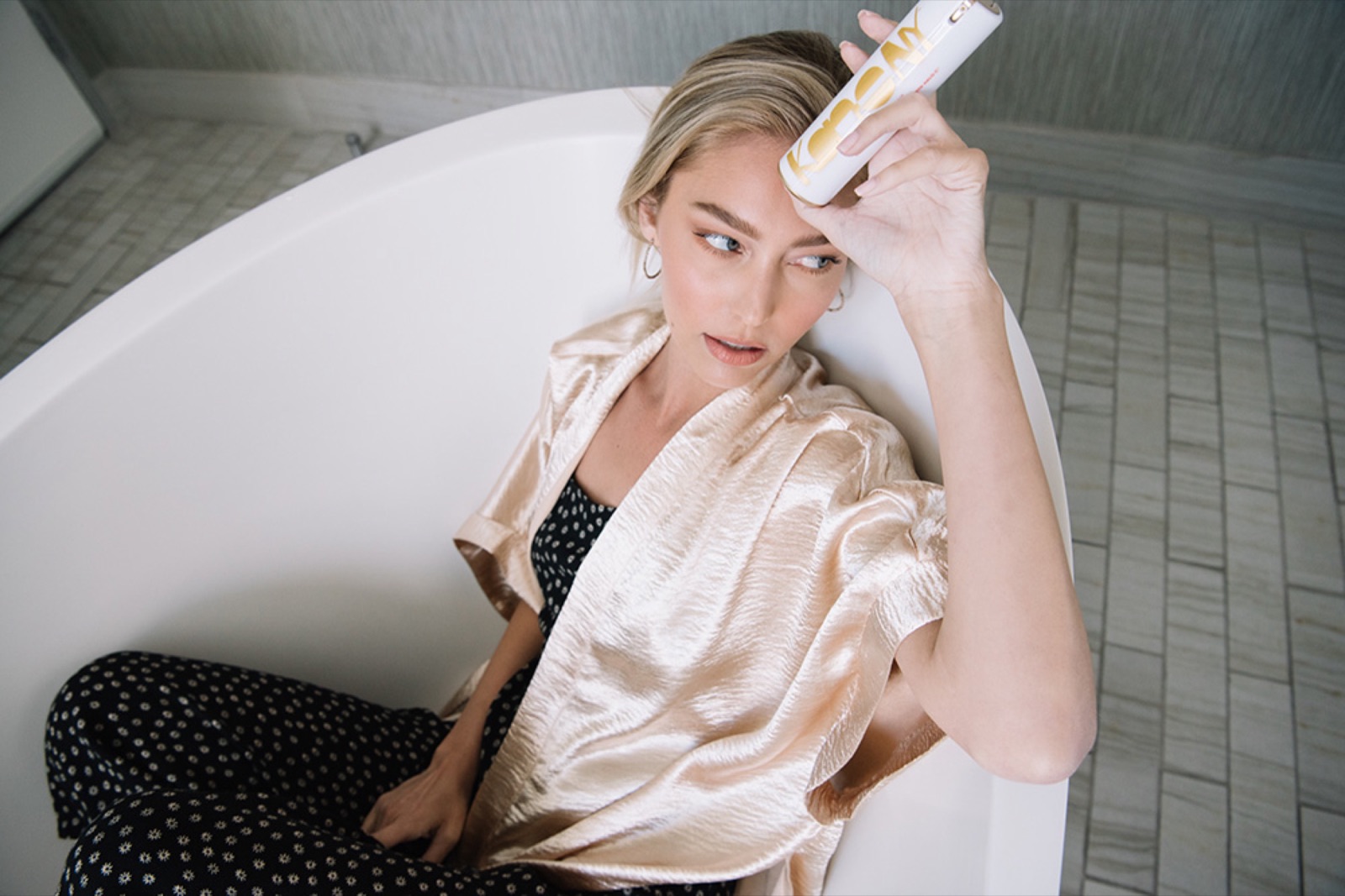
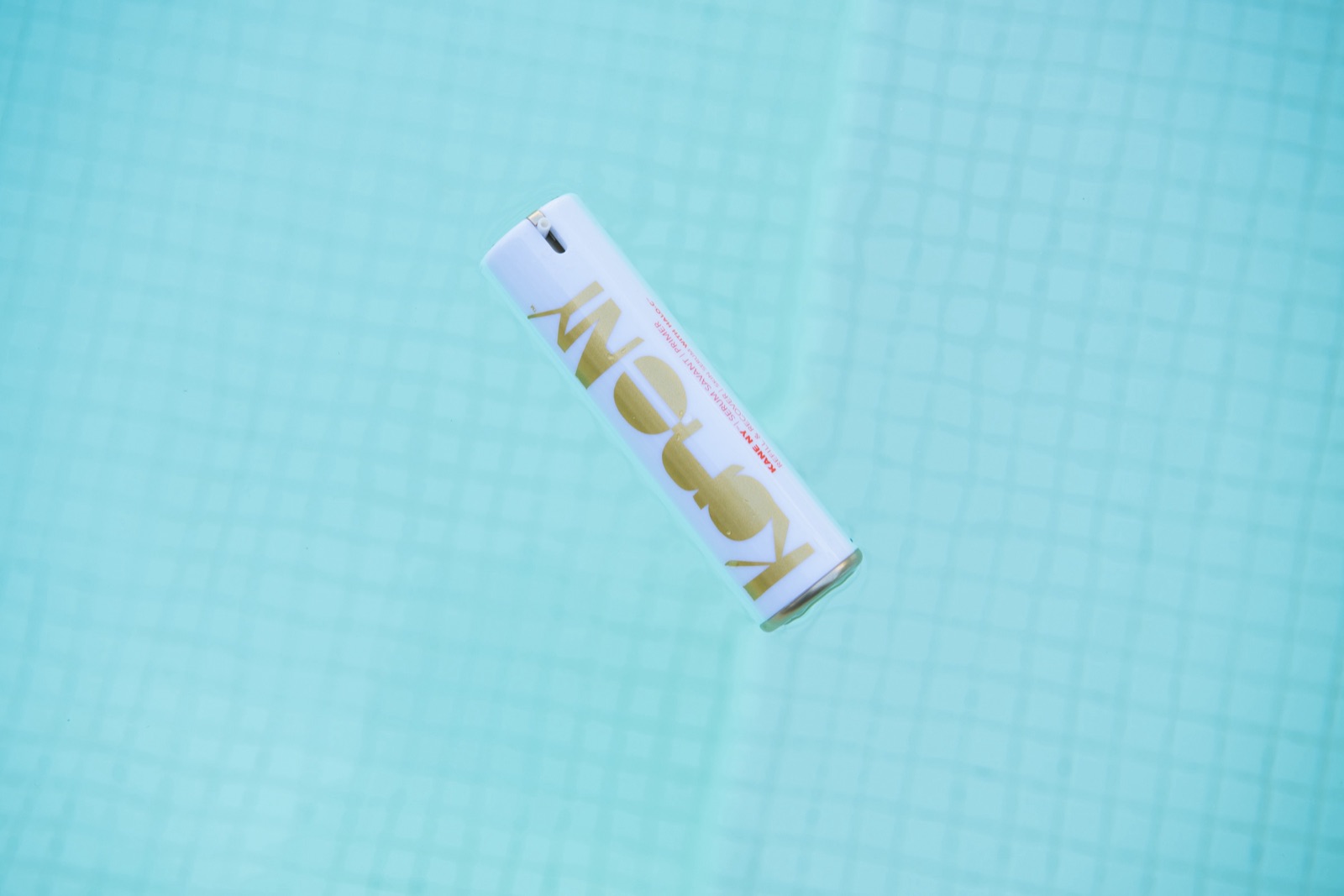
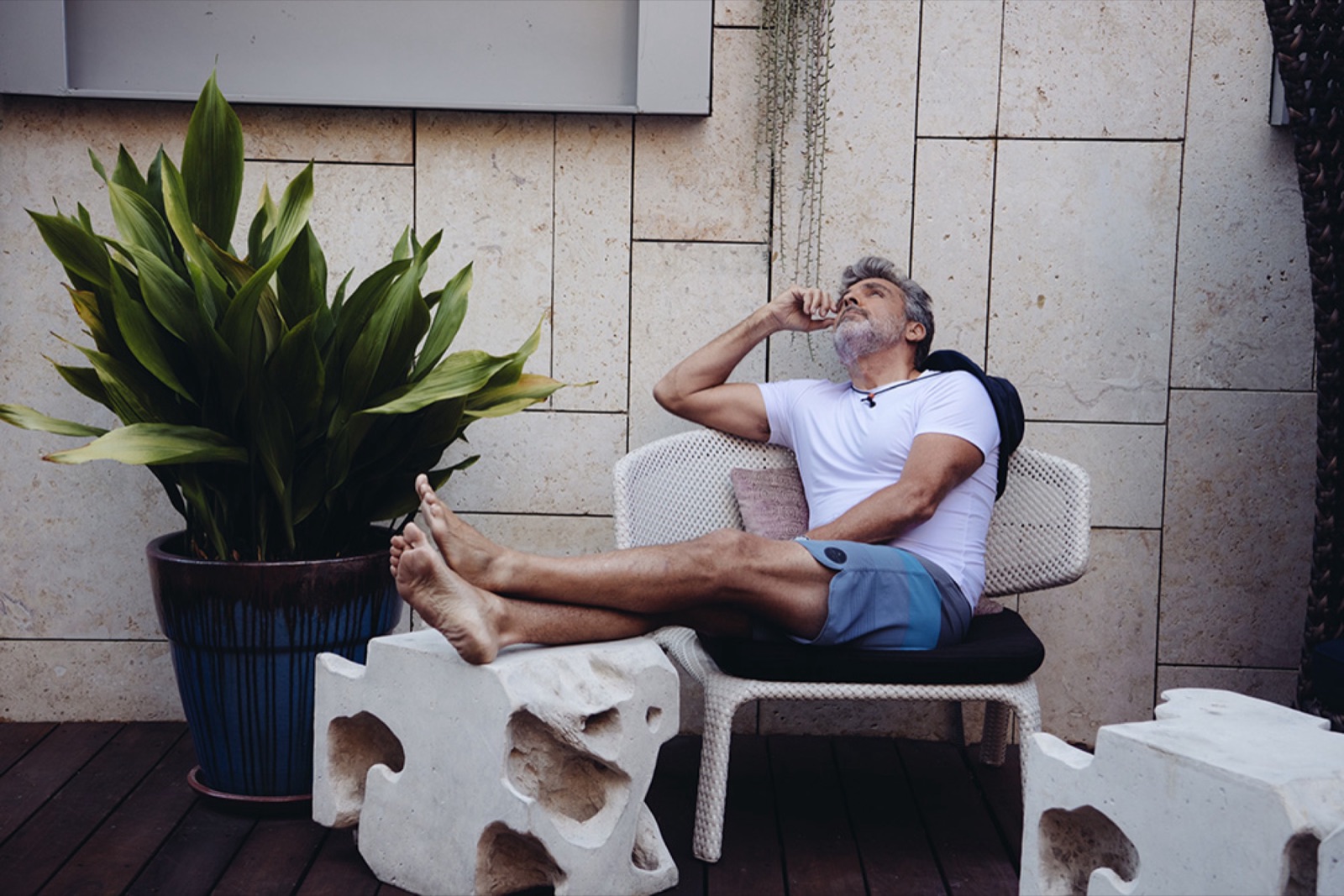
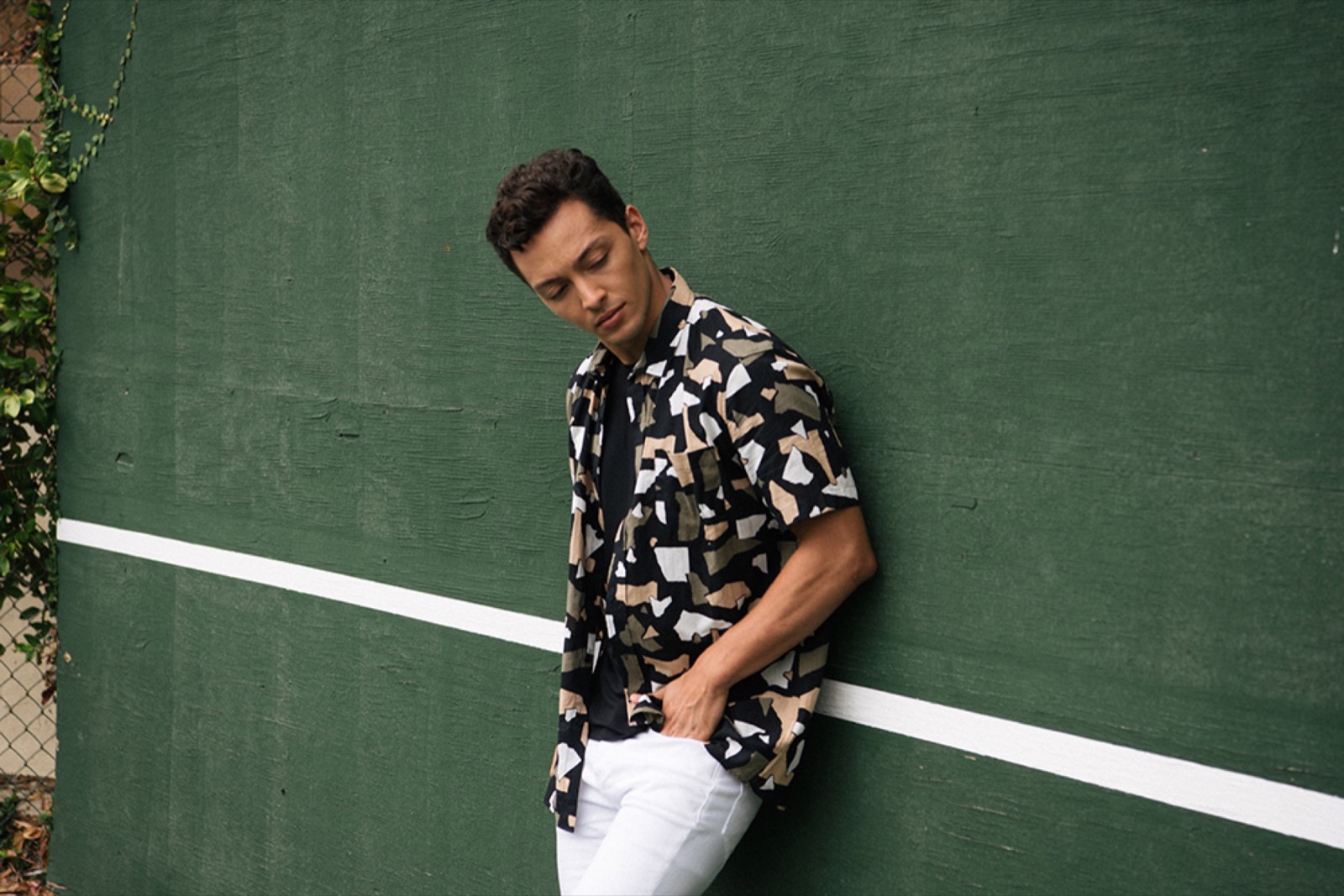
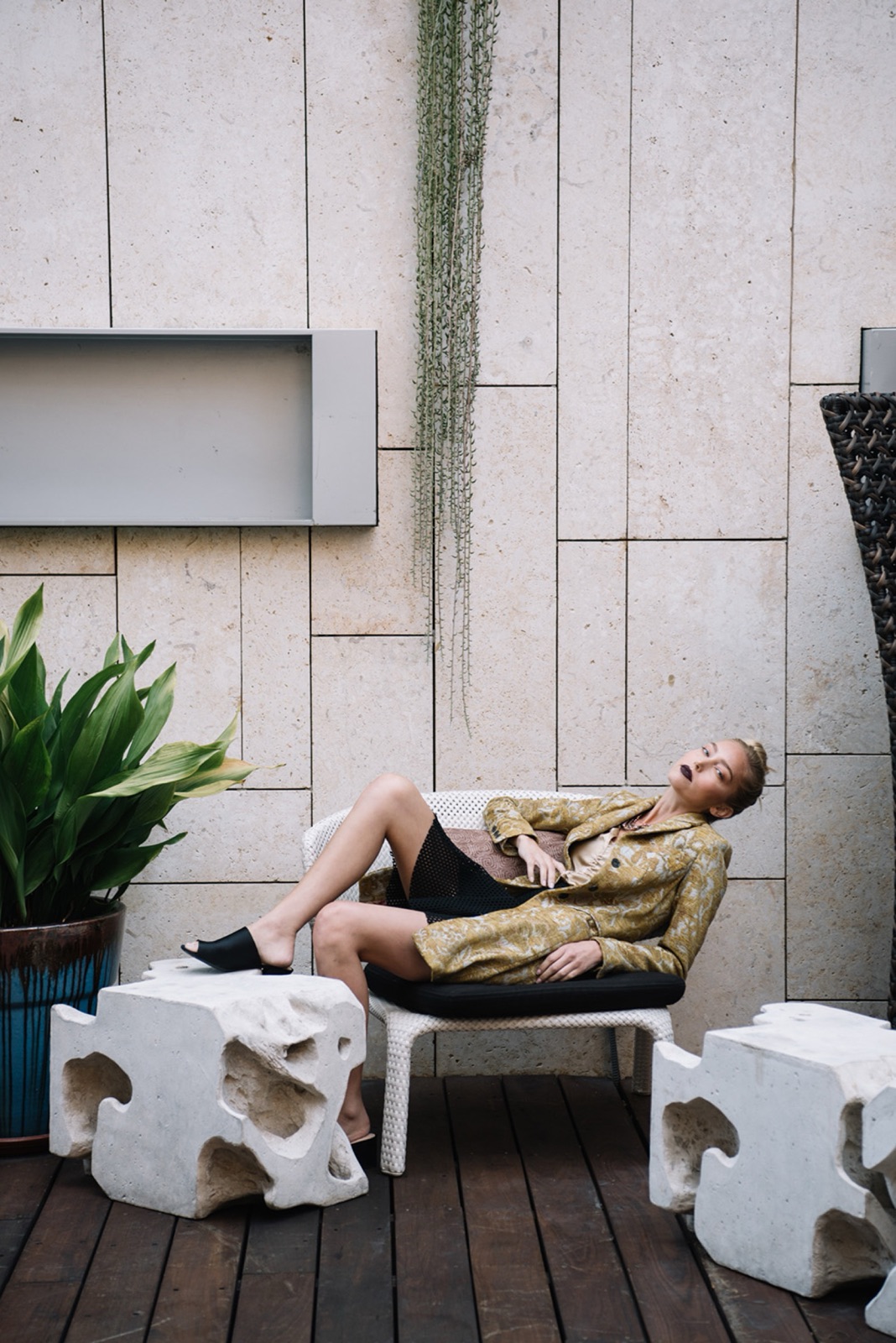
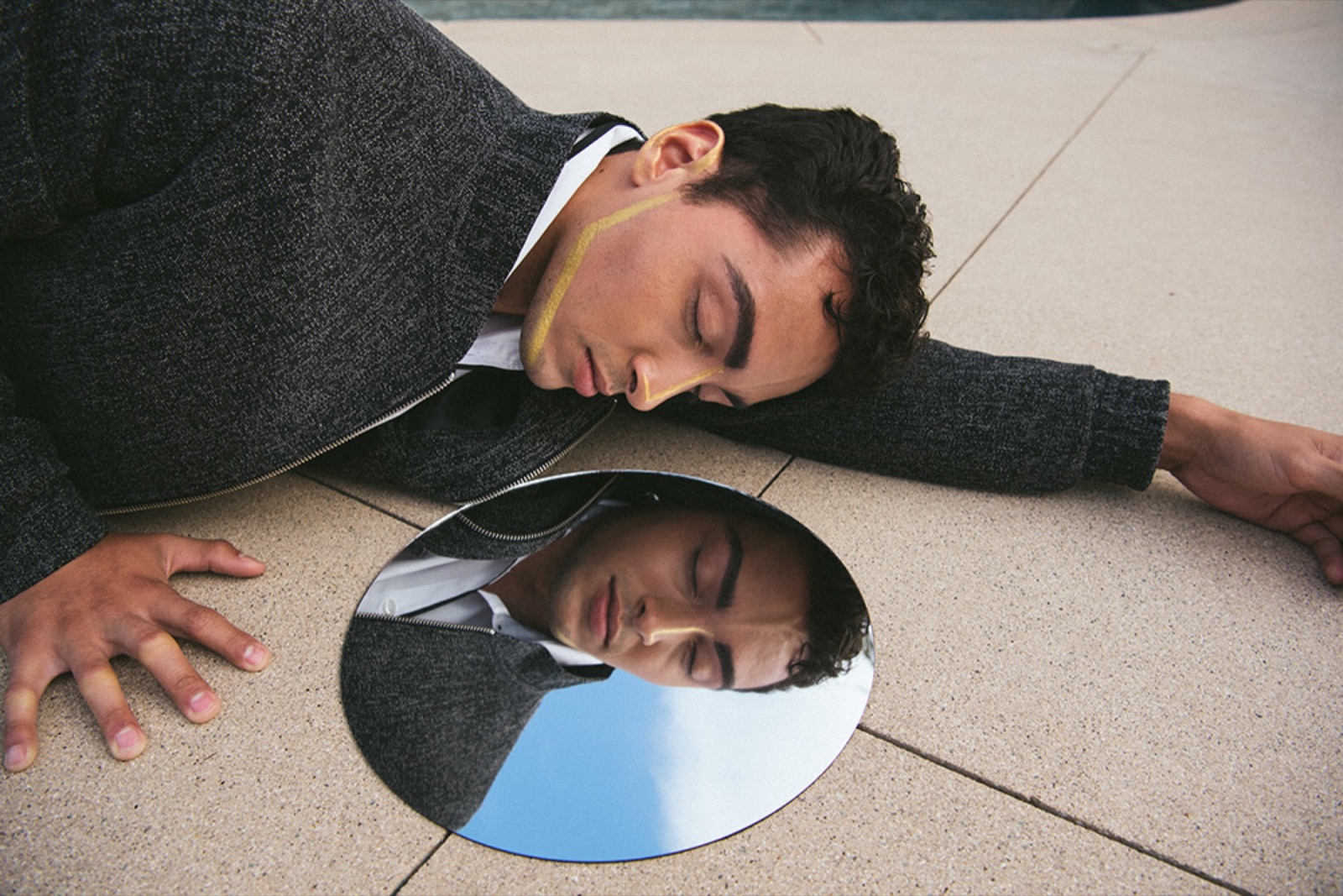
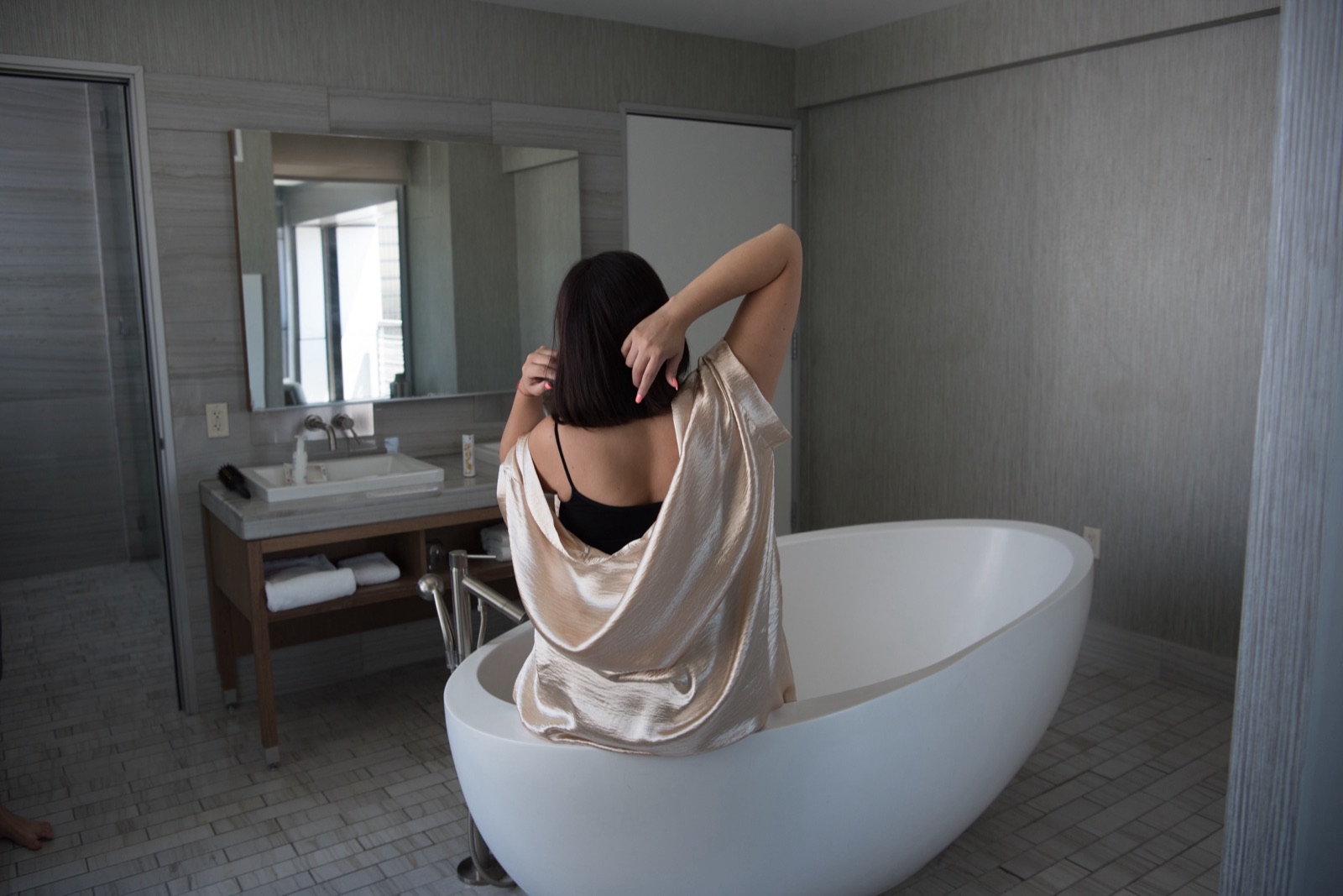
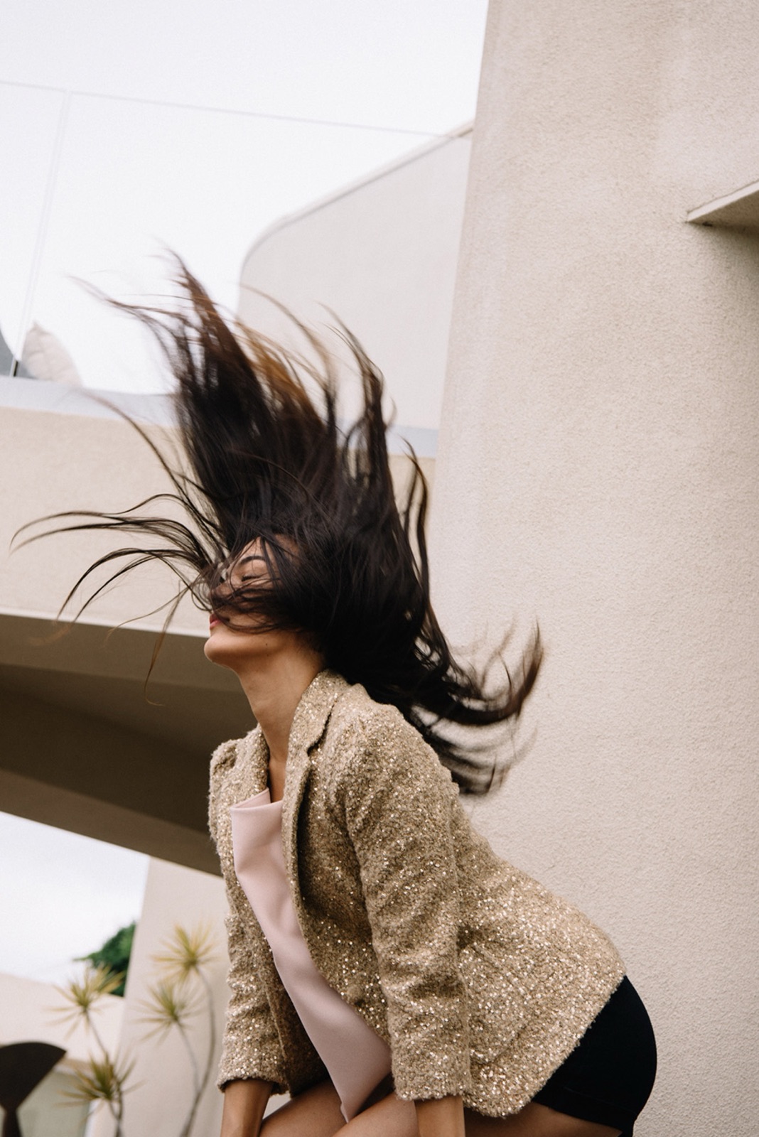
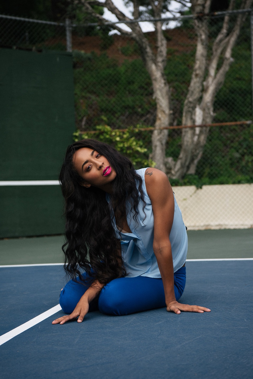
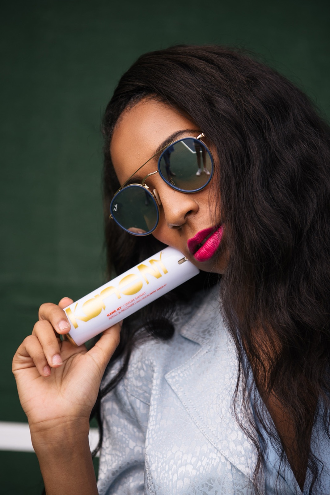
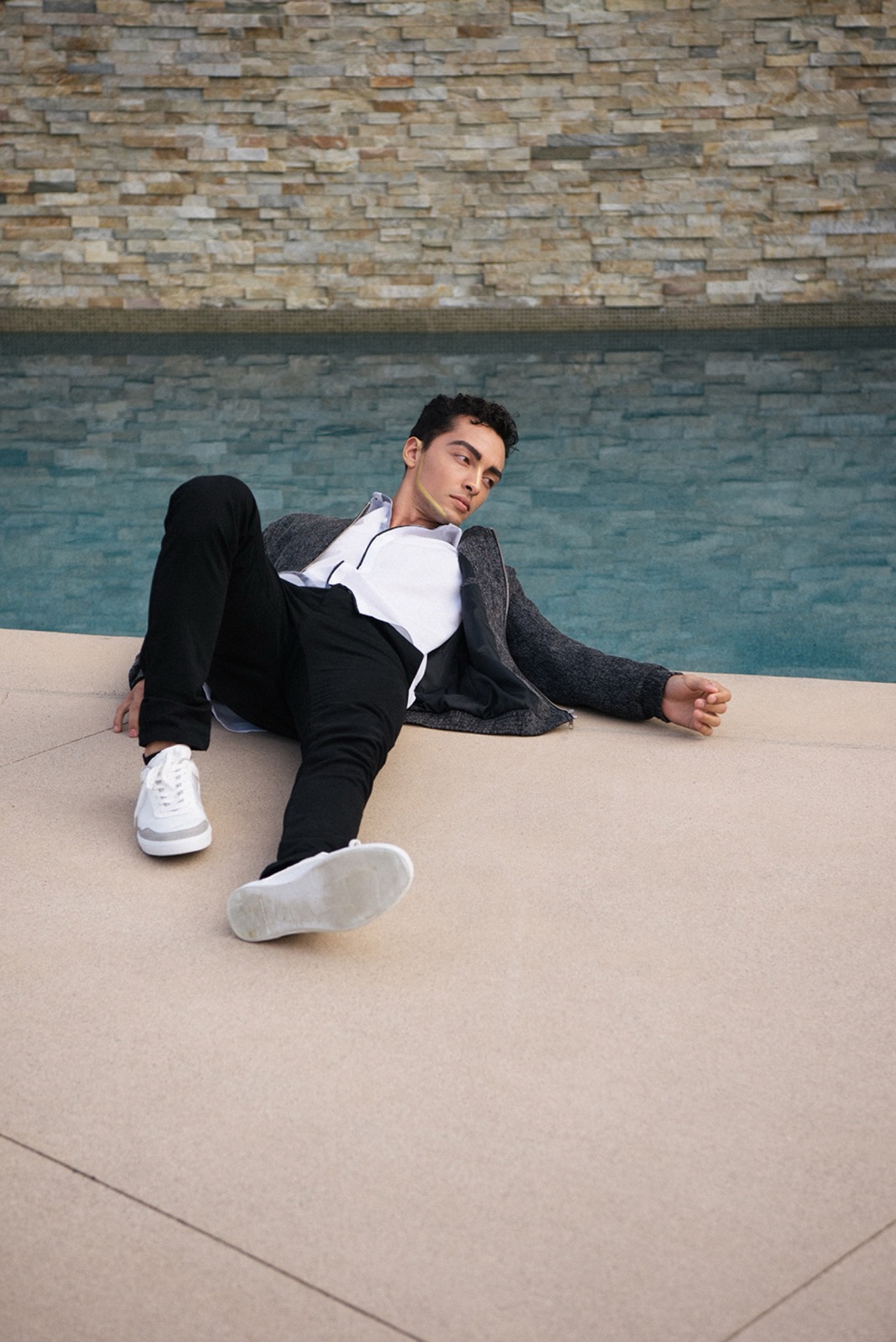
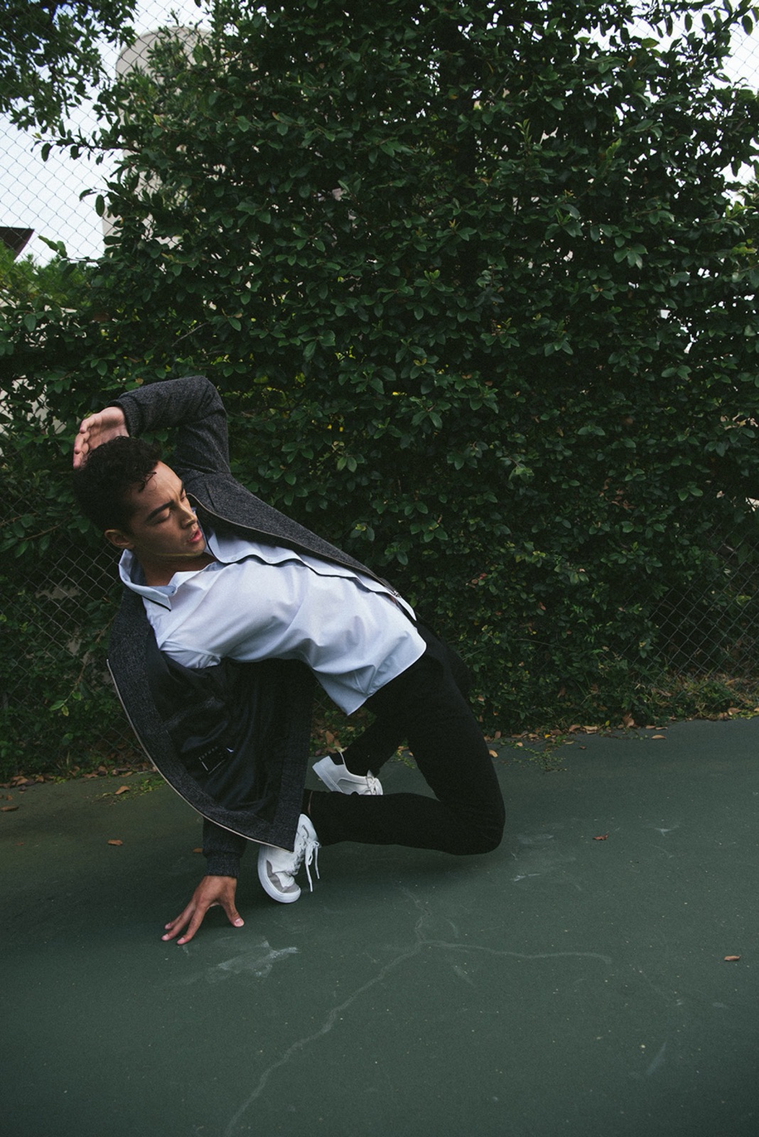
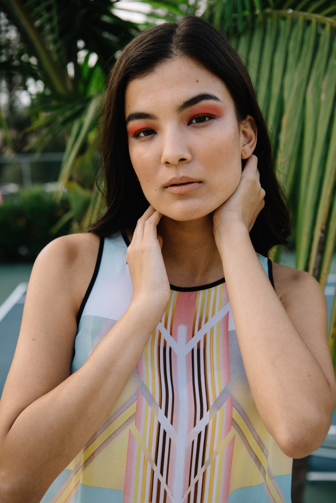
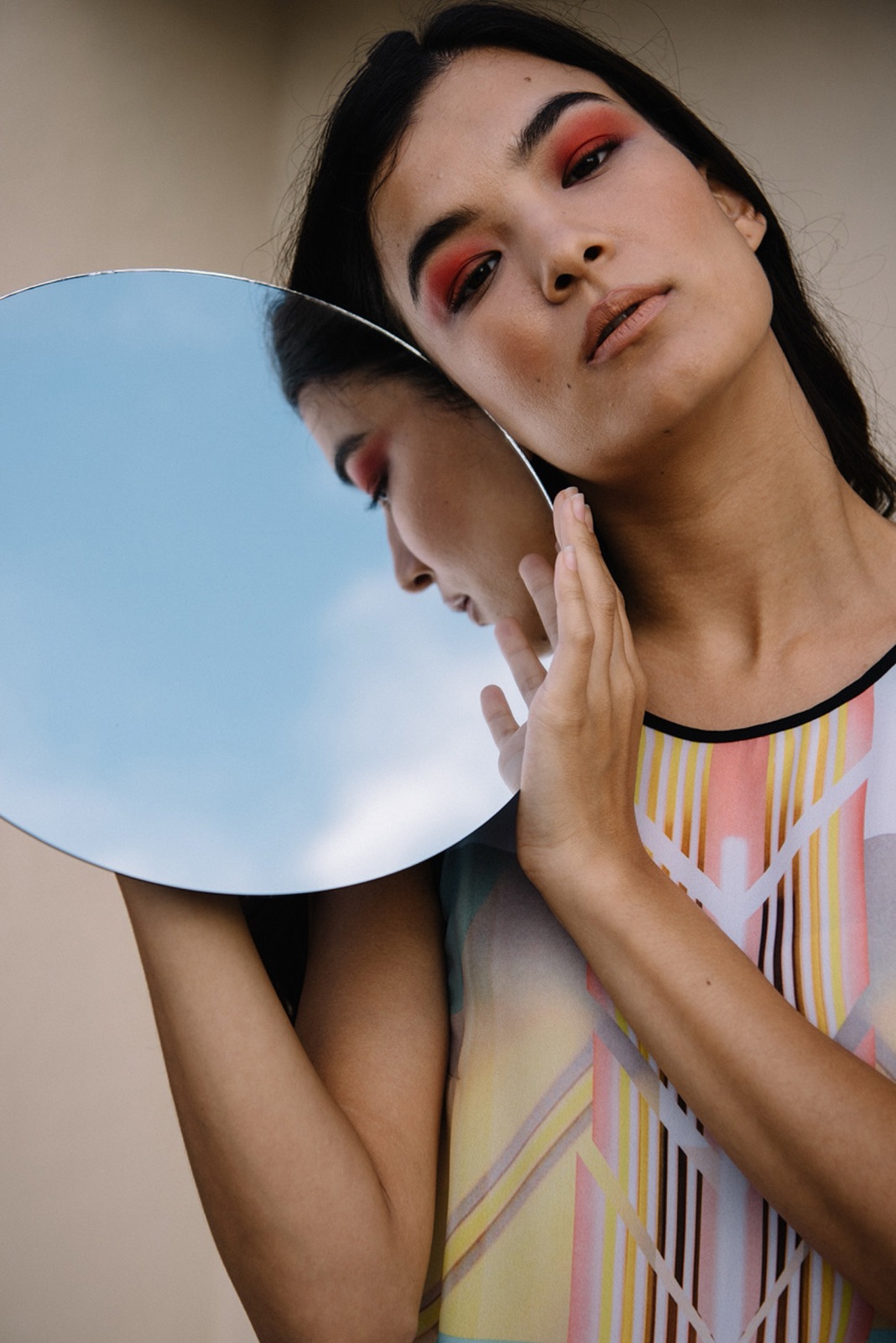
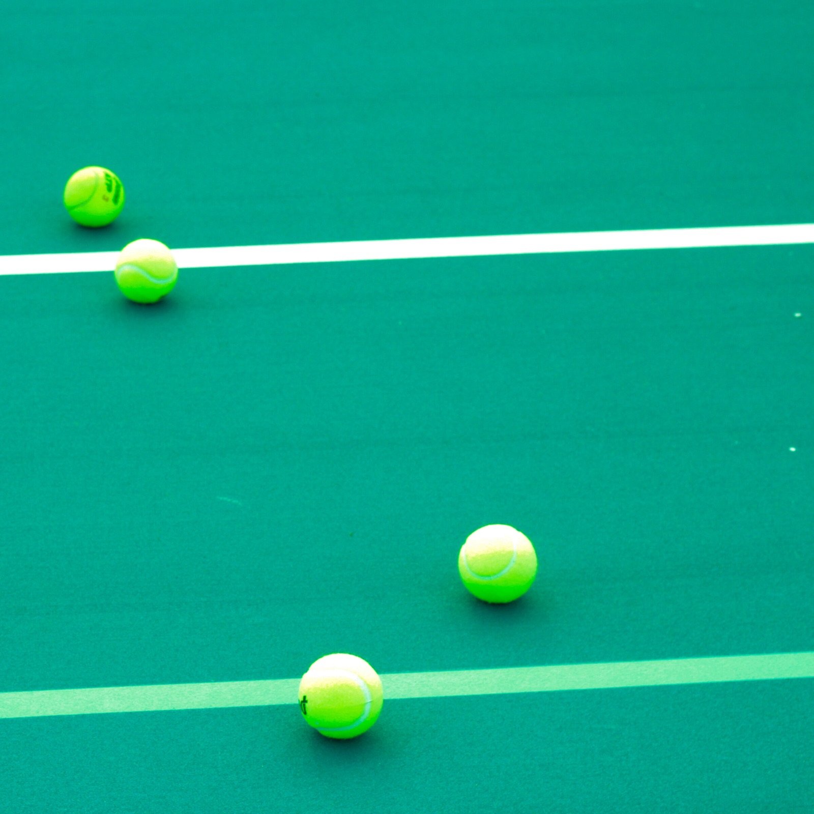
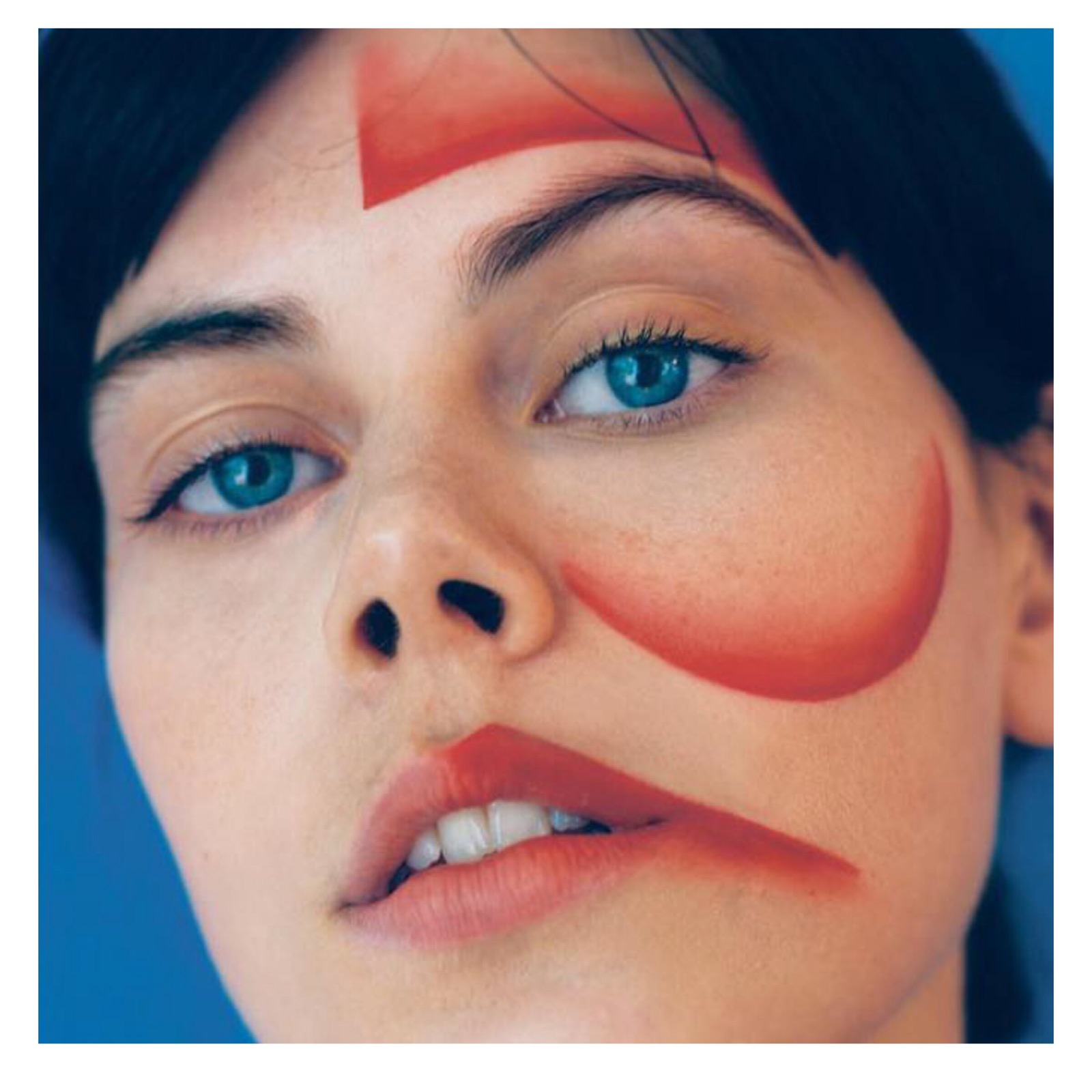
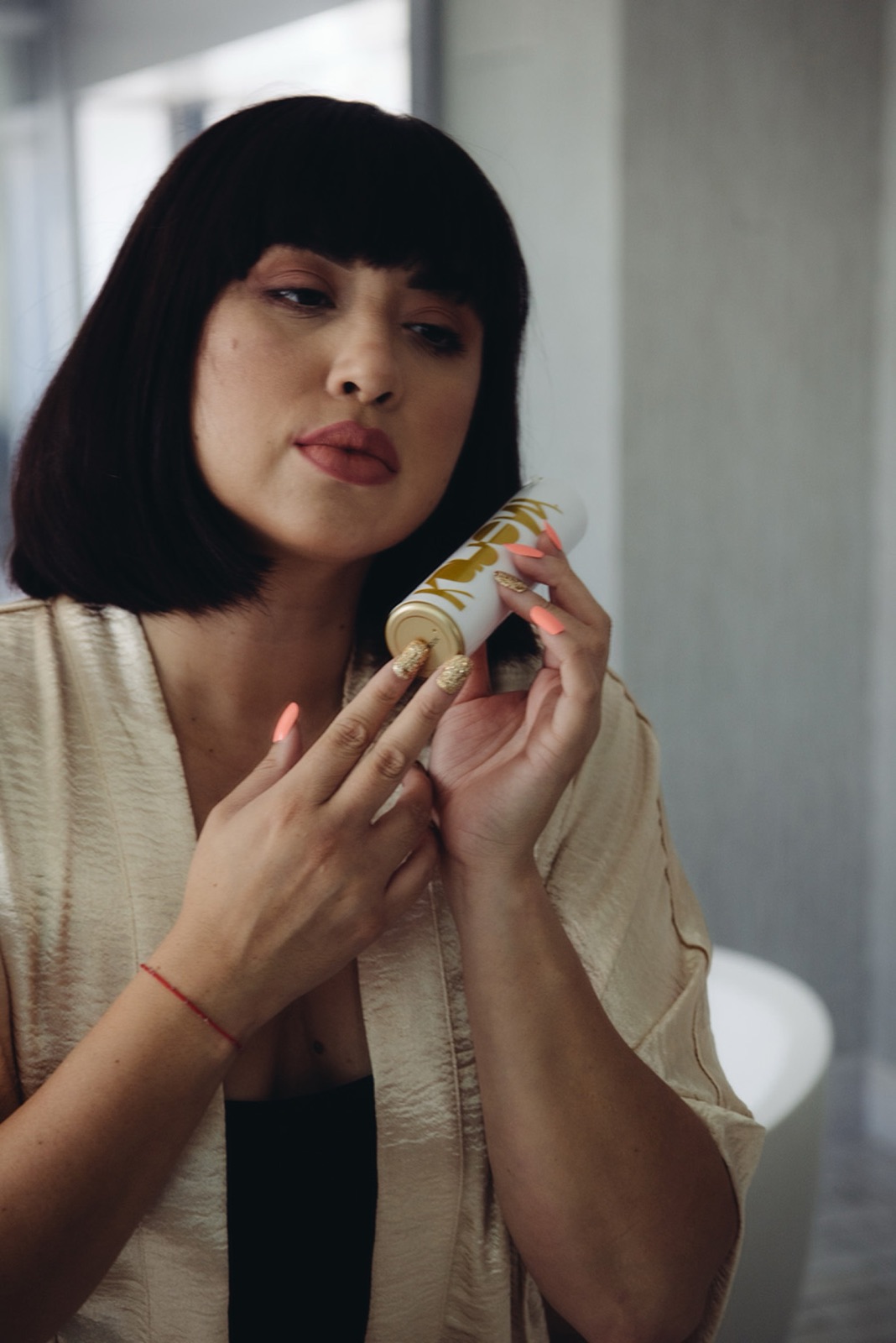
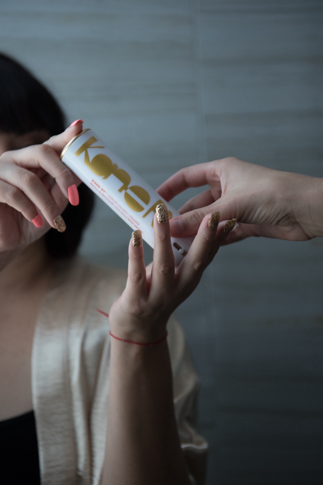
Original photography kept Kane NY from looking like anyone else on the shelf. A directed editorial shoot with photographer Leah Beilhart set the tone: pools, courts, dunes, and bathrooms in hard light, with the product in hand. Around it, four years of studio still lifes and location photography carried the product through texture, color, and the city.

Directed editorial

The editorial shoot, 2017.

The directed shoot that set the tone for the feed: pools, courts, dunes, and bathrooms in hard light.

Originals

Summer 2016. Originals.

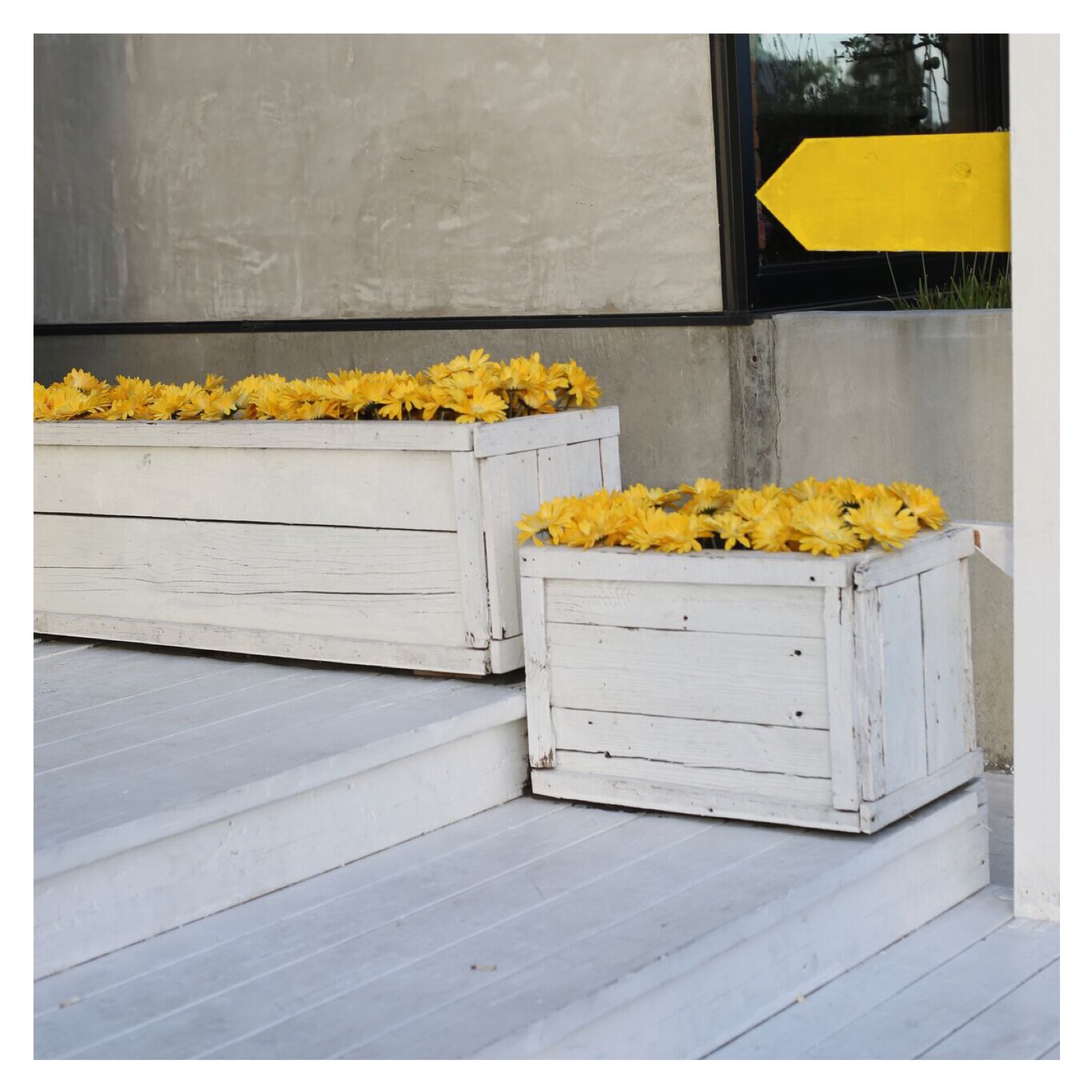
Place and surface studies shot for the feed between the directed editorials.

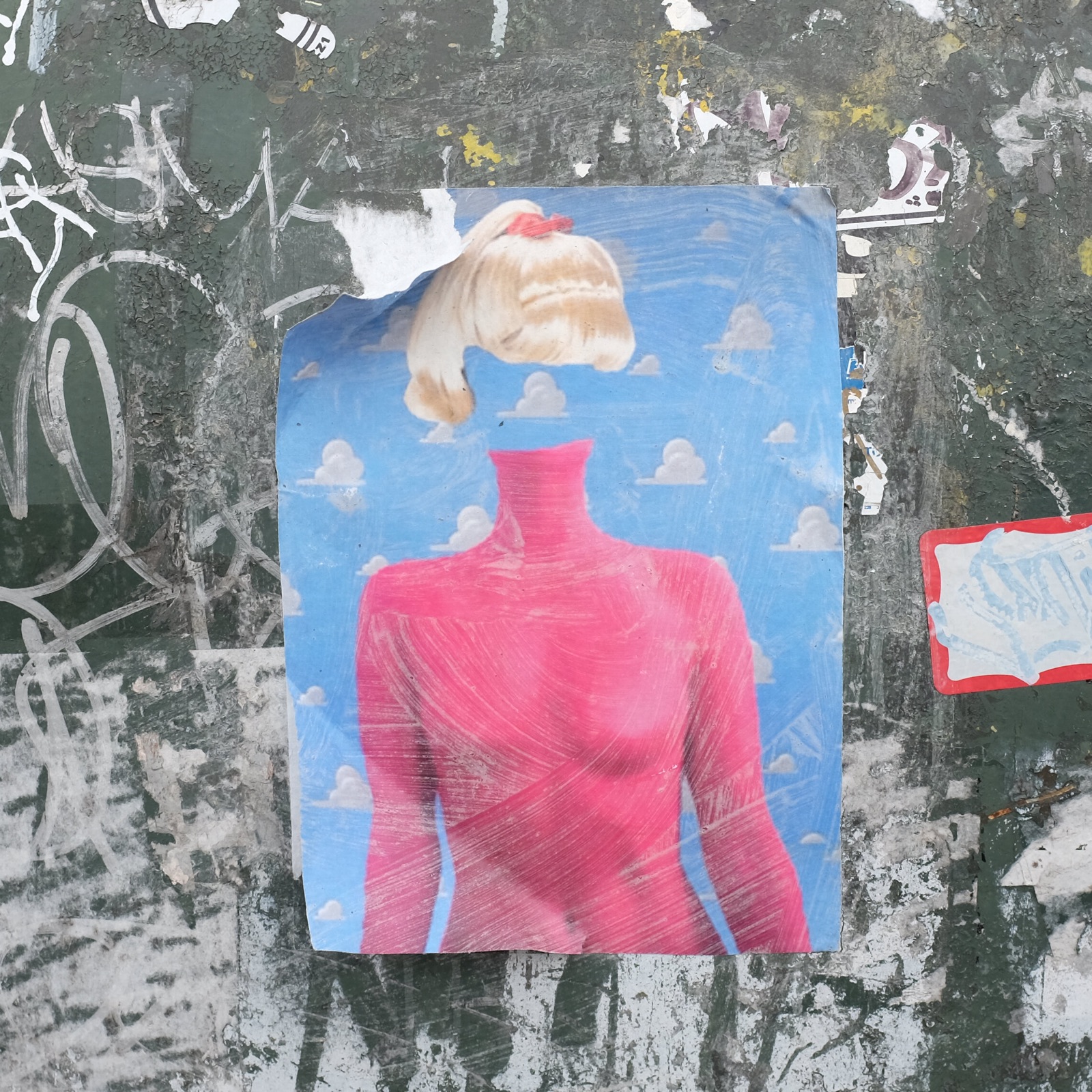
Torn poster of a figure in red on a scratched wall
Torn poster, scratched wall.
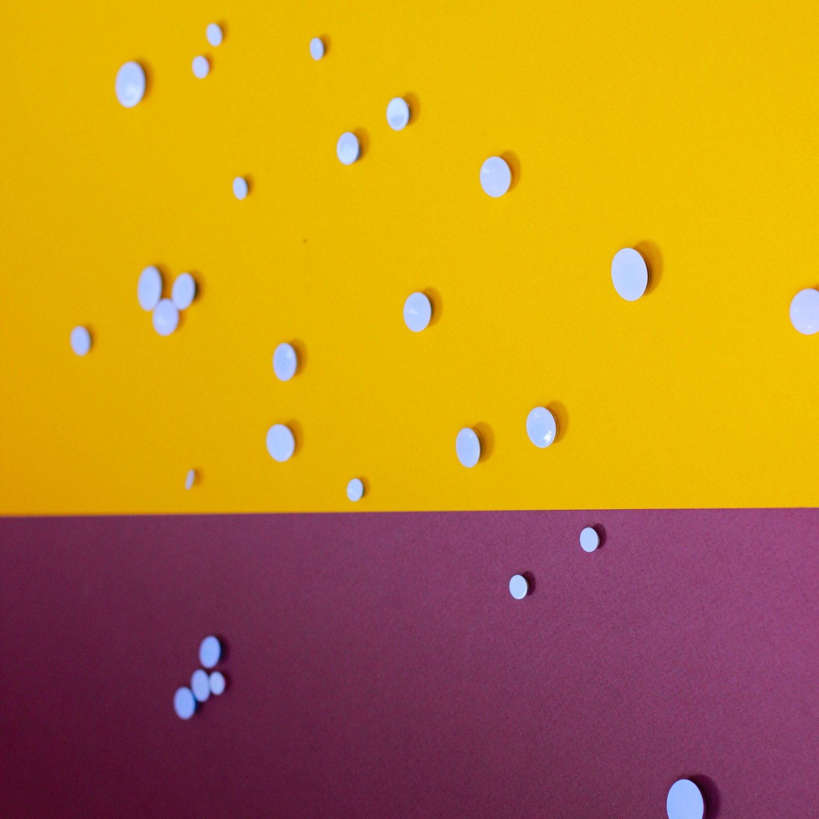
White drops scattered across a yellow and magenta ground
Drops on yellow and magenta.
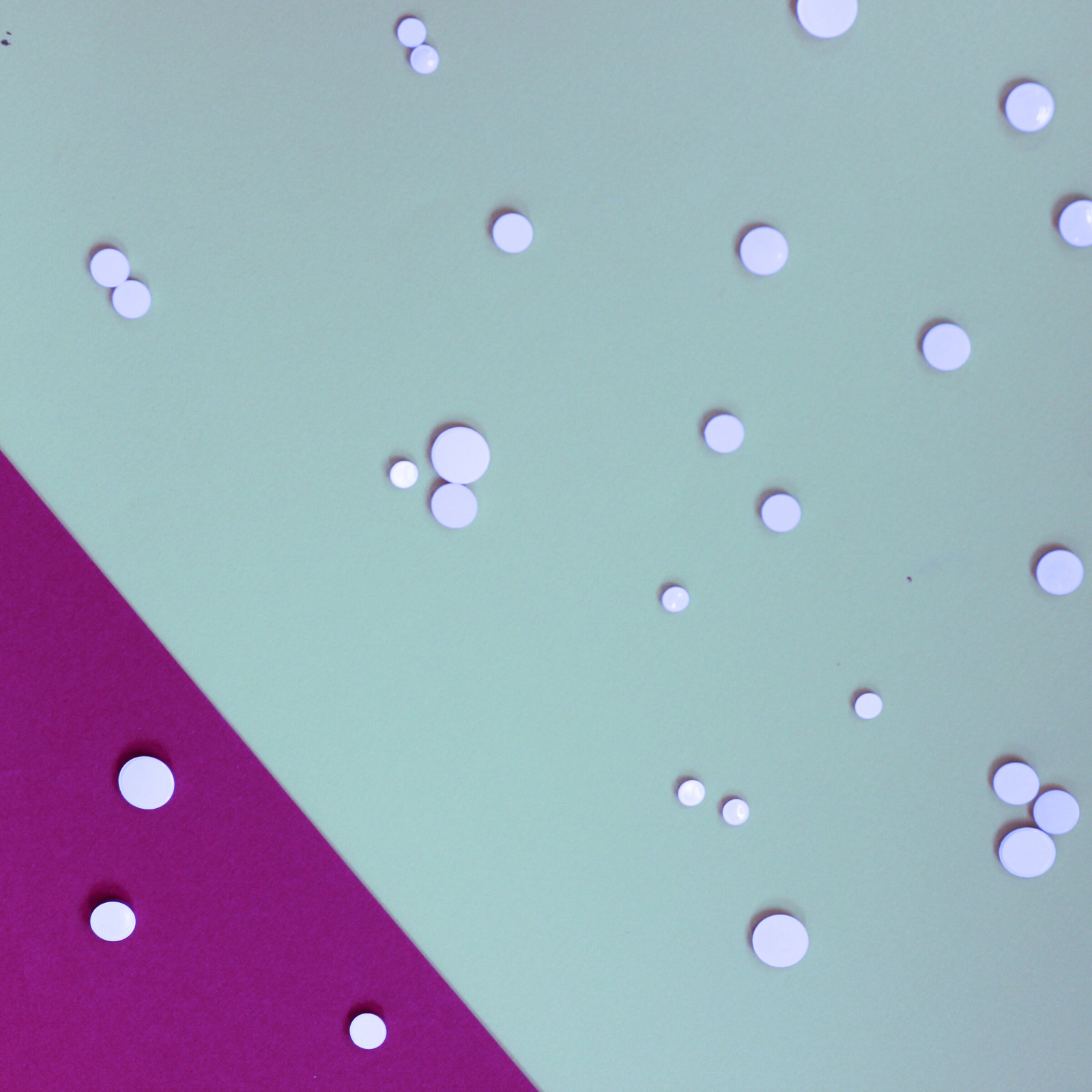
White drops on pale blue and magenta paper
Drops on pale blue and magenta.
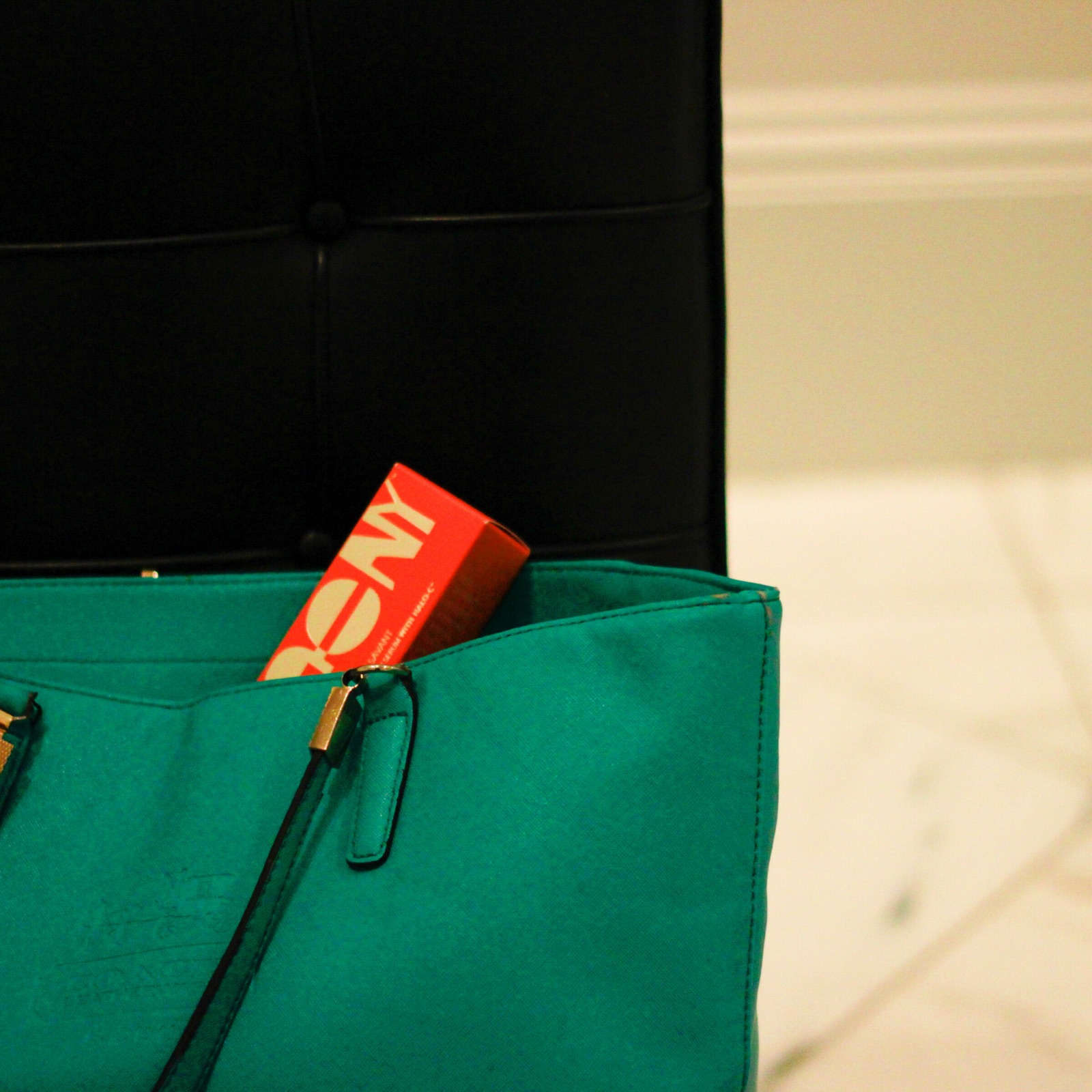
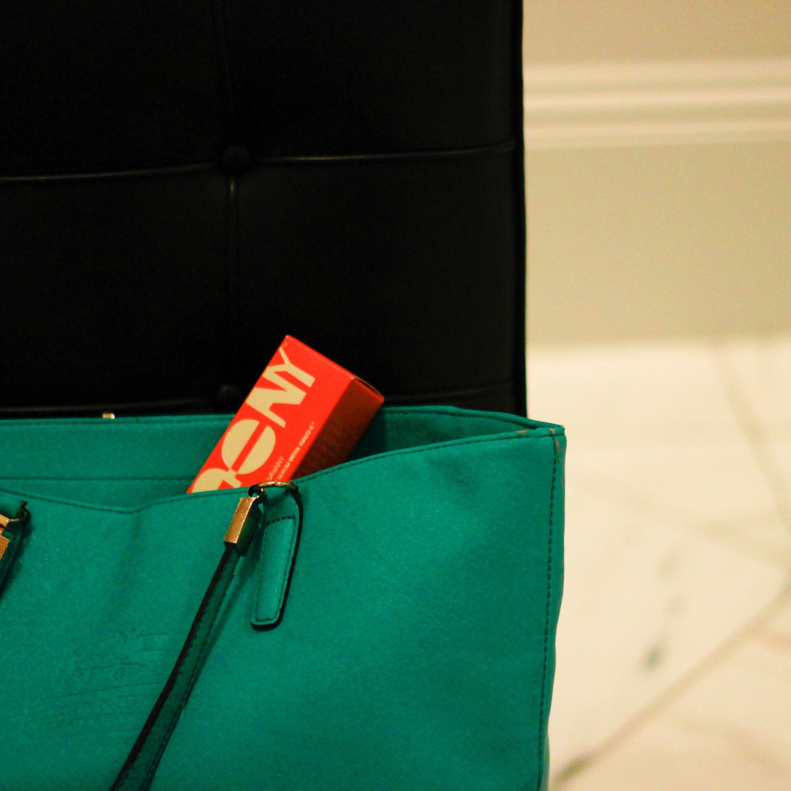
Serum Savant box tucked into a green leather bag
The box in a green bag.
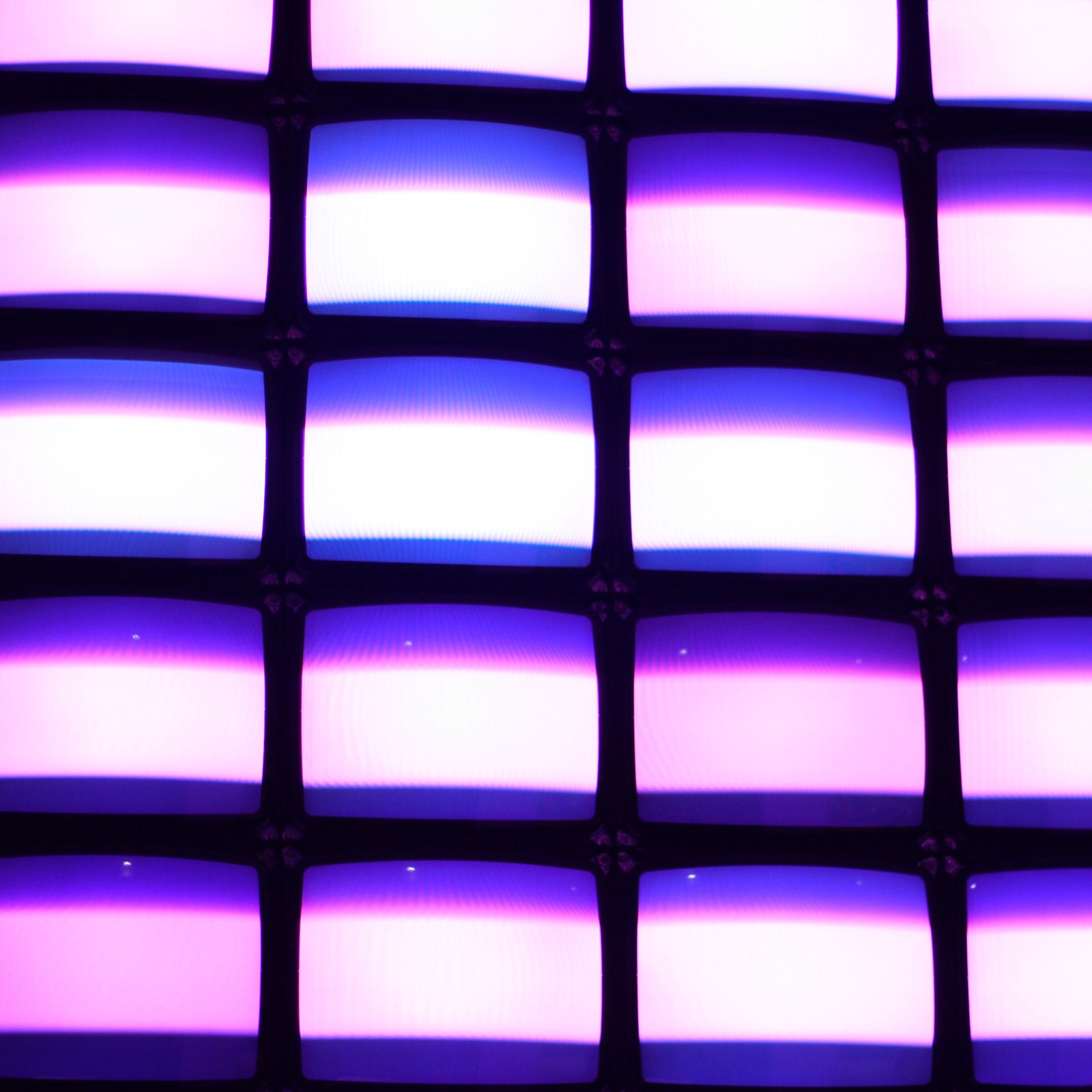
Grid of violet light panels
Violet light, a grid of panels.
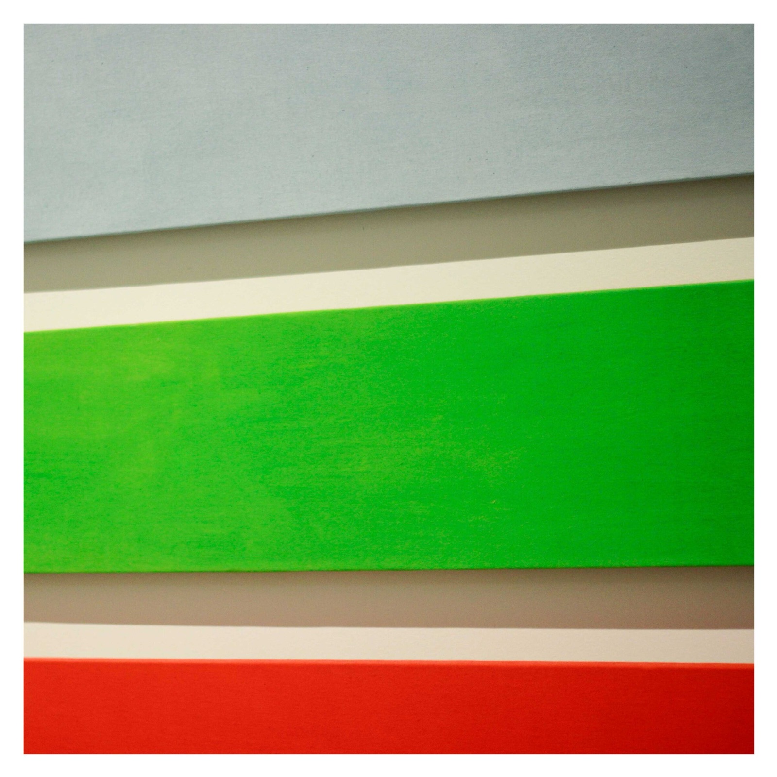
Abstract painting in pink, green, and blue on a gallery wall
Gallery wall. Art as an infusion.
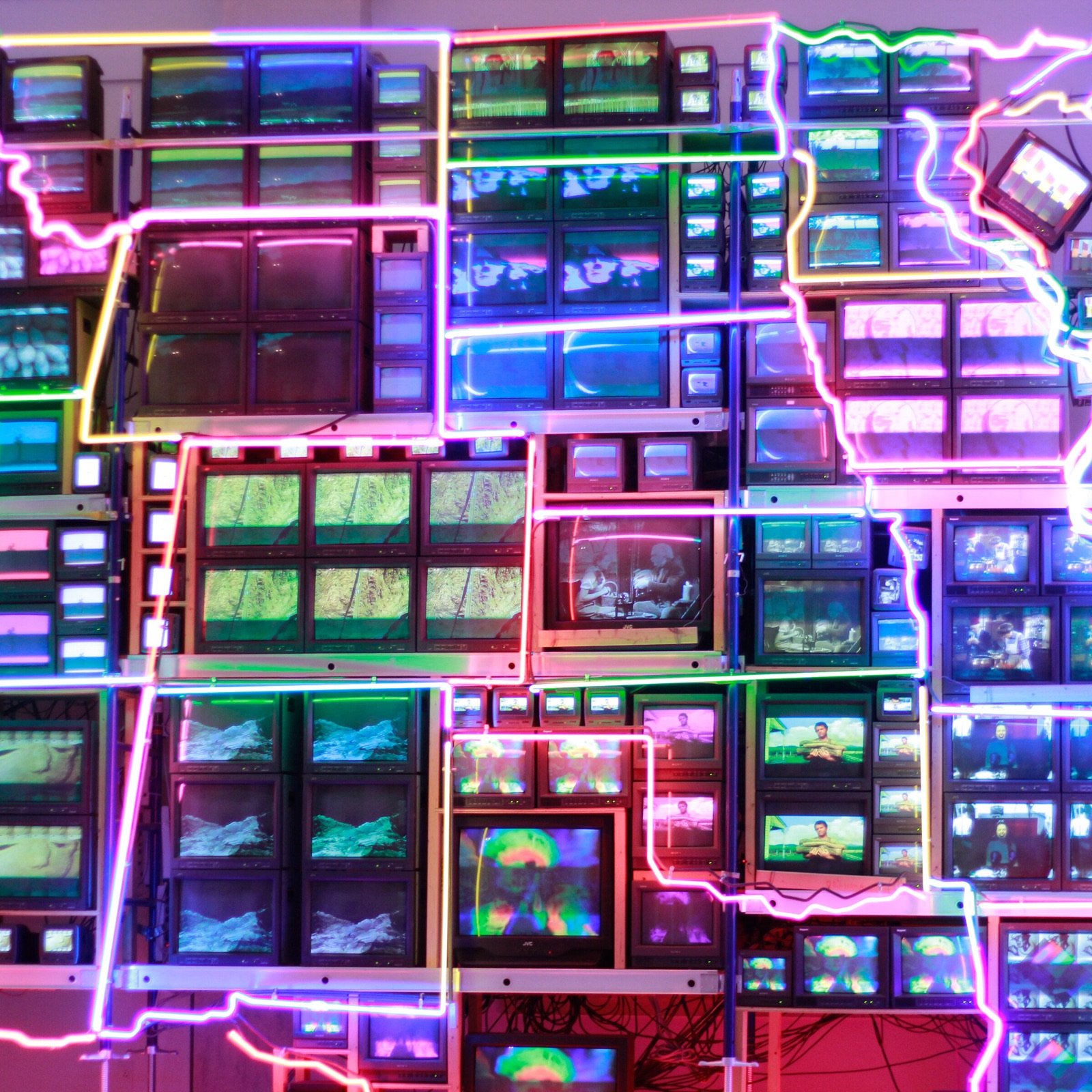
Neon circuit map in pink and blue
Neon map.
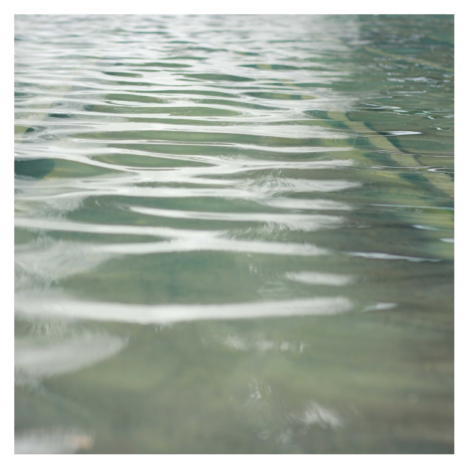
Ripples on gray-green water
Water, ripples.

Feed

Spring 2017.

Color as the organizing principle: green, pink, blue, red, gold, and white rows across the season.

Feed

2019.

The last full year of the program.

03

Feed

The feed as an editorial layout.

We treated the Instagram grid as a magazine spread. Every post was designed as part of a larger composition, and each week a wide hero row ran across all three columns, marking a season, a product moment, press coverage, or one of the three brand promises. The result was a profile that read as one continuous piece of art direction.

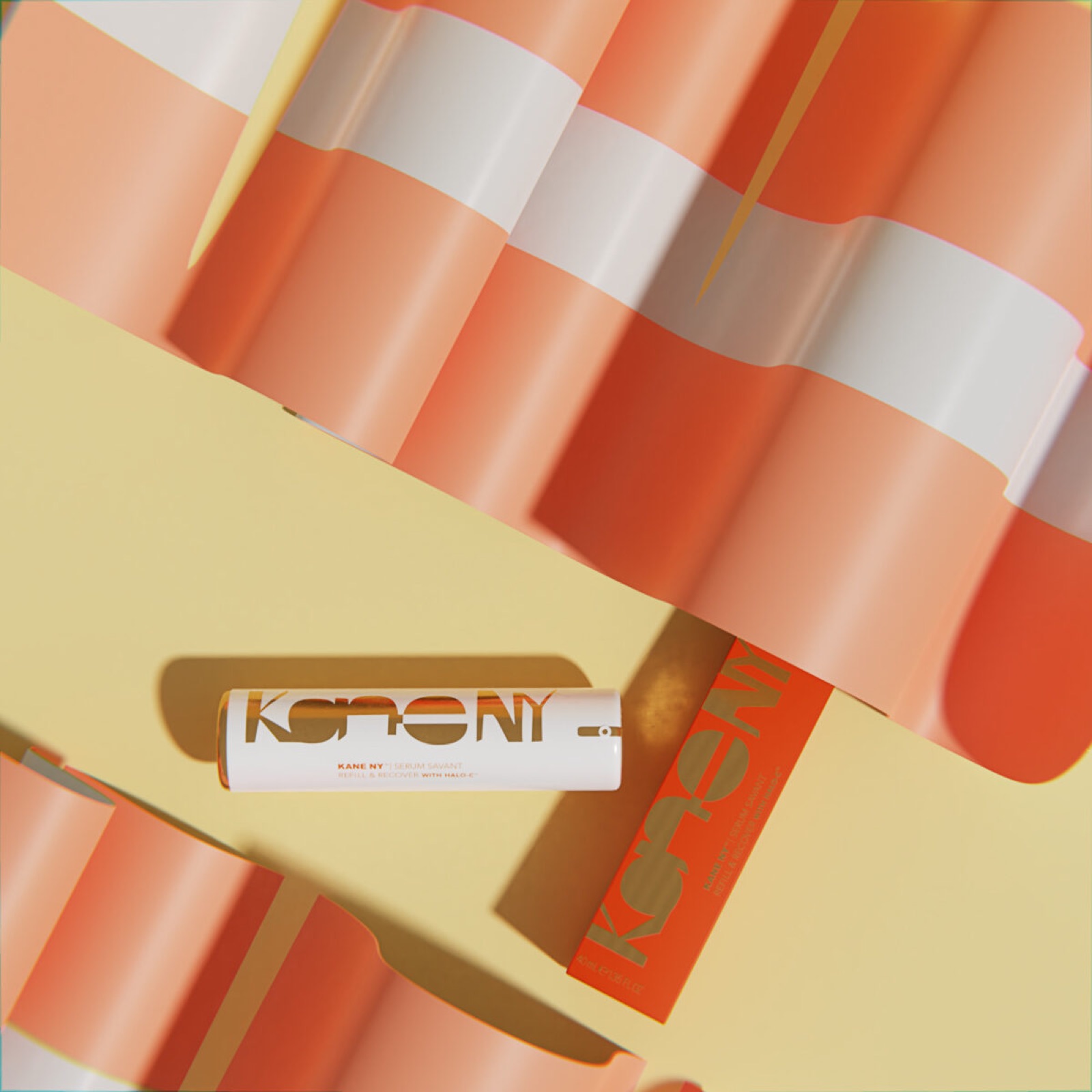
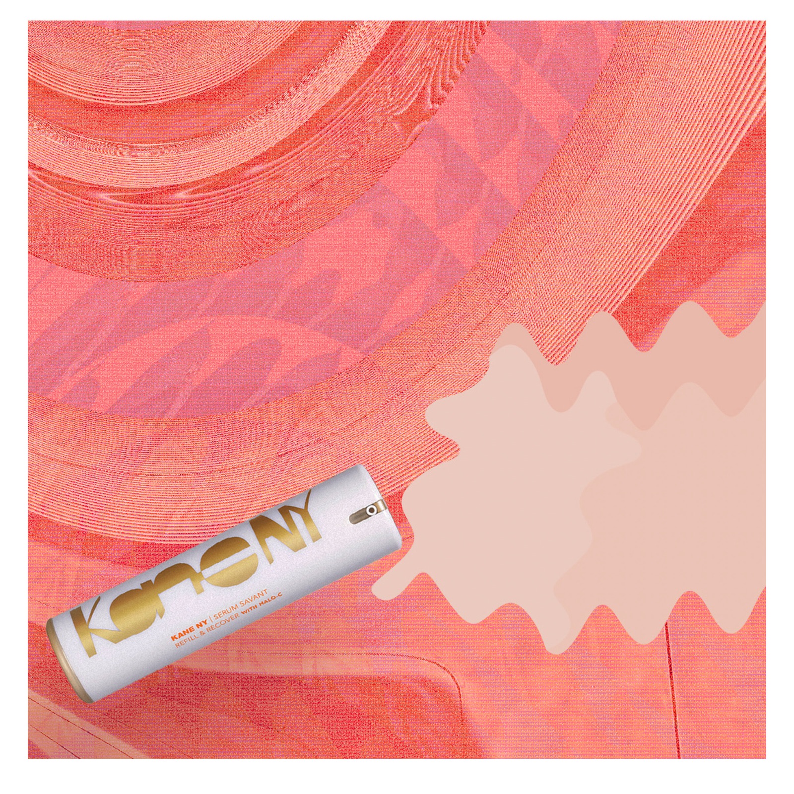
Most hero rows were built in 3D. Rendering the product in surreal, art-directed sets gave the feed a scale and polish usually reserved for far larger brands, and kept a new row going out every week.

Instagram · 2015–2019

Managed end to end.

Strategy, art direction, photography, graphics, copywriting, and posting were all handled in-house, so the feed kept one voice and one look for four years.

Kane #KaneGetEnough card on phone
Kane NY hero row, Radiance, September 2018
Radiance, September 2018. One of three rows for the brand promises.
Kane NY hero row, Contour, September 2018
Contour, September 2018.
Kane NY hero row, Visual, September 2018
Visual, September 2018.
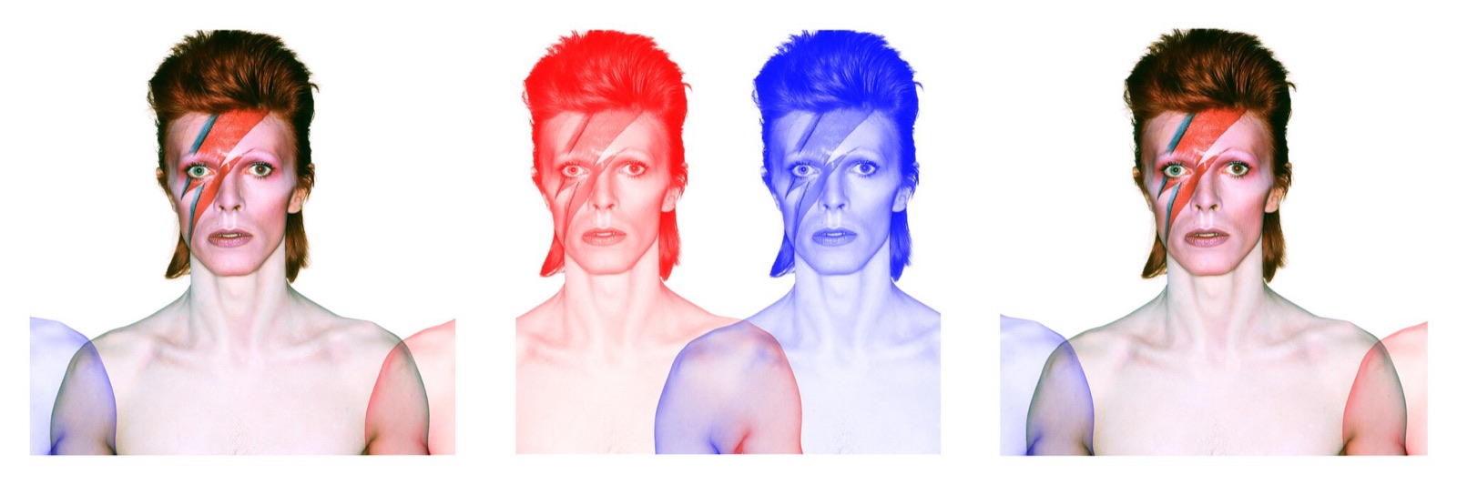
Kane NY hero row, David Bowie tribute, April 2016
David Bowie tribute, April 2016.
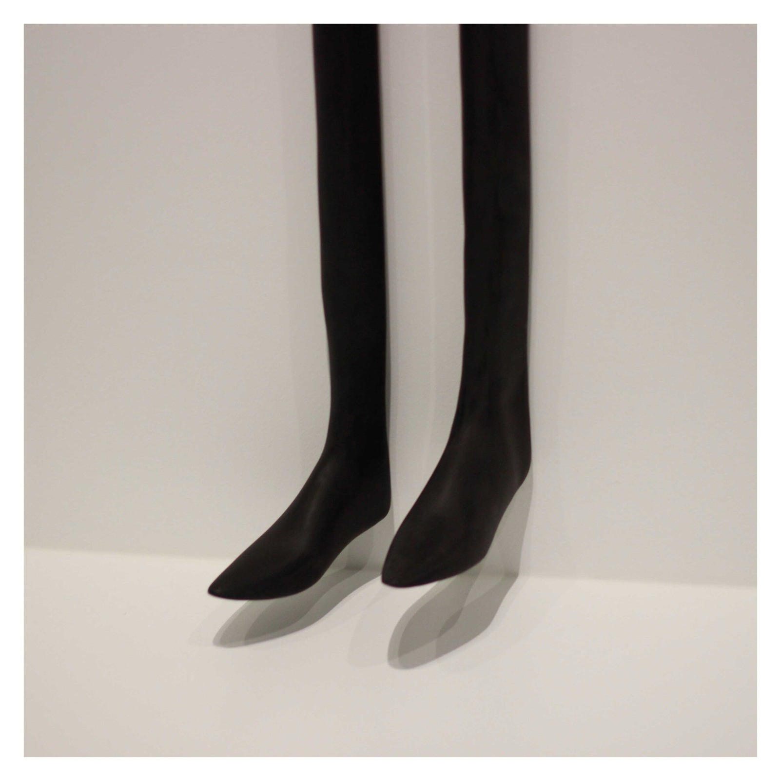
Kane NY hero row, MoMA, April 2016
MoMA, April 2016.
Kane NY hero row, green color story, March 2017
Green, March 2017. A spring series organized by color.
Kane NY hero row, pink color story, March 2017
Pink, March 2017.
Kane NY hero row, sunset orange, July 2017
Sunset orange, July 2017.
Kane NY hero row, embroidery, October 2017
Embroidery, October 2017.
Kane NY hero row, color blocks, July 2016
Blocks, July 2016.
Kane NY hero row, Elle feature, May 2017
Elle feature, May 2017. Press placed into the feed as a row.

Forty-four rows, 2016 to 2018.

Two years of weekly rows, by season.

04

Dimensional

Dimensional design became the signature.

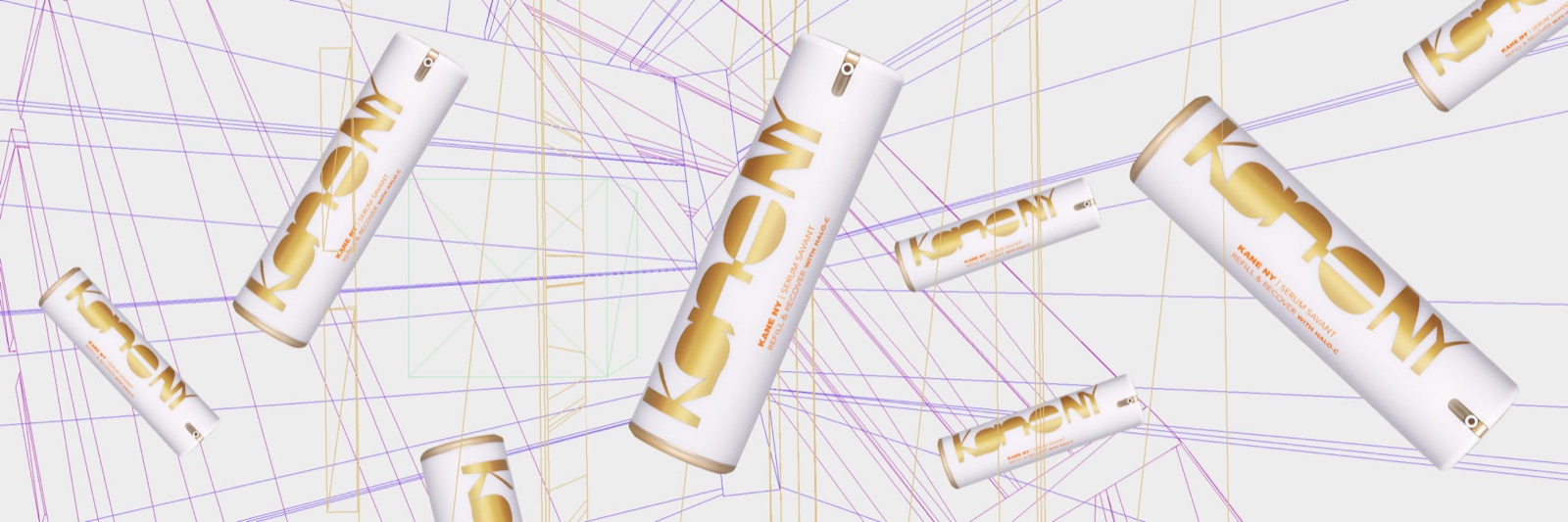
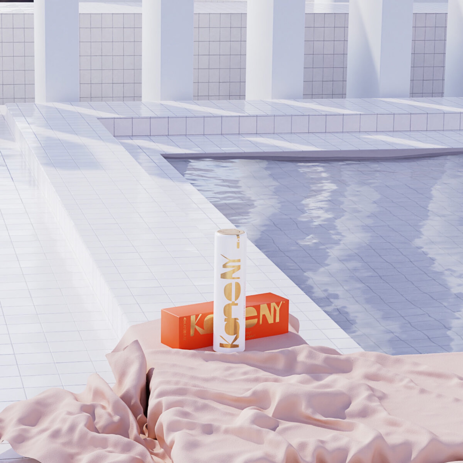
The serum and its box were rendered in 3D across surreal, art-directed sets: a tiled courtyard, a poolside towel, a field of stone spheres, a wireframe hand. What began as a way to keep the calendar full between shoots became the look people associated with Kane NY.

Kane NY 3D render, the tube and box in a pink tiled courtyard with chrome spheres
Courtyard.
Kane NY 3D render, the tube and box on a striped towel at a pool edge
Poolside.
Kane NY 3D render, the tube floating among grey stone spheres
Stone spheres.
Kane NY 3D render, the tube resting in a wireframe hand over a nebula
Wireframe hand.
05

#KaneGetEnough

#KaneGetEnough and partnerships.

#KaneGetEnough, a monthly feature celebrating women in business, fashion, beauty, and art, gave the brand a voice beyond product. Influencer partnerships in beauty and wellness were art directed to the same standard, so partner content strengthened the feed rather than interrupting it.

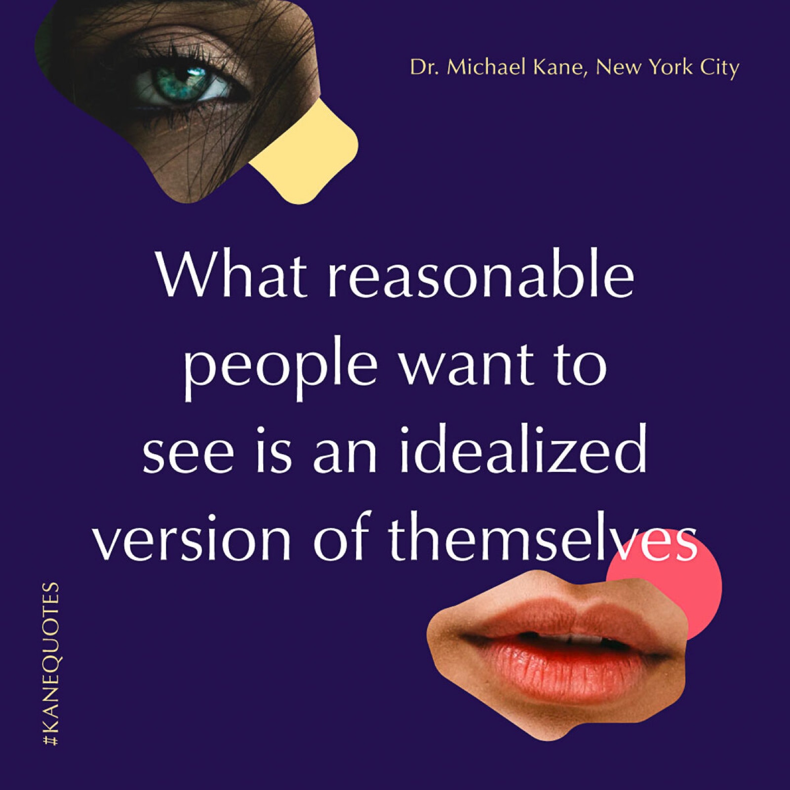
#KaneGetEnough quote card.
06

Website

The website.

In 2017 we redesigned kaneny.com to bring the feed’s art direction to the brand’s home. The site leads with Serum Savant and the clinical story behind it, a 100% efficacy rate in clinical trials, followed by press from Elle, Grazia, and Space NK.

The two products are presented as a morning and evening routine, which gives the line a clear ritual and a reason to buy both.

The redesigned home page, 2017.

Cut from the full case study at wrkhrs.co/work/kane-ny

From
Abraham Garcia
Studio
Charleston, South Carolina
Email
abe@wrkhrs.co
Phone
(202) 550-7569
Studio site
www.wrkhrs.co
LinkedIn
in/thehonestape