



The brief.
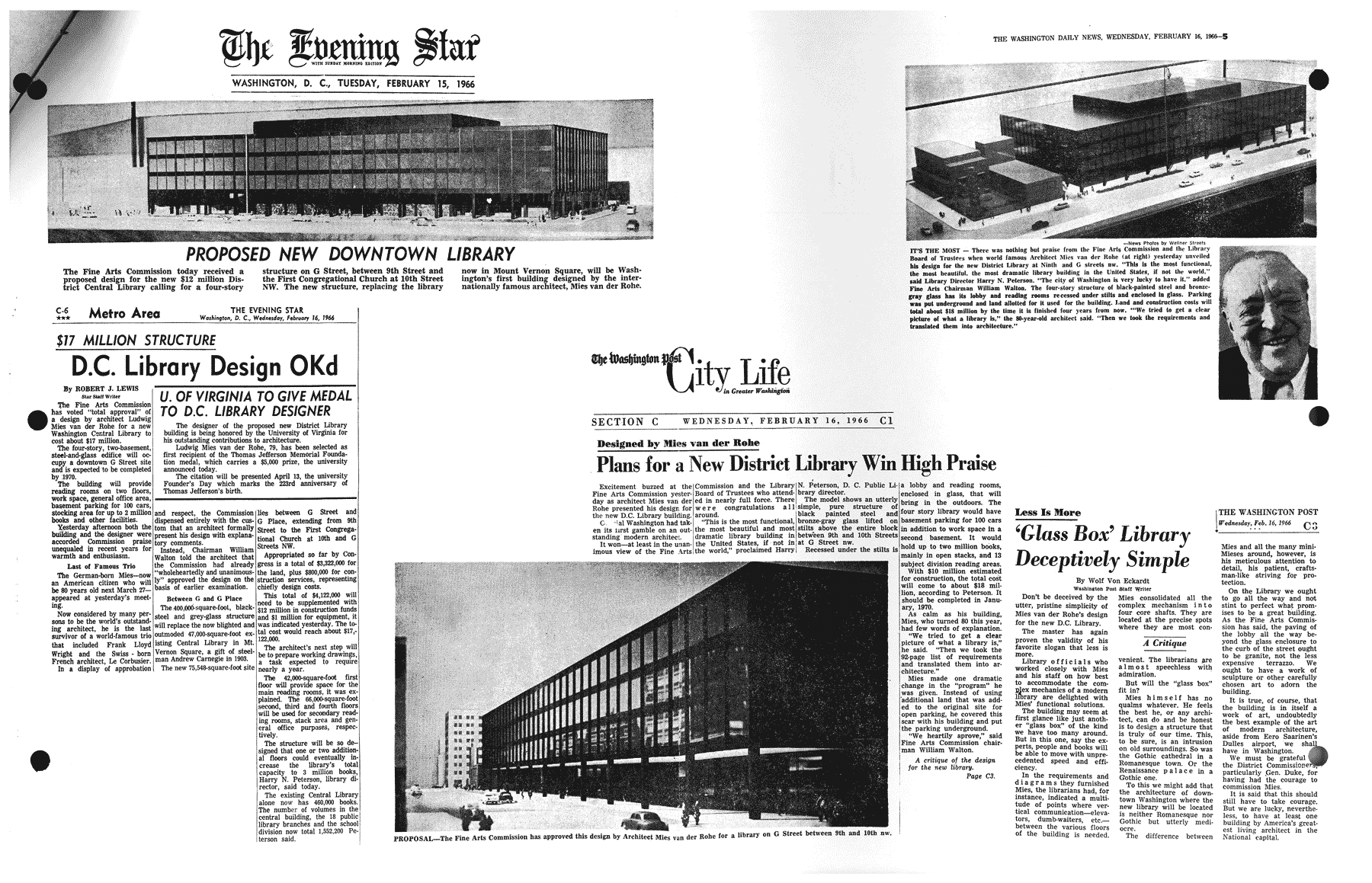
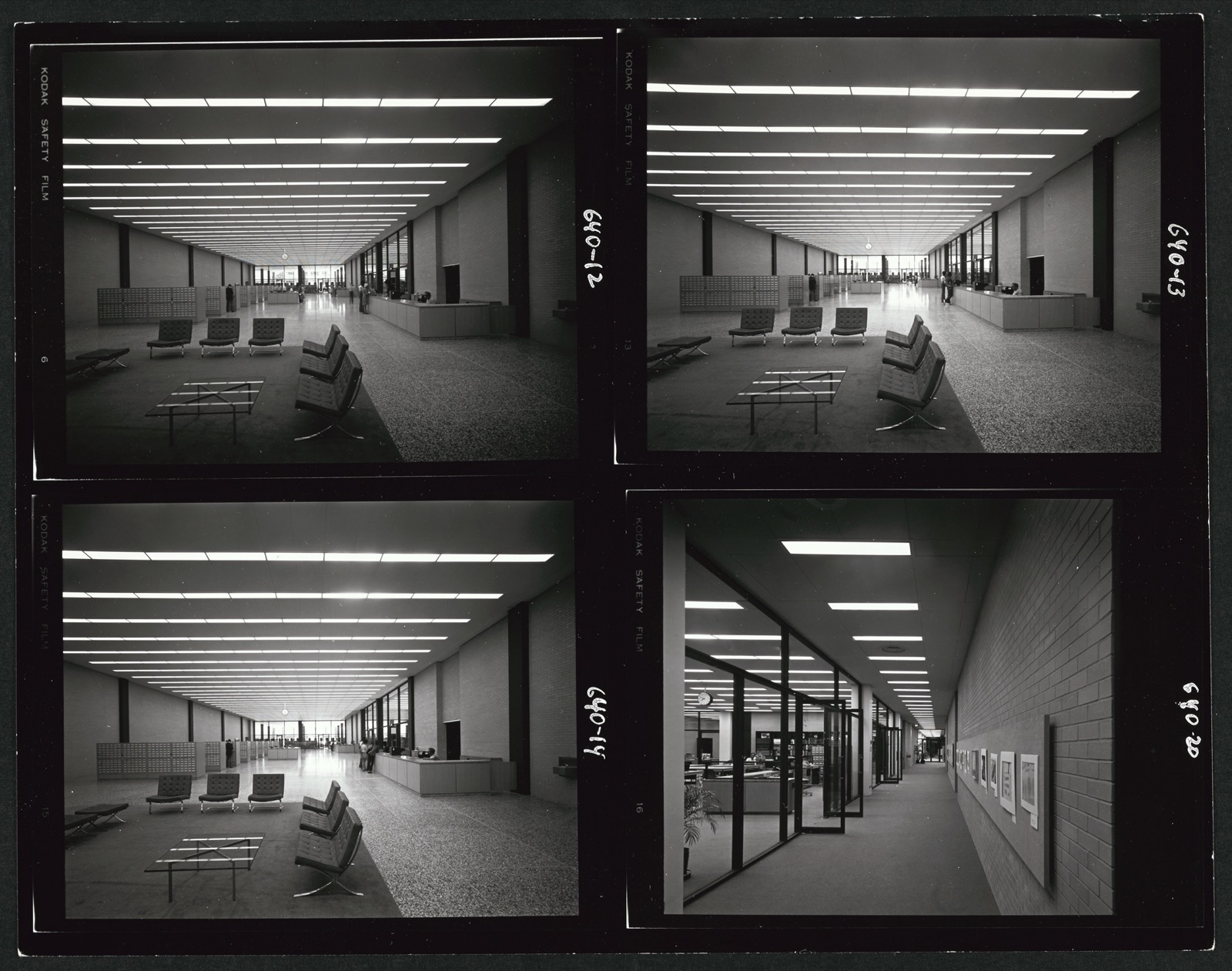
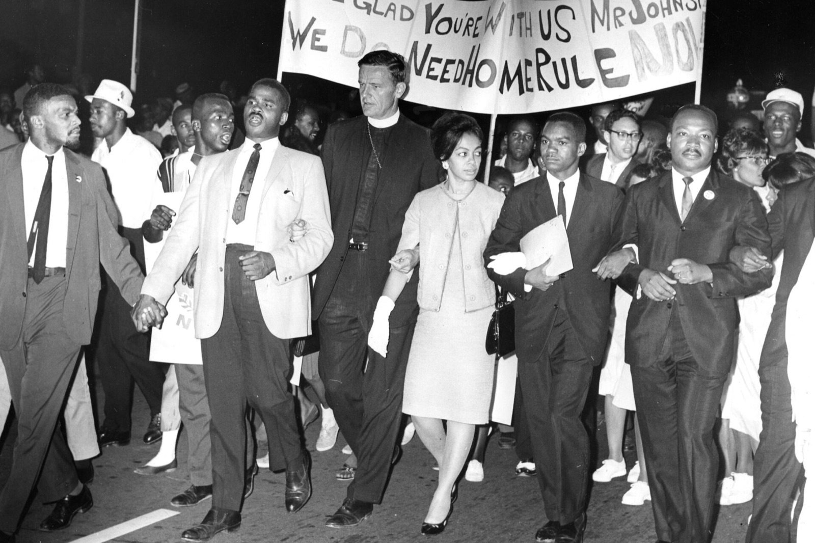
The Martin Luther King Jr. Memorial Library is the District’s central library and the only public library Ludwig Mies van der Rohe ever designed. The board named it for Dr. King less than a decade after the March on Washington. In 2020 the building reopened after a renovation by Mecanoo and OTJ Architects, and it reopened with a permanent exhibition on the city’s own history of protest: Dr. King’s ties to the District, Walter Fauntroy, Marion Barry, the Student Non-Violent Coordinating Committee, the Poor People’s Campaign, home rule.
The library asked for an exhibition that could tell that story inside a Bauhaus interior without arguing with the building, and that could be built from its own special collections. Workhorse was the brand and visual design partner, working with Bluecadet, Colloqate, Kubik Maltbie, Openbox and Studio Joseph and with the library’s curators and archivists from early 2019 through the opening.
Building
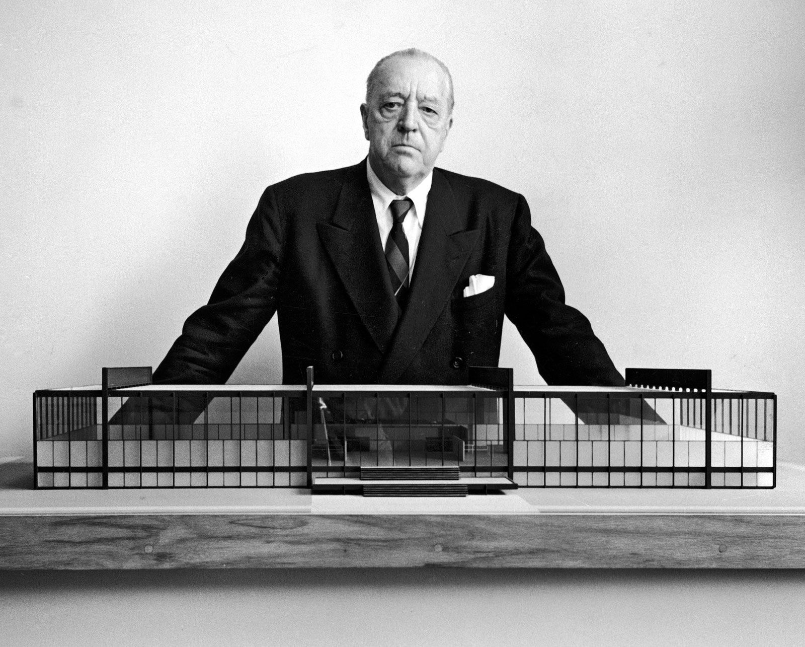
The only public library Mies built.
Ludwig Mies van der Rohe was the last director of the Bauhaus and one of the century’s most influential architects. The MLK Library is the only public library he designed.
The exhibition sits inside that building and had to be designed with it. The panel angles, the black steel, the flush glass and the grotesque on the captions all come from the interior.
Archive
The People’s Archive.
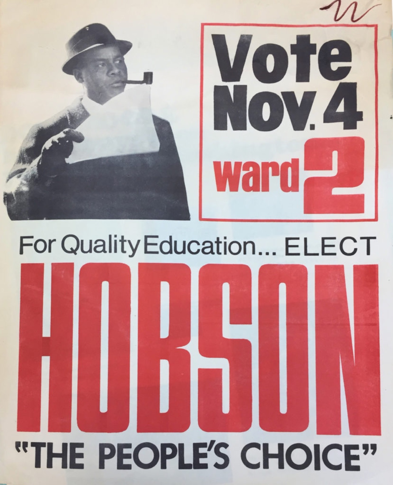
The library’s special collections hold the District’s own record of itself: photographs, fliers, correspondence and oral histories going back more than sixty years.
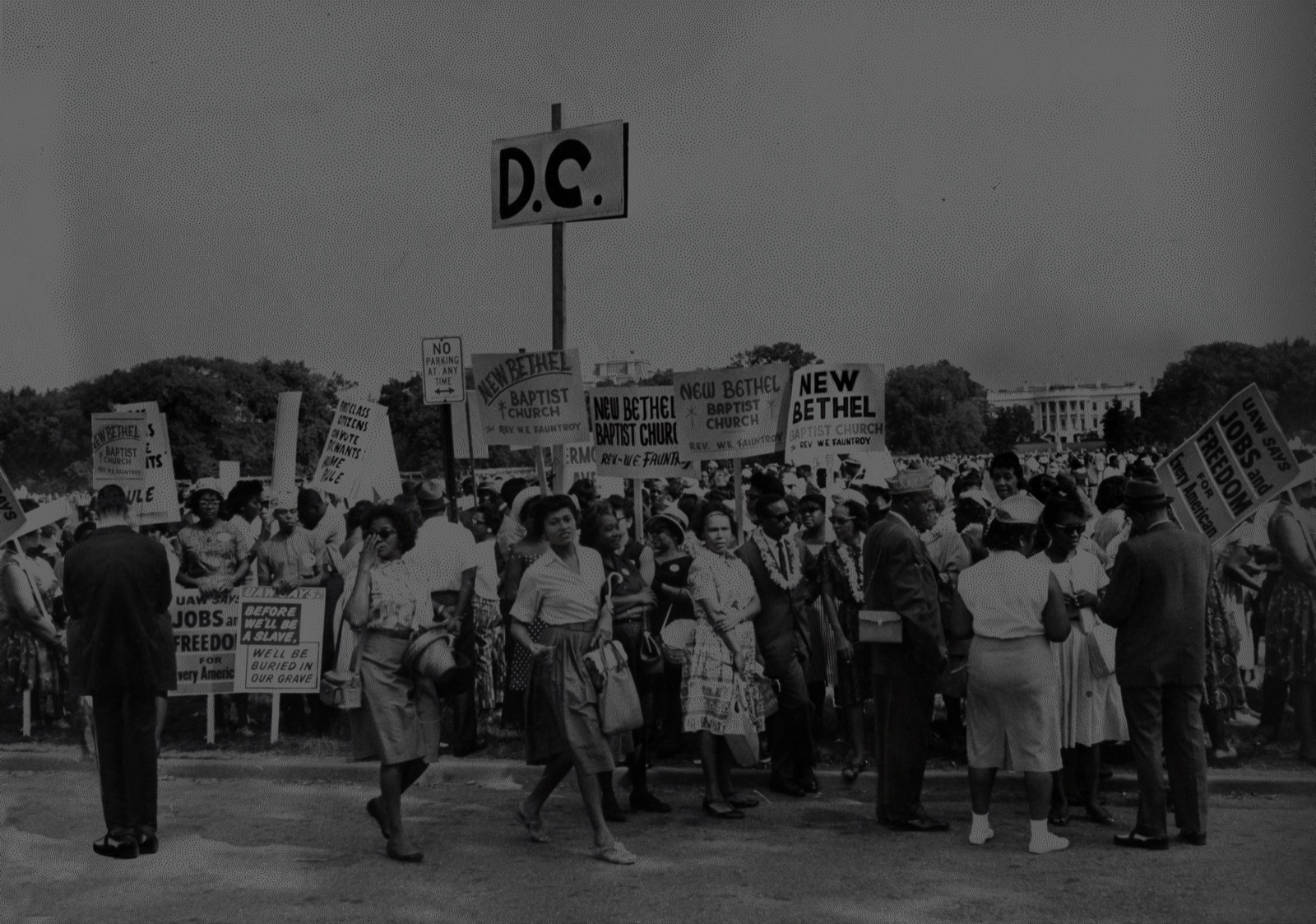
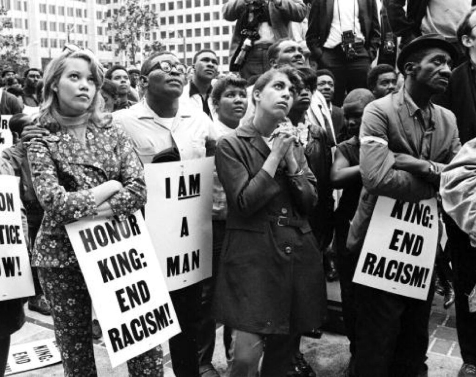
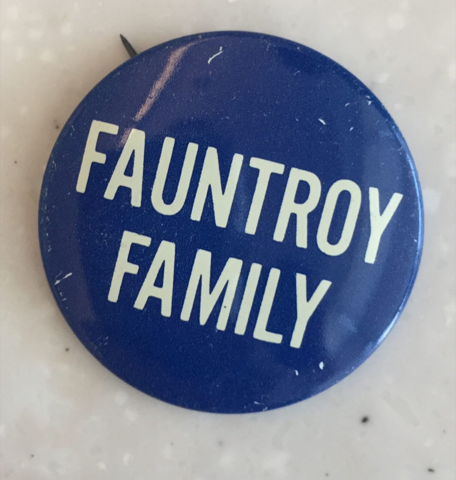
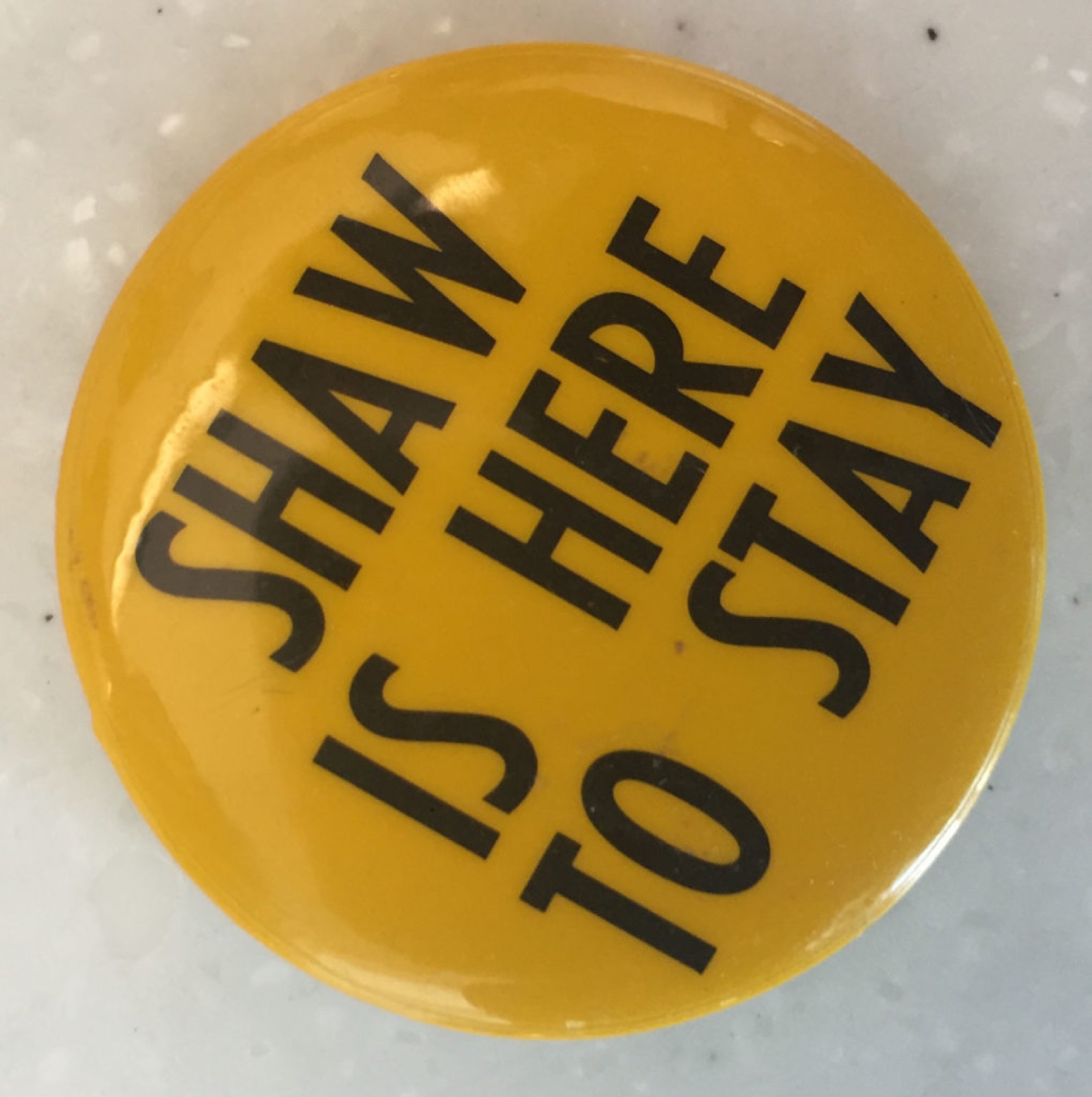
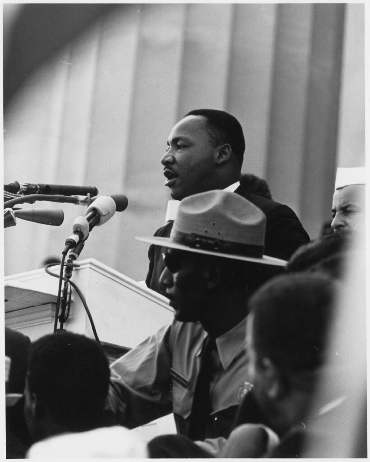
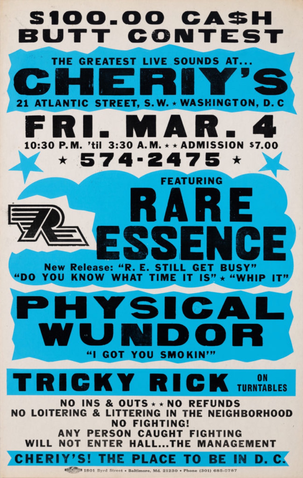
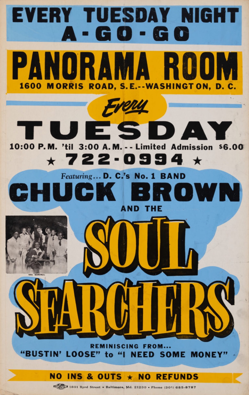
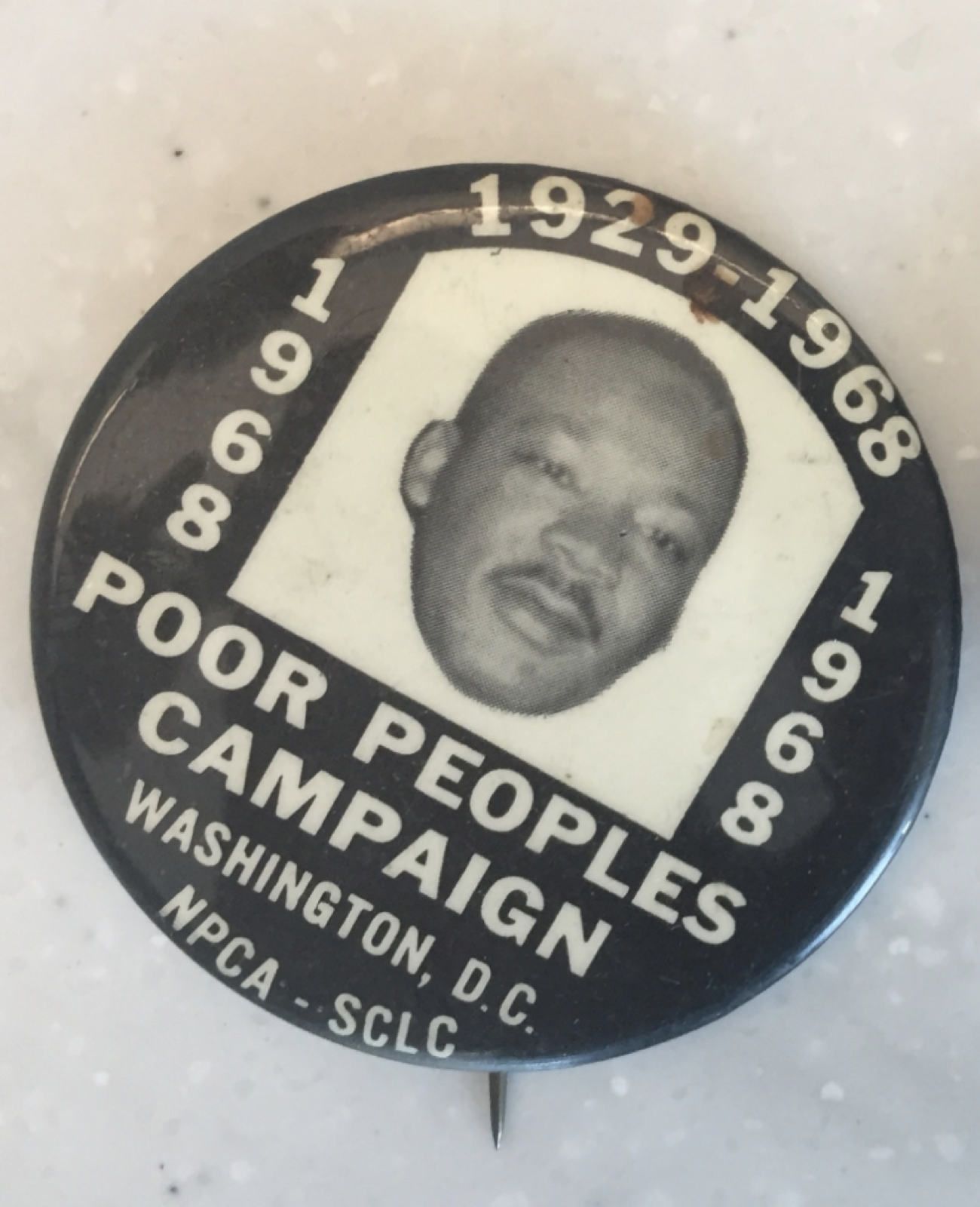
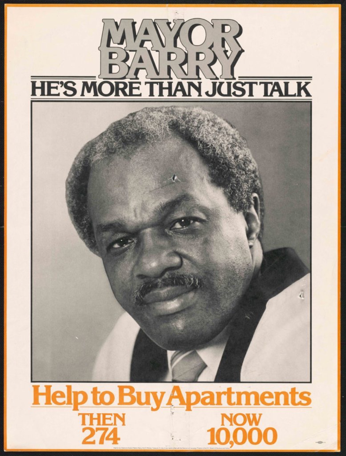
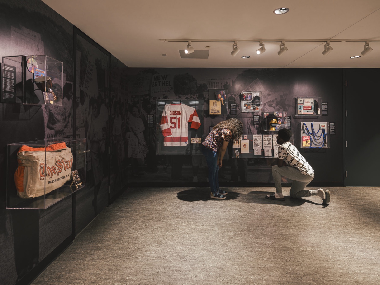
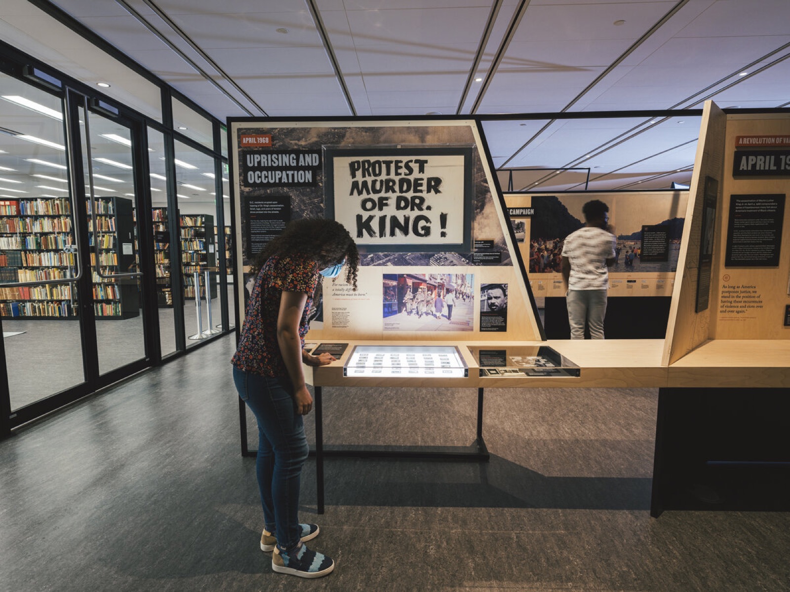
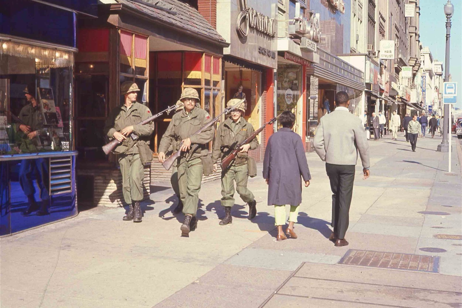
We worked with the library’s archivists to pull the exhibition from that collection. Dr. King at the podium in the District. Walter Fauntroy, the young pastor who became the city’s first delegate to Congress. Marion Barry as SNCC chairman and later as mayor. The Poor People’s Campaign, the 1968 uprising, home rule, and the go-go handbills and campaign buttons that put the same decades in the hands of the people who lived them.
Workshops
Made with the library.
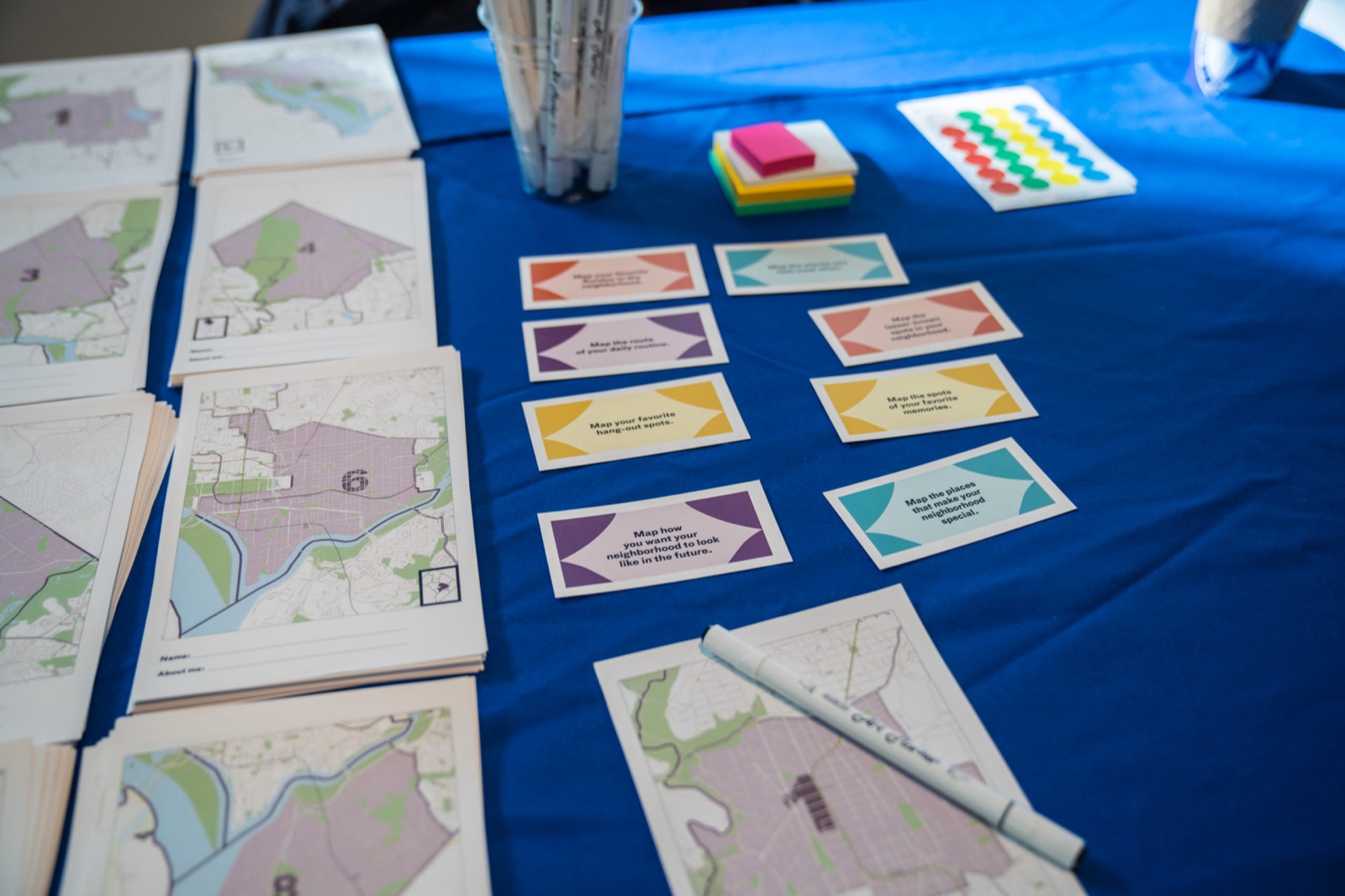
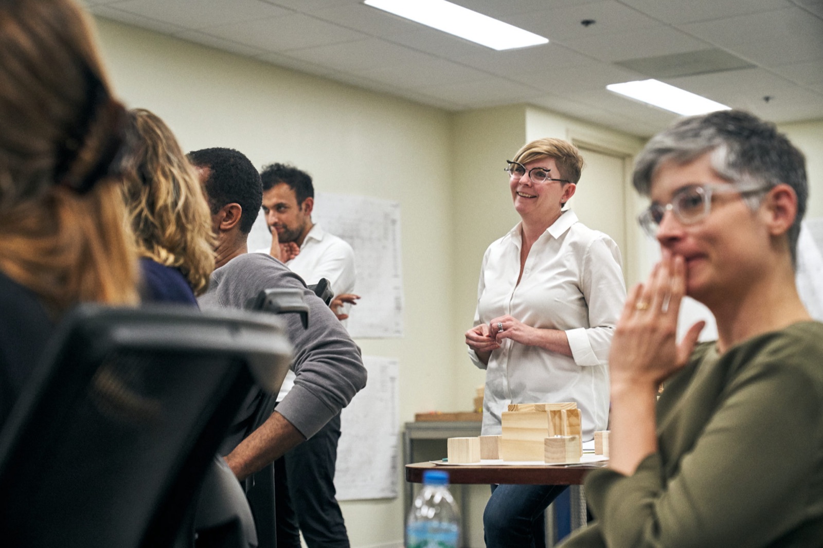
The content came out of workshops with library staff through 2019: wards mapped on the table, themes voted onto the wall, and a model of the floor that went around the room. The named figures, the neighborhoods and the questions in the drawers were settled there before a panel was drawn.
Exhibition
On the floor.
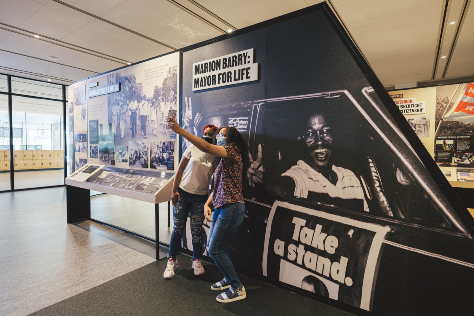
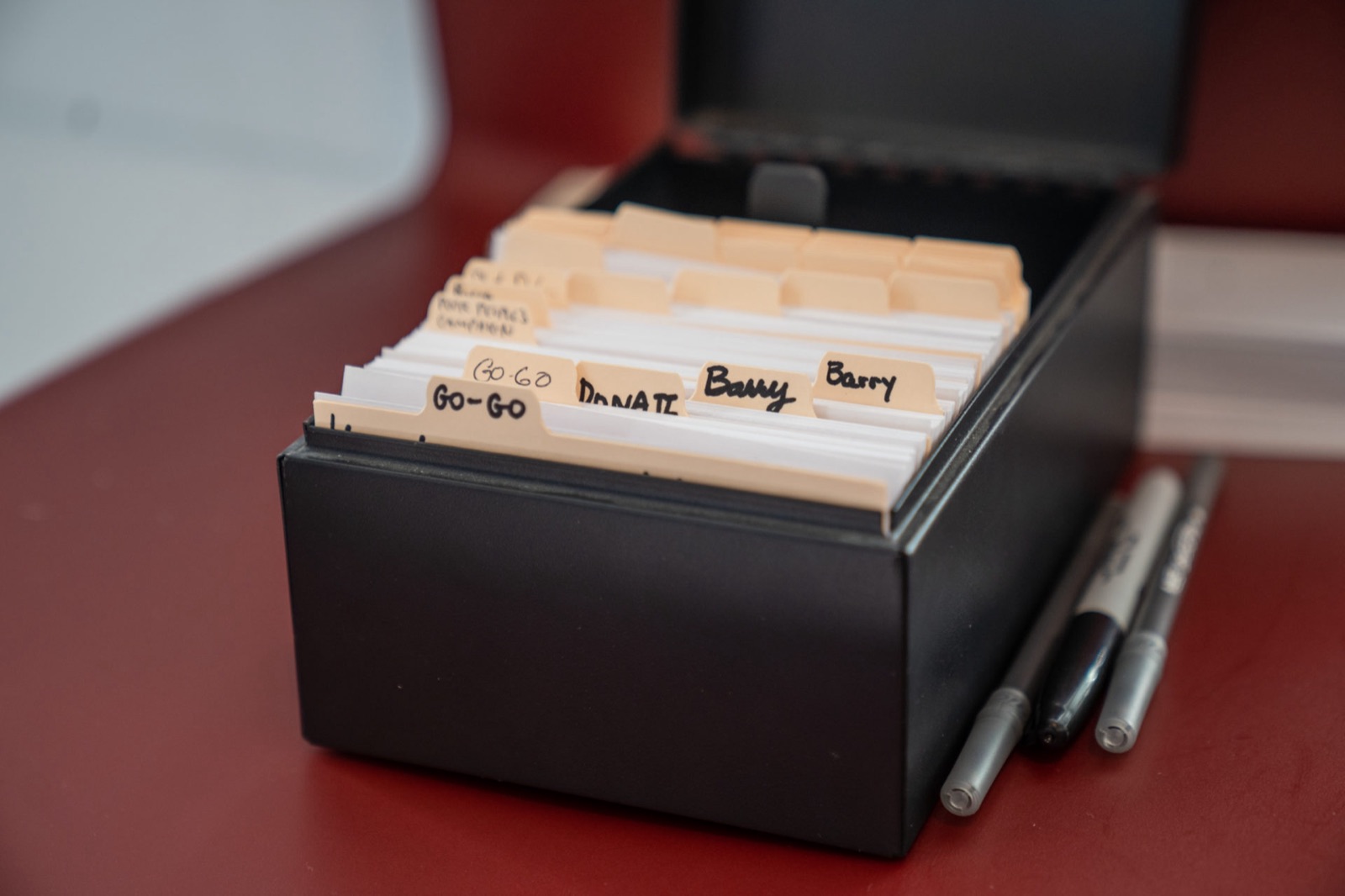
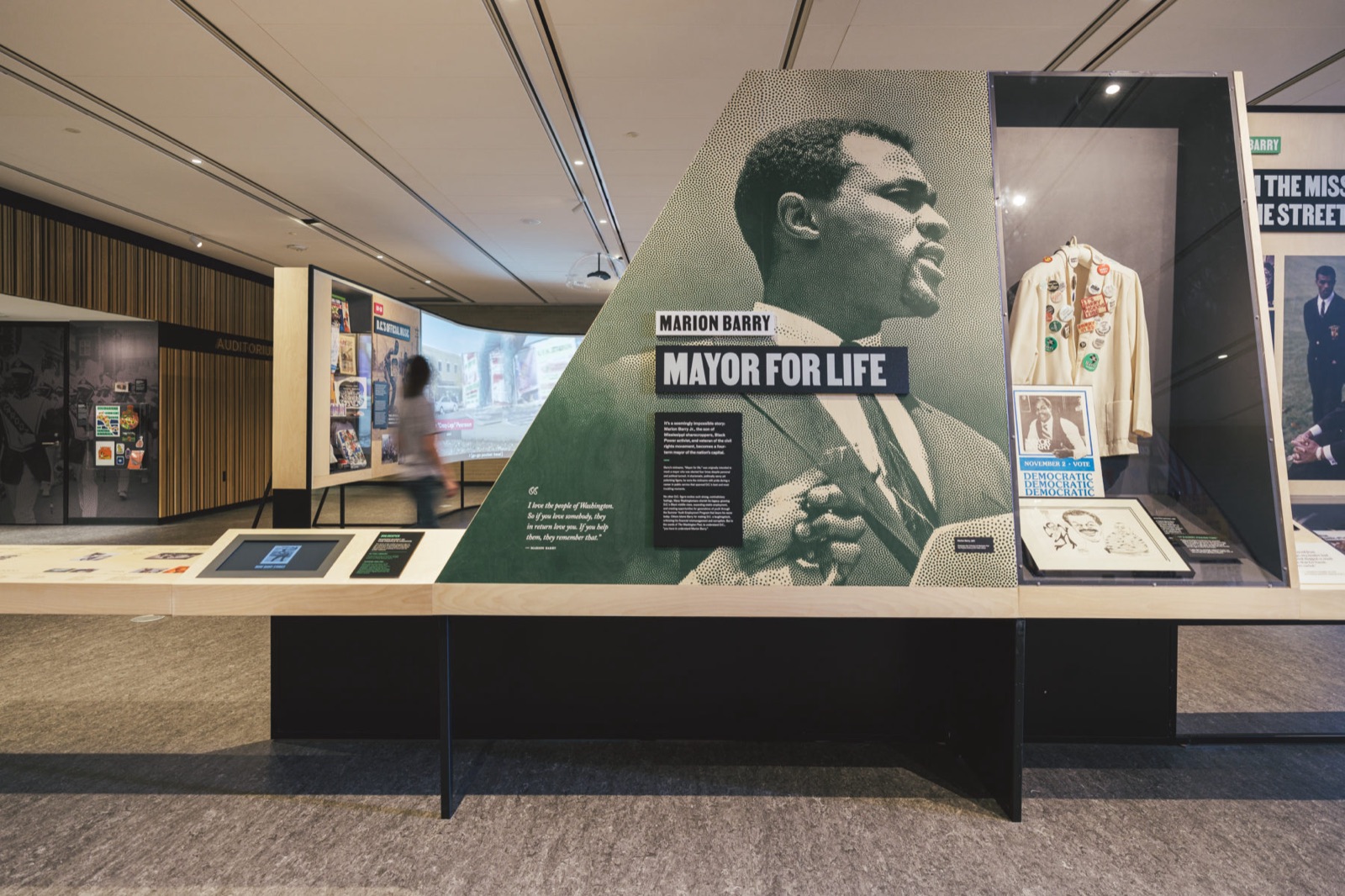
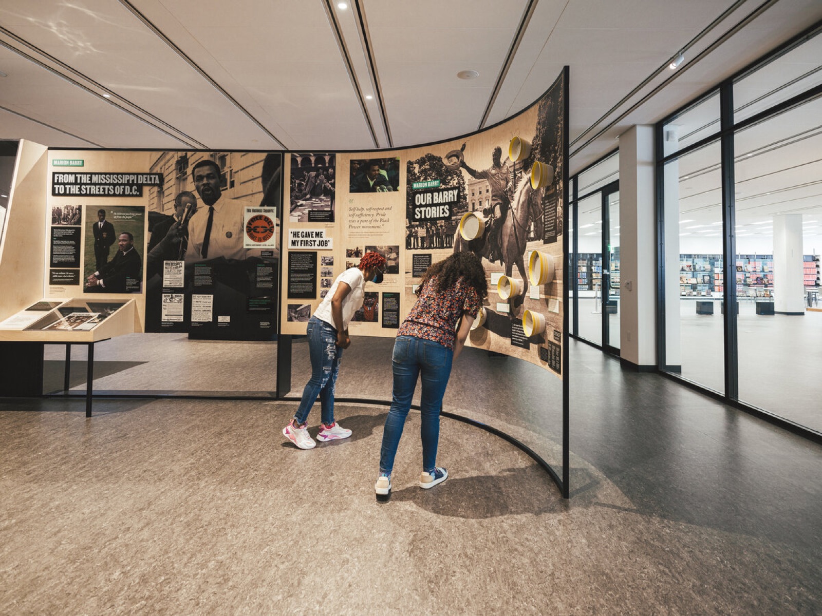
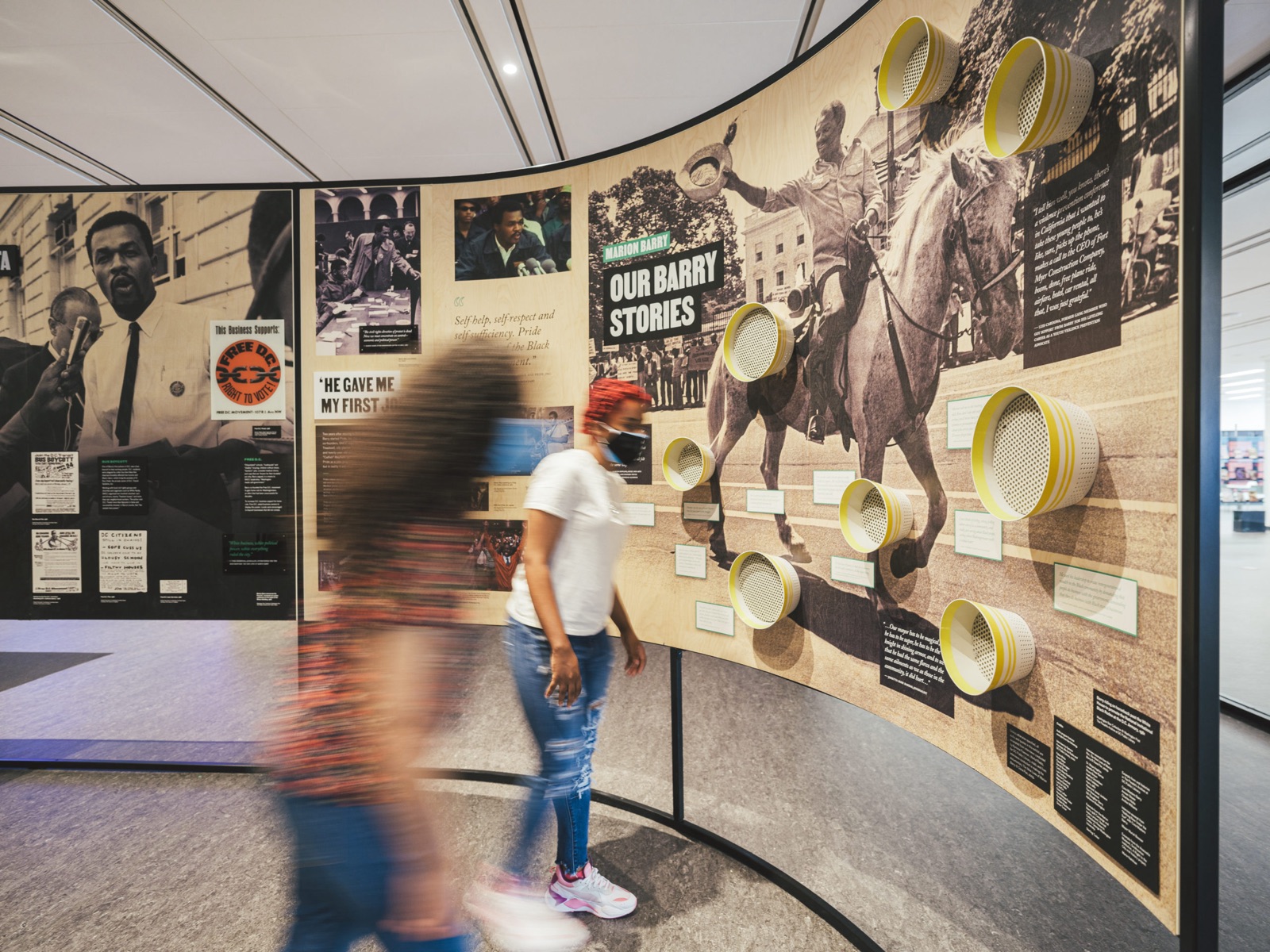
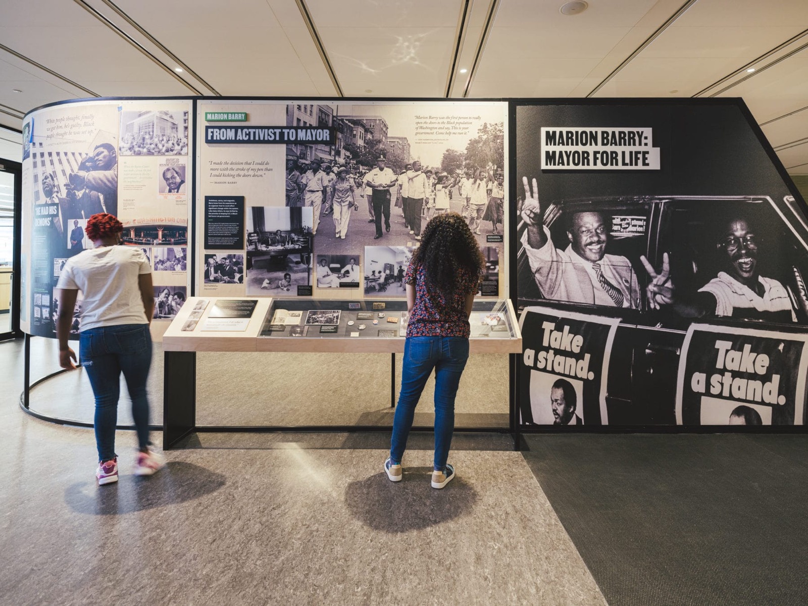
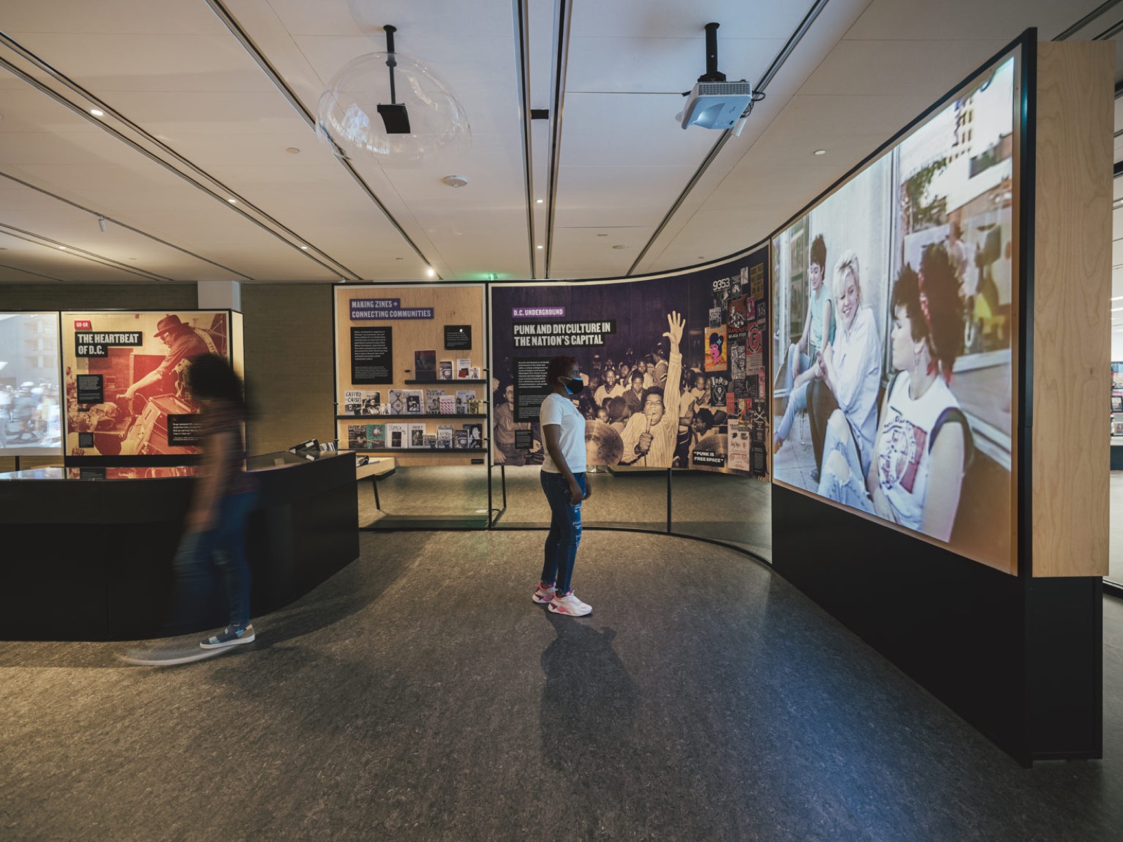
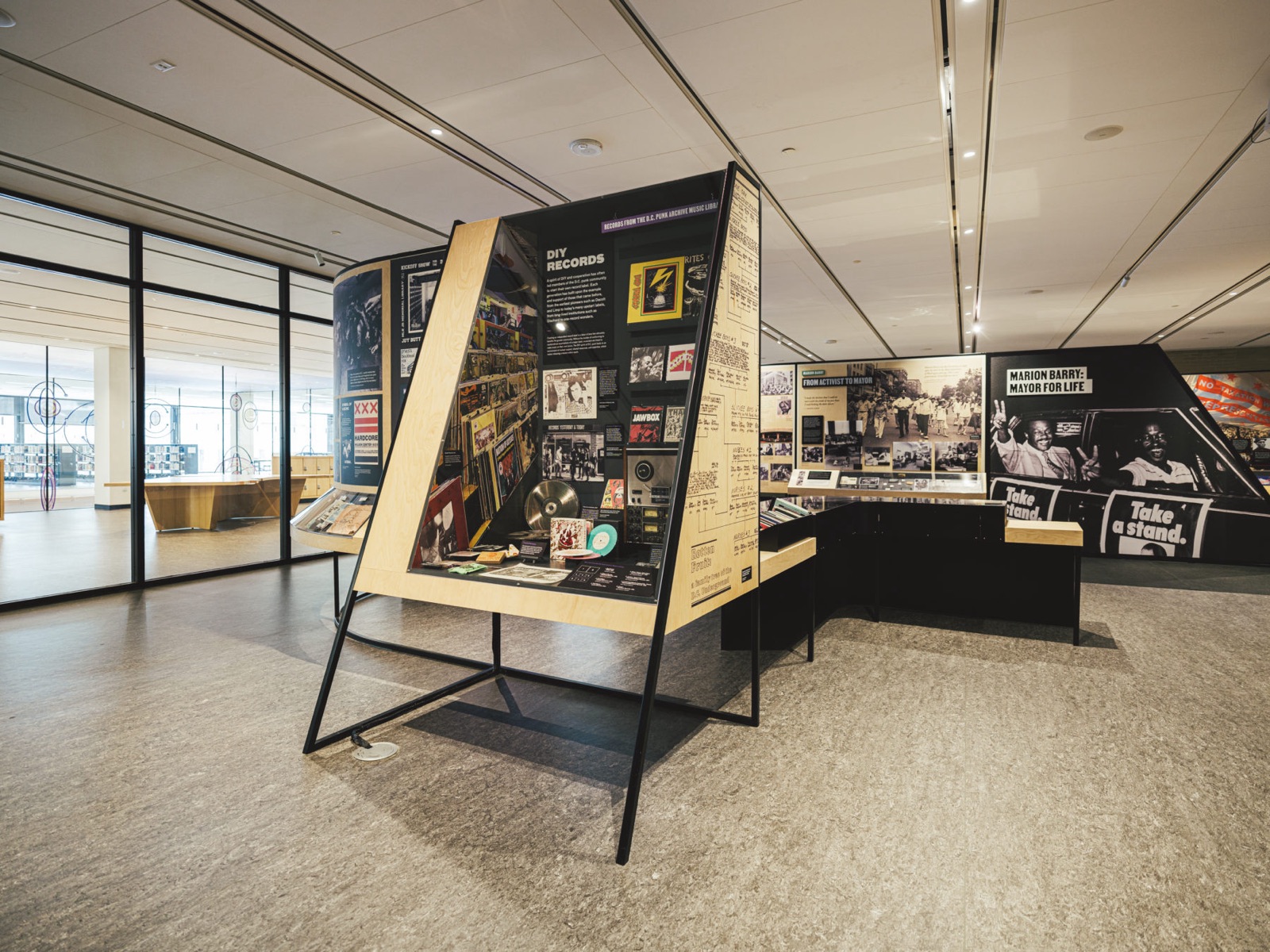
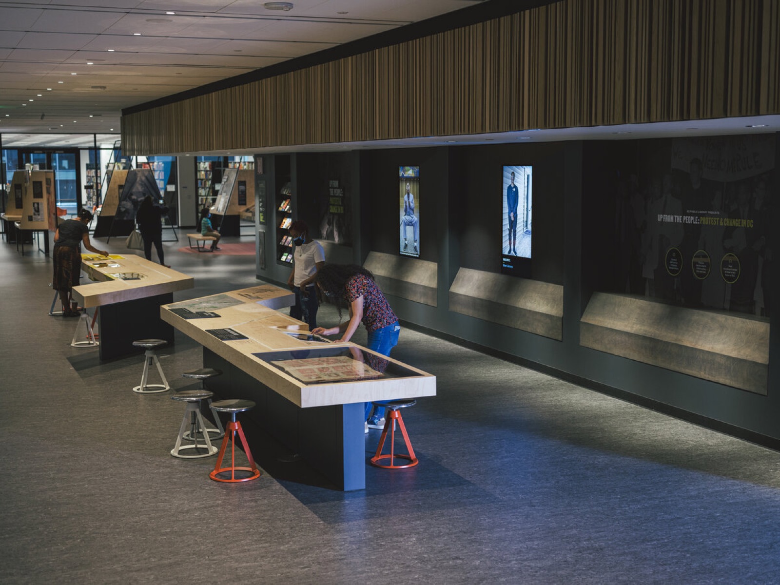
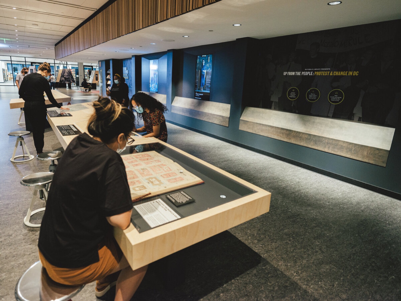
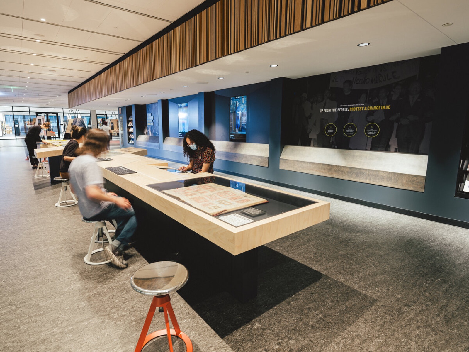
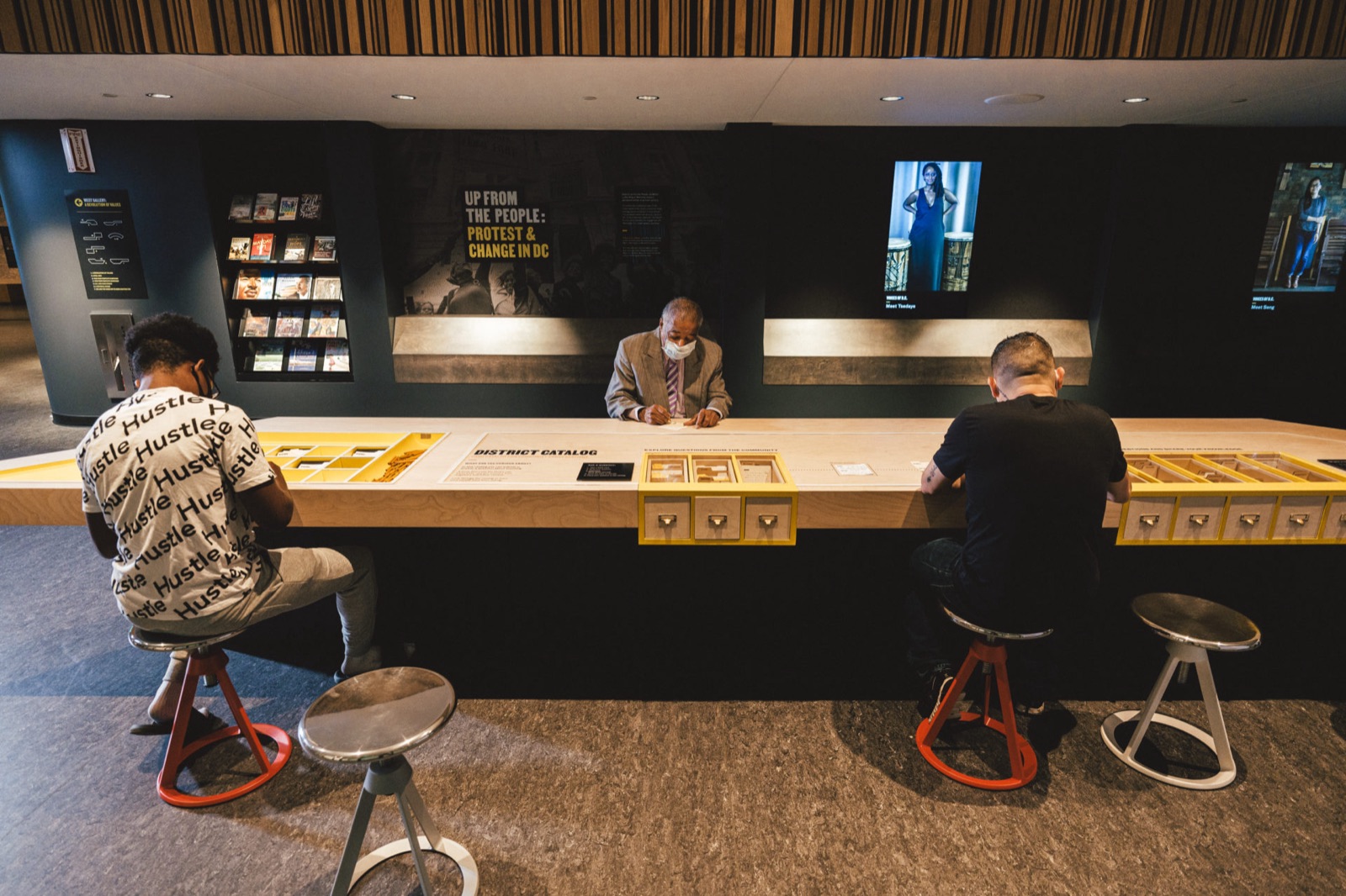
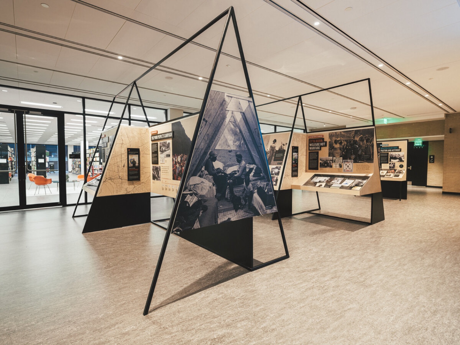
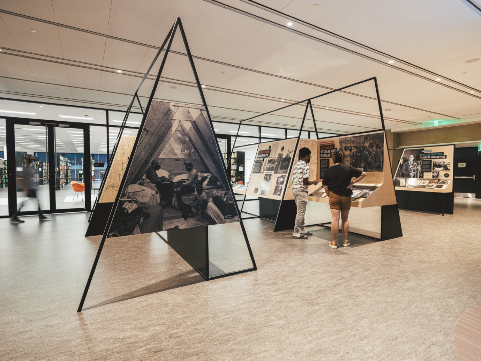
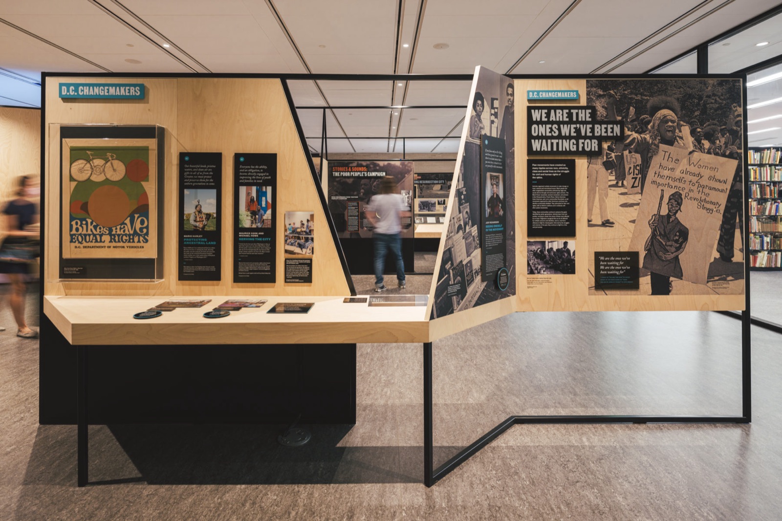
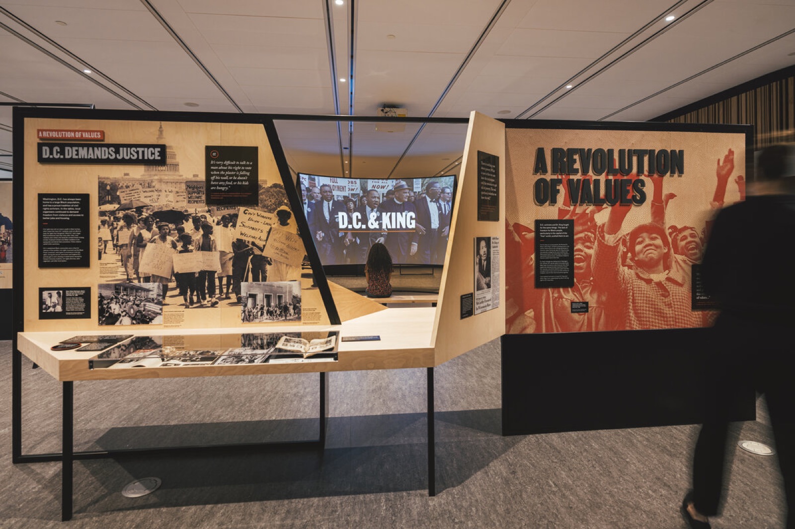
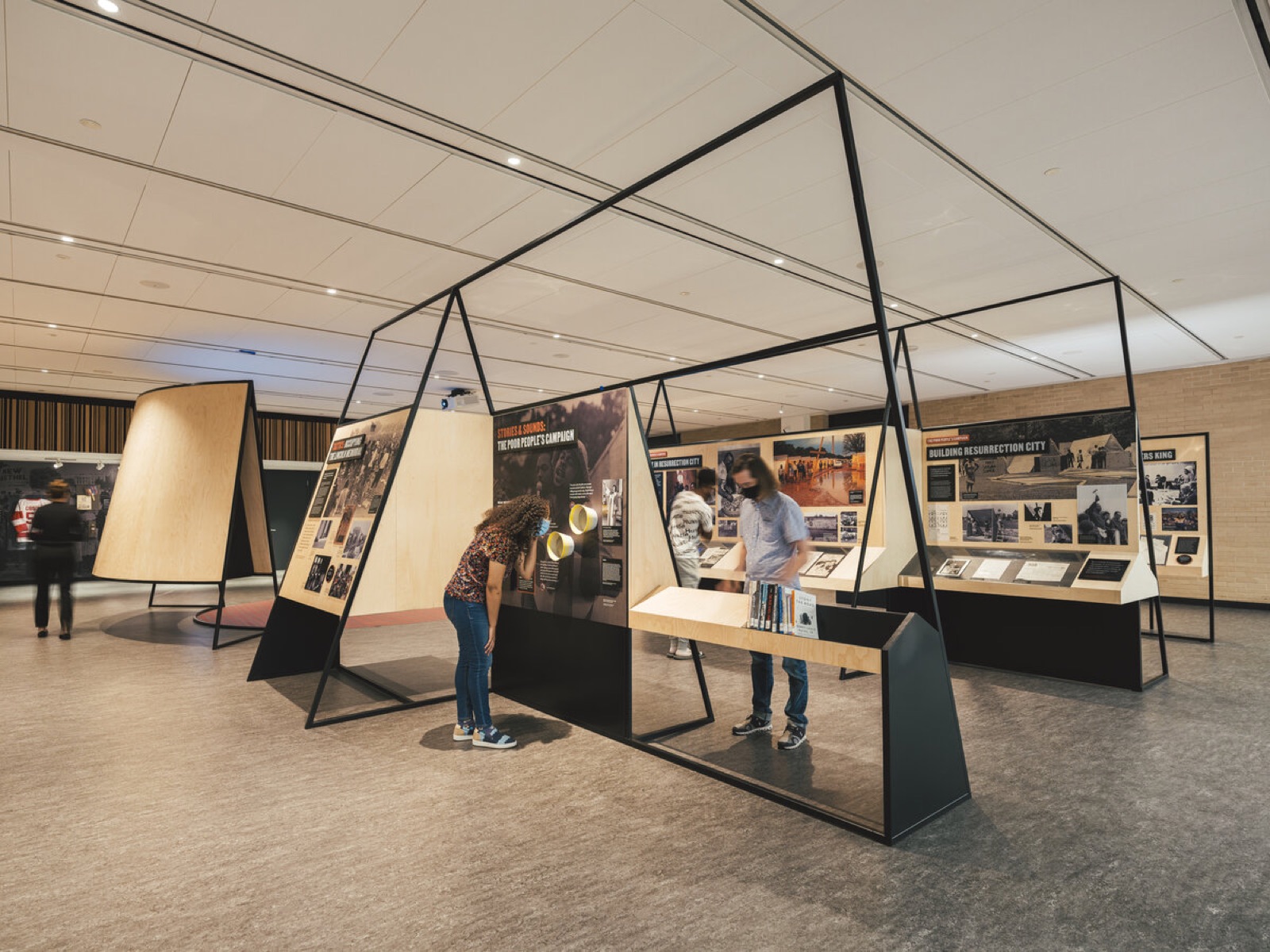
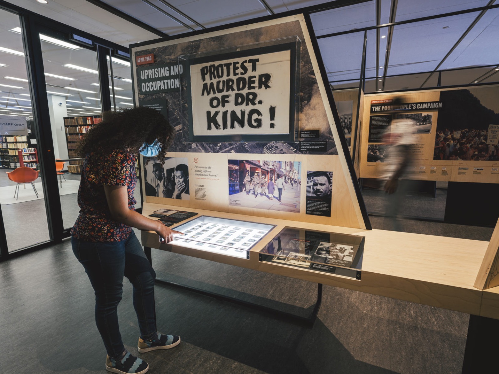
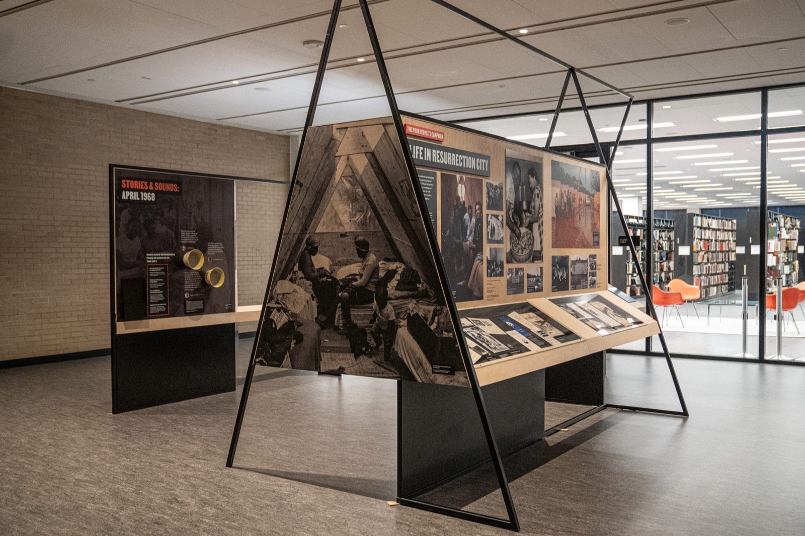
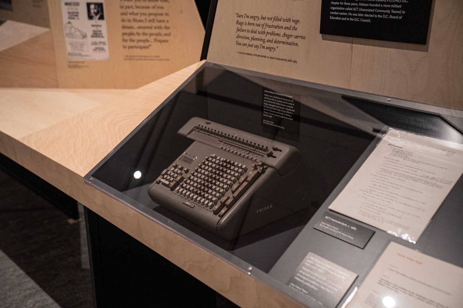
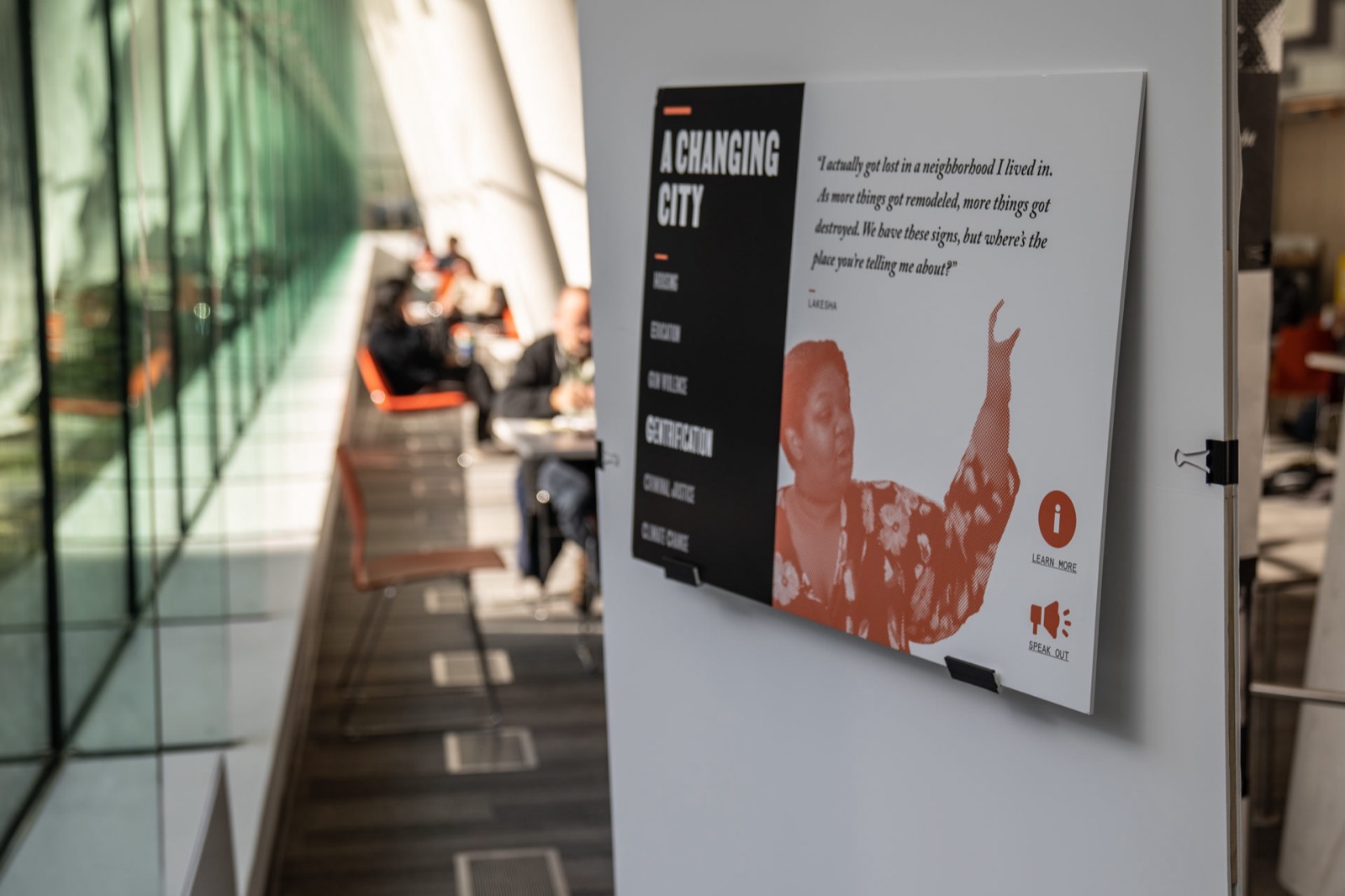
The exhibition runs along the library floor in three kinds of piece. Angled panels on black steel frames carry the named figures, Marion Barry, Mayor for Life, over low tables of artifacts. A-frames hold single archival photographs at full height, so a 1968 street scene stands in the room at the scale of the room. Long tables with stools carry the drawers, the vitrines and the touchscreens, and put the visitor at reading distance from a typewriter, a card file, a campaign button.
Every angle comes off the Mies grid. The panels are cut to it, the vitrines sit flush with the panel walls, and the black steel reads with the building’s own mullions, so the exhibition holds its place in the interior.
Installation
Up from the People, installed.
The permanent exhibition on the library floor after the 2020 reopening: panels, A-frames, the long tables, and the drawers people write into.
Identity
Take a stand.
Two typefaces.
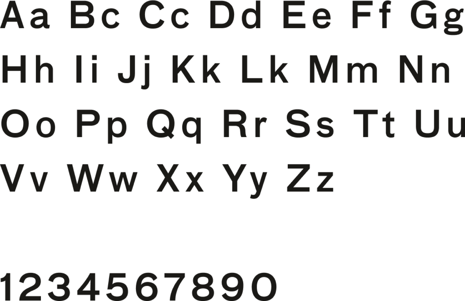
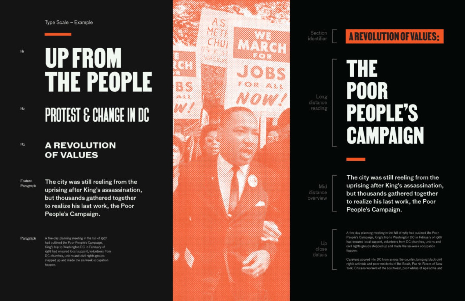
The identity had to speak in two voices at once: the protest it documents and the building it lives in. MARTIN, by Tré Seals of Vocaltype, is drawn from the placards of the 1968 Memphis sanitation strike, the campaign Dr. King went to Memphis to support. It sets the exhibition title, the named-figure callouts and every line meant to be read from across the floor. FF Bau, Christian Schwartz’s grotesque first drawn for the architecture magazine Baumeister, carries the panel copy and the captions, and answers the Bauhaus interior Mies built.
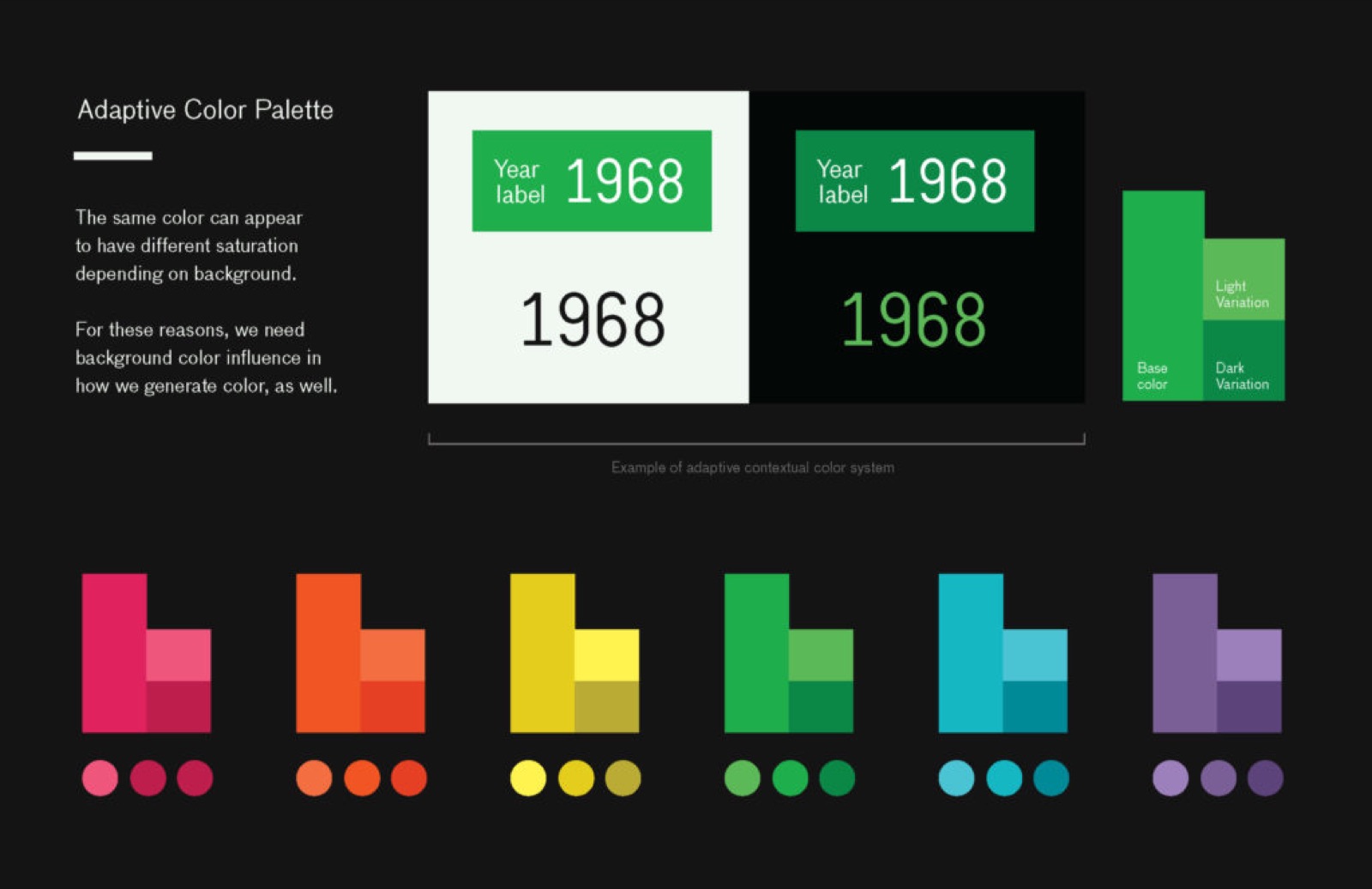
Underneath both sits a four-tier distance hierarchy: section identifier, long distance, mid distance, up close. The same system sets a headline read at twenty-five feet and a caption read over a vitrine, so the curators could write to a tier and the type would land at the right size. The palette is Activist Orange, Bauhaus Black and a cream stock, with an adaptive rule that adjusts a color to its ground so a date like 1968 reads the same on light and dark.
Participation
What visitors add.
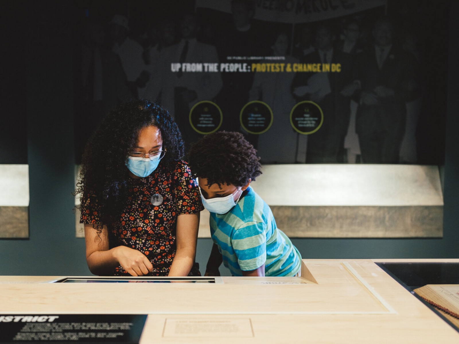
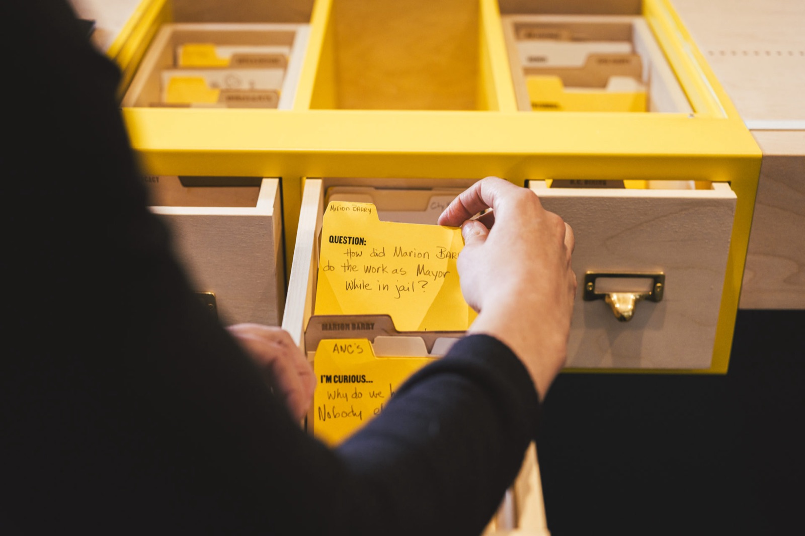
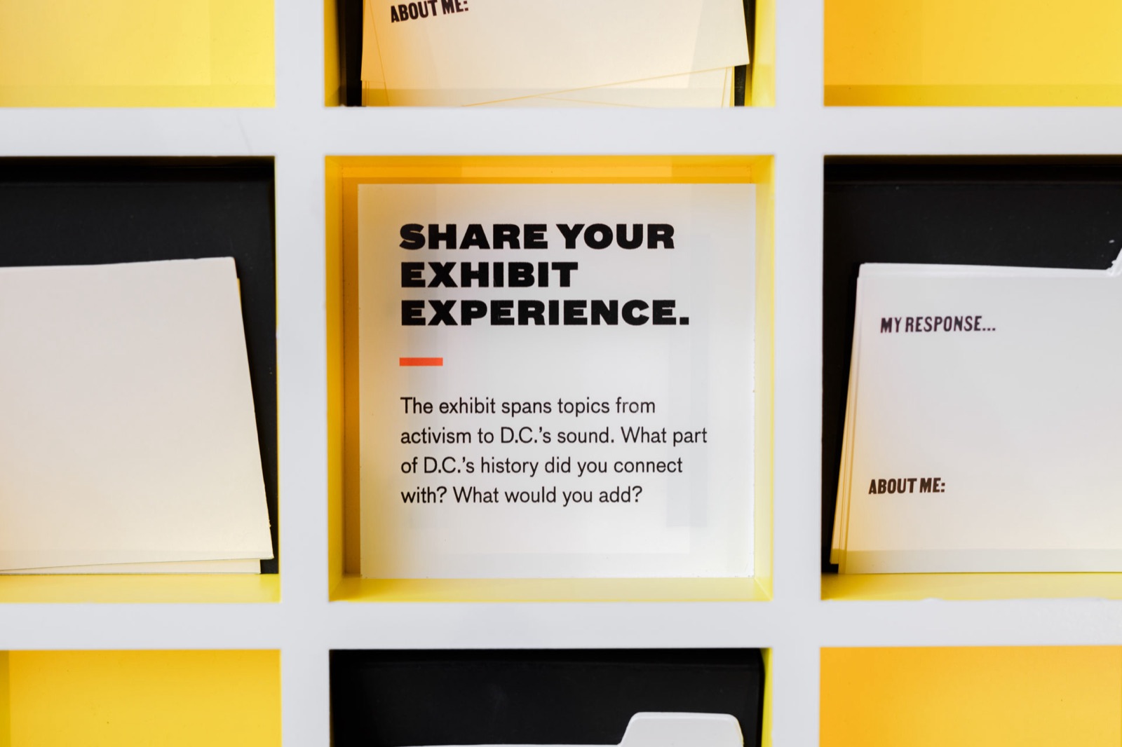
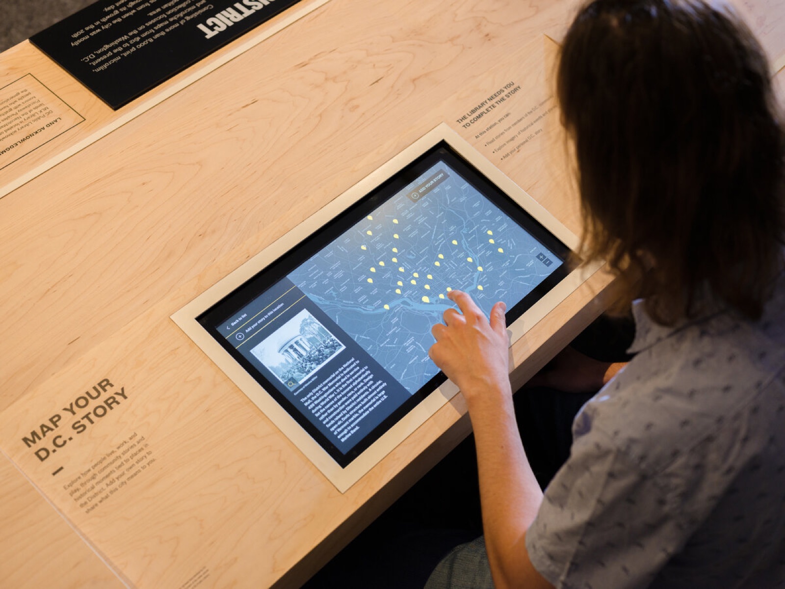
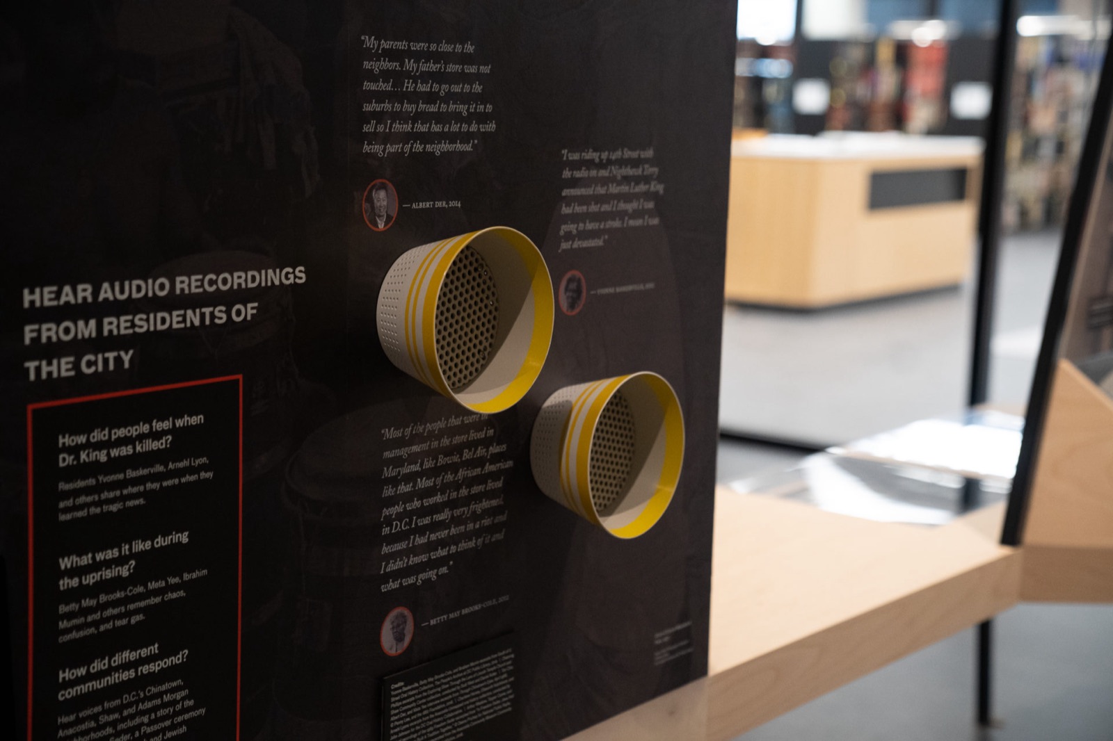
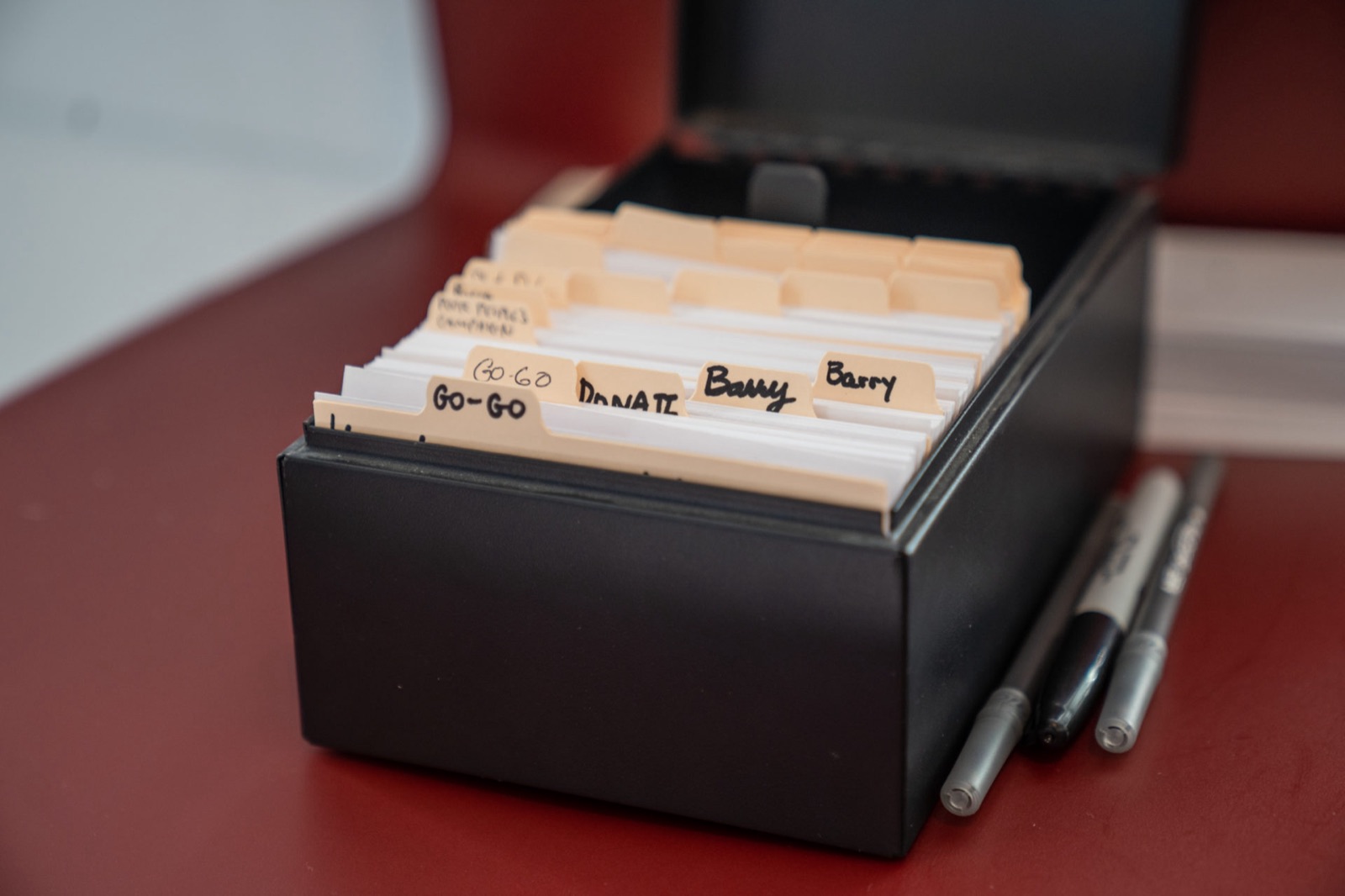
The exhibition is permanent, so it needed a way to keep taking in the city. The long tables carry that: a Map Your DC Story touchscreen set into the wood, listening cups with recordings from residents of the city, drawers of question cards, and a yellow cabinet where a visitor answers one and files the card for the next person. The copy on the cards is the same voice as the panels, one tier down.
Opening
2020.
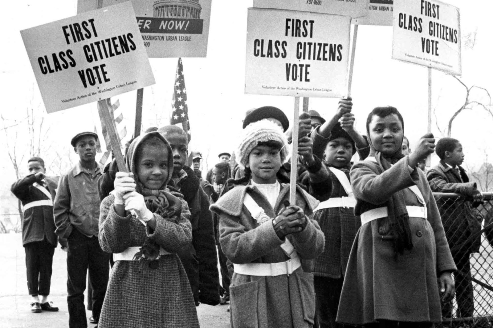
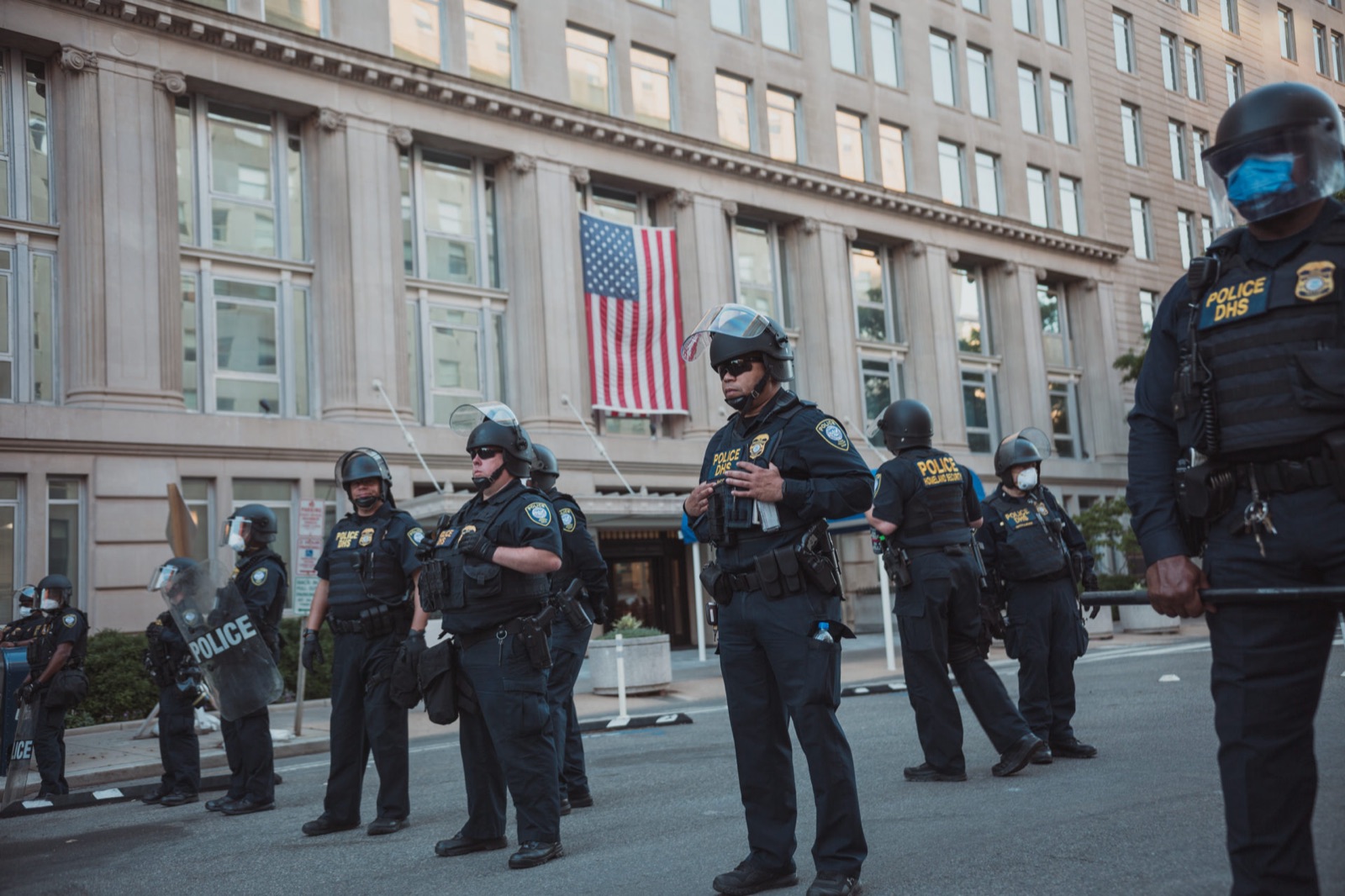
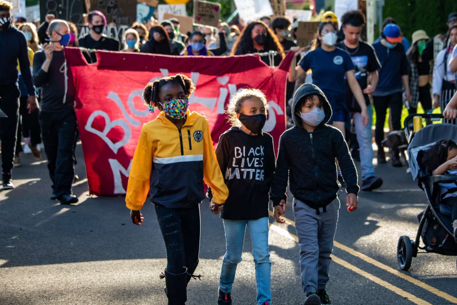
The library reopened in 2020, into a pandemic and a summer of protest in the same streets the exhibition documents. The photographs from the opening year sit beside the archival ones: the 1964 children’s march for voting rights and the 2020 march for Black lives.
Cut from the full case study at wrkhrs.co/work/mlk-public-library
